-1.svg "Hexa (1)-1")
Logo Slider
In your module click on Content Tab > left side > you can edit everything according to you
Also, you can edit custom colors in the style tab :
Main section: background color Or background image
Spacing: desktop, tablet, and mobile
Main Heading Content: heading/content color
Slider Style: arrows, dost, autoplay, show (desktop, tablet, and mobile) logo,
Button Style: bg-color, text color, border radius and hover bg-color, hover text-color
Video Popup | UZ
In your module click on Content Tab > left side > you can edit everything according to you
Also, you can edit custom colors in the style tab :
Max Width Container: Max Width and Padding Left / Right
Main section: Background color Or Background image
Spacing: Desktop, Tablet, and Mobile
Play Button Background Color: Background Color
Popup Overlay: Background Overlay
Custom Button Style: Background Color, Text Color, Border Color,
Custom Button Style: > Hover: Background Color, Text Color, Border Color,
jQuery CDN: If jQuery is included in the page settings, then this jQuery CDN is not working in your module.


Services Cards
In your module click on Content Tab > left side > you can edit everything according to you
Also, you can edit custom colors in the style tab :
Main section: background color Or background image
Spacing: desktop, tablet, and mobile
Main Heading Content: heading/content color
Tage Line: tagline text color and tagline color
Card style: Card background color, content color, card hover background color, card hover content color


Count Down
In your module click on Content Tab > left side > you can edit everything according to you
Also, you can edit custom colors in the style tab :
Module: Show / Hide
Main section: background color Or background image
Spacing: desktop, tablet, and mobile
Countdown Background Color: background color
Countdown Text Color: number color, (day, hours, minutes, and seconds color)


FAQ
In your module click on Content Tab > left side > you can edit everything according to you
Also, you can edit custom colors in the style tab :
Module: Show / Hide
Main section: background color Or background image
FAQ Style: background color, border width, border color, icon color, and also set the hover/active colors
Spacing: desktop, tablet, and mobile


Pricing card
In your module click on Content Tab > left side > you can edit everything according to you
Also, you can edit custom colors in the style tab :
Module: Show / Hide
Main section: background color Or background image
Spacing: desktop, tablet, and mobile


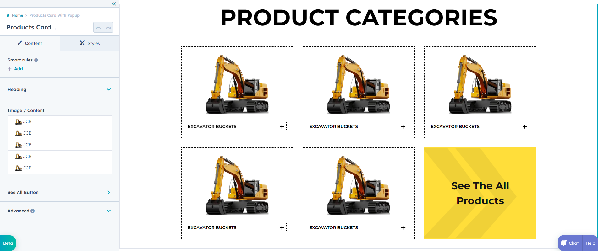
Products Card With Popup
In your module click on Content Tab > left side > you can edit everything according to you
Also, you can edit custom colors in the style tab :
Maximum content Width: Max Width Or Padding Left Right
Main section: background color Or background image
Spacing: desktop, tablet, and mobile
Card Style: Border Color, Border Choice and Background Color
Popup Style: Background color, Button Background Color, Close Icon Color and Border Line Color
Popup Style > Button Style: Background color, Text Color, Border Width, Border Radius and Border Color
Popup Style > Button Style > Hover: Background color, Text Color and Border Color


Our Team With Slider | UZ
In your module click on Content Tab > left side > you can edit everything according to you
Also, you can edit custom colors in the style tab :
Maximum content Width: Max Width Or Padding Left Right
Spacing: desktop, tablet, and mobile
Main section: background color Or background image
Arrow Icon Background Color: Color


Testimonial Slider With Popup | UZ
In your module click on Content Tab > left side > you can edit everything according to you
Also, you can edit custom colors in the style tab :
Spacing: desktop, tablet, and mobile
Maximum content Width: Max Width Or Padding Left Right
Main section: background color Or background image
Shape Color: Color
Popup Section Style: Overlay, Background color and Cross icon color
Dot Style: Dot Active Color and Border Color


Content With Accordion | UZ
In your module click on Content Tab > left side > you can edit everything according to you
Also, you can edit custom colors in the style tab :
Module: Show / Hide
Maximum content Width: Max Width Or Padding Left Right
Main section: background color Or background image
Spacing: desktop, tablet, and mobile
Tab Style: Border Color
Tab Style > Arrow: Background Color, Icon Color and Border Color
Tab Style > Arrow > Active: Background Color, Icon Color and Border Color


Table Chart | UZ
In your module click on Content Tab > left side > you can edit everything according to you
Also, you can edit custom colors in the style tab :
Module: Show / Hide
Maximum content Width: Max Width Or Padding Left Right
Main section: background color Or background image
Spacing: desktop, tablet, and mobile
Table Style: Background Color and Border Color
Second Column Style: Header Gradient, Headear Text Color, Icon Color and Background Color
Third Column Style: Header Gradient, Headear Text Color, Icon Color and Background Color


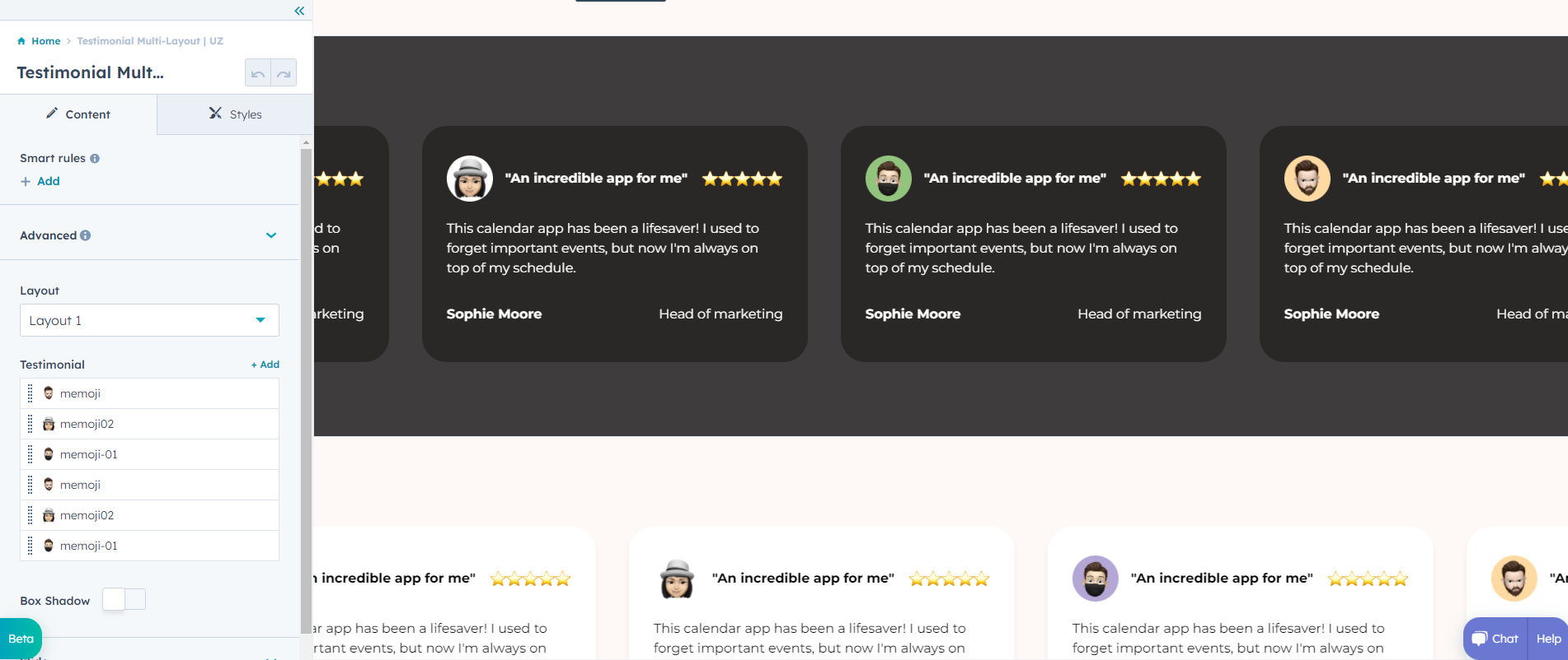
Testimonial Multi-Layout | UZ
In your module click on Content Tab > left side > you can edit everything according to you
Also, you can edit custom colors in the style tab :
Module: Show / Hide
Maximum content Width: Max Width Or Padding Left Right
Main section: background color Or background image
Spacing: desktop, tablet, and mobile
Autoplay On/Off Toggle
Speed Add Slider Speed
Dots Styling: Toggle
Dots Style: Dots Color and Dot Active Color

Toggle Features | UZ
In your module click on Content Tab > left side > you can edit everything according to you
Also, you can edit custom colors in the style tab :
Maximum content Width: Max Width Or Padding Left Right
Main section: background color Or background image
Spacing: desktop, tablet, and mobile
Column ReverseToggle On / Off
Card Style: Border width, border Color and Arrow Color


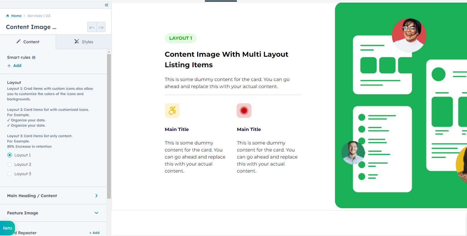
Content Image With Multi Layout Listing Items | UZ
In your module click on Content Tab > left side > you can edit everything according to you
Also, you can edit custom colors in the style tab :
Maximum content Width: Max Width Or Padding Left Right
Main section: background color Or background image
Spacing: desktop, tablet, and mobile
Column ReverseChoice option

Card Toggle With Feature Image | UZ
In your module click on Content Tab > left side > you can edit everything according to you
Also, you can edit custom colors in the style tab :
Maximum content Width: Max Width Or Padding Left Right
Main section: background color Or background image
Spacing: desktop, tablet, and mobile
Card StyleBackgroud color, icon color, and active icon and content color.
.png?width=1901&height=754&name=f%20(1).png)
.png?width=1896&height=756&name=s%20(1).png)
Tabbing With Slider | UZ
In your module click on Content Tab > left side > you can edit everything according to you
Also, you can edit custom colors in the style tab :
Maximum content Width: Max Width Or Padding Left Right
Spacing: desktop, tablet, and mobile
Navigation Section StyleBackgroud color, text color, and text active Color.
Card StyleBackgroud color, dost style, arrow style and icon style.


Feature | UZ
In your module click on Content Tab > left side > you can edit everything according to you
Also, you can edit custom colors in the style tab :
Maximum content Width: Max Width Or Padding Left Right
Spacing: desktop, tablet, and mobile
Background TypeBackgroud color or Background Image.
.png?width=1582&height=843&name=content%20(1).png)
.png?width=1584&height=843&name=style%20(1).png)
Multi Card Layouts | UZ
In your module click on Content Tab > left side > you can edit everything according to you
Also, you can edit custom colors in the style tab :
Maximum content Width: Max Width Or Padding Left Right
Spacing: desktop, tablet, and mobile
Background Backgroud color or Background Image.
Heading StyleBackground Shape color and Underline Gradient


Vertical Toggle With Image | UZ
In your module click on Content Tab > left side > you can edit everything according to you
Also, you can edit custom colors in the style tab :
Maximum content Width: Max Width Or Padding Left Right
Spacing: desktop, tablet, and mobile
Background: Backgroud color or Background Image.
Gradient Card: Background Image
Gradient Text Color: If you want "Text Gradient Color" add the class "text-gradient" and you have control the gradient color
Accordion Style: Background color and Active background Color
Pattern Image: Background image


Vertical Slider | UZ
In your module click on Content Tab > left side > you can edit everything according to you
Also, you can edit custom colors in the style tab :
Maximum content Width: Max Width Or Padding Left Right
Spacing: desktop, tablet, and mobile
Background: Backgroud color or Background Image.
slider dots color: Default color and Active Color
Slider content alignment: image right content left & image left content right choice
Dots Alignment: left, center, right
Slider slide height settings : slider slide custom height show/hide


Horizontal Tabbing With Image
In your module click on Content Tab > left side > you can edit everything according to you
Also, you can edit custom colors in the style tab :
Maximum content Width: Max Width Or Padding Left Right
Background: Backgroud color or Background Image.
Spacing: desktop, tablet, and mobile
Tab Button styling: default color style & Active Color style
Tab tooltip styling : tooltip background color, text color
Main title gradient : title gradient Color
Arrow Button styling (for mobile view) : Arrow button bg color , svg icon color & Disable Button bg color and svg icon color
Sector after bg color : background color


Horizontal Tabbing With Container | UZ
In your module click on Content Tab > left side > you can edit everything according to you
Also, you can edit custom colors in the style tab :
Maximum content Width: Max Width Or Padding Left Right
Background: Backgroud color or Background Image.
Spacing: desktop, tablet, and mobile
Tab Color: Tab Active Color and Tab Acyive underline Color


Partner Cards | UZ
In your module click on Content Tab > left side > you can edit everything according to you
Also, you can edit custom colors in the style tab :
Maximum content Width: Max Width Or Padding Left Right
Background: Backgroud color or Background Image.
Spacing: desktop, tablet, and mobile
Card Style: Background Color & Border Color & Shadow Enable


Blur Cards Slider | UZ
In your module click on Content Tab > left side > you can edit everything according to you
Also, you can edit custom colors in the style tab :
Maximum content Width: Max Width Or Padding Left Right
Background: Backgroud color or Background Image.
Spacing: desktop, tablet, and mobile
Section Border: Section Top / Bottom Border Color


Animated Card Slider | UZ
In your module click on Content Tab > left side > you can edit everything according to you
Also, you can edit custom colors in the style tab :
Maximum content Width: Max Width Or Padding Left Right
Background: Backgroud color or Background Image.
Spacing: desktop, tablet, and mobile


Client Testimonial Multi-Layout | UZ
In your module click on Content Tab > left side > you can edit everything according to you
Also, you can edit custom colors in the style tab :
Maximum content Width: Max Width Or Padding Left Right
Background: Backgroud color or Background Image.
Spacing: desktop, tablet, and mobile
Slider Options: Infinite, Autoplay: When toggled on, the autoplay speed option becomes enabled, allowing you to set the desired speed. Additionally, you can configure the number of slides to show and the number of slides to scroll, dots and arrows show hide options for each view: desktop, tablet, and mobile.


Leadership Module | UZ
In your module click on Content Tab > left side > you can edit everything according to you
Maximum content Width: Max Width Or Padding Left Right
Background: Backgroud color or Background Image.
Cards Style: Background Color, Image Overlay,Button / Icon Color, Social Icon
Spacing: desktop, tablet, and mobile
Slider Style Options: Slider On/Off , Infinite, Autoplay: When toggled on, the autoplay speed option becomes enabled, allowing you to set the desired speed. Additionally, you can configure the number of slides to show and the number of slides to scroll, dots and arrows show hide options for each view: desktop, tablet, and mobile.


Image Slider Timeline | UZ
In your module click on Content Tab > left side > you can edit everything according to you
Spacing: Desktop, Tablet, and Mobile
Slider Syle: Text Color, Active Color, Border Color, Bullet Color, Arrows Color, Image Overlay, Content Max Width, Left Right Padding , Desktop Content Alignment, Mobile Content Alignment


Pricing Table | UZ
In your module click on Content Tab > left side > you can edit everything according to you
Heading Here : Heading
Pricing Table : Table Content > Content Choice > Content | Check Icon | Cross Icon | Button
Table Content : Row Background Color | Content Color
Also, you can edit custom colors in the style tab :
Module Visibility: Module Show / Hide
Main section: Background color, Background Gradient Or background image
Image Shadow Show Hide
Image Shadow : Horizontal and Vertical Shadow | Blur Radius Shadow | Spread Radius Shadow
Image Border Radius
Main Heading Container Max-Width
Center Line / Circle Style : Center Cricle BG Color | Circle Border Color | Arrow Color | Center Line Color
Spacing: desktop, tablet, and mobile


Before After Image Effect | UZ
In your module click on Content Tab > left side > you can edit everything according to you
Add Content
Add Image: Before and After Image
Also, you can edit custom colors in the style tab :
Module Visibility: Module Show / Hide
Main section: Background color, Background Gradient Or background image
Image Shadow Show Hide
Image Shadow : Horizontal and Vertical Shadow | Blur Radius Shadow | Spread Radius Shadow
Image Border Radius
Main Heading Container Max-Width
Center Line / Circle Style : Center Cricle BG Color | Circle Border Color | Arrow Color | Center Line Color
Spacing: desktop, tablet, and mobile


Content With Before After Image Slider | UZ
In your module click on Content Tab > left side > you can edit everything according to you
Tittle / Content
Button: primary, secondary, simple, and custom option
Edit Image: Before and After Image
Also, you can edit custom colors in the style tab :
Module Visibility: Show / Hide
Main section: Background color, Background Gradient Or background image
Spacing: desktop, tablet, and mobile


Square Timeline Card | UZ
In your module click on Content Tab > left side > you can edit everything according to you
Add Heading
Cards Group > Card Repeater > Year Text, Title and Description, circle & Date Color and Square Box Color
Also, you can edit custom colors in the style tab :
Module Visibility : Show / Hide
Main section: background color, Background Gradient Or background image
Spacing: desktop, tablet, and mobile
Card style: Card background color


Product Cards | UZ
In your module click on Content Tab > left side > you can edit everything according to you
Also, you can edit custom colors in the style tab :
Max Width Container: Max Width and Padding Left / Right
Main section: Background color Or Background image
Spacing: Desktop, Tablet, and Mobile
Cards Same Hight Ensure all card items have the same height.
Toggle Slider Feature: Enable or Disable the slider functionality with a simple toggle, allowing you to customize how content is presented based on your needs.
jQuery CDN: If jQuery is included in the page settings, then this jQuery CDN is not working in your module.


Card With Popup Content | UZ
In your module click on Content Tab > left side > you can edit everything according to you
Also, you can edit custom colors in the style tab :
Max Width Container: Max Width and Padding Left / Right
Main section: Background color Or Background image
Spacing: Desktop, Tablet, and Mobile
Card Style: Card Background Color, Card Author Name | Color, Card Author Designation | Color, Card Button Text | Color, Card Button Text | Color - Hover, Card Button | Background, Card Button | Background - Hover, Card Button Border | Color, Card Button Border | Color - Hover, Card Social Icon | Color, Card Social Icon | Color - Hover, Card Social Icon | Background, Card Social Icon | Background - Hover
Card Popup Inside | Style: Card Popup Inside | Background, Card Popup Author Name | Color, Card Popup Author Location & Designation | Color, Card Popup Experience Number | Color, Card Popup Experience Content | Color, Card Popup Industries Heading | Color, Card Popup Industries Progress Bar | Color, Card Popup Industries Progress Text | Color, Card Popup Logo Title | Color, Card Popup Button Text | Color, Card Popup Button Text | Color - Hover, Card Popup Button | Background, Card Popup Button | Background - Hover
Card Slider | Style: Make Card slider in Mobile view, Dot Color, Dot Color - Active
jQuery CDN: If jQuery is included in the page settings, then this jQuery CDN is not working in your module.


Ul Timeline Cards | UZ
In your module click on Content Tab > left side > you can edit everything according to you
Also, you can edit custom colors in the style tab :
Max Width Container: Max Width and Padding Left / Right
Main section: Background color Or Background image
Spacing: Desktop, Tablet, and Mobile
Track: Track Color
Card Background: Card Background Color
Card Circle Background: Card Circle Background Color
Animation: Animation Hide & Show
jQuery CDN: If jQuery is included in the page settings, then this jQuery CDN is not working in your module.


Team Flip Card
In your module click on Content Tab > left side > you can edit everything according to you
Also, you can edit custom colors in the style tab :
Main section: background color Or background image
Spacing: desktop, tablet, and mobile
Main Heading Content: heading/content color
Tage Line: tagline text color and tagline color
Card style: Card background color, content color, card hover background color, card hover content color


Style Quote
In your module click on Content Tab > left side > you can edit everything according to you
Quote Icon Choice:- Svg Code Icon | Image Icon |Hubspot Icon
Add Heading / Content
User Details :- User Image | User Details
Wrapper
- Maximum Width :- Large Screens | Medium Screens | Small Screens
- Block Alignment :- Large Screens | Medium Screens | Small Screens
- Text Alignment :- Large Screens | Medium Screens | Small Screens
- Indetifires :- Custom ID |Custom class
Also, you can edit custom colors in the style tab :
Backgroud Choice: background color Or background image
Spacing: desktop, tablet, and mobile
Quote Box Style
-
Box Background Color Show/Hide: Box Background Color
-
Quote Icon Color
-
Svg Icon Color
-
Box Border
-
Border Radius:- Top Left Radius / Bottom Right Radius || Top Right Radius / Bottom Left Radius


Services Cards
In your module click on Content Tab > left side > you can edit everything according to you
Also, you can edit custom colors in the style tab :
Main section: background color Or background image
Spacing: desktop, tablet, and mobile
Main Heading Content: heading/content color
Tage Line: tagline text color and tagline color
Card style: Card background color, content color, card hover background color, card hover content color
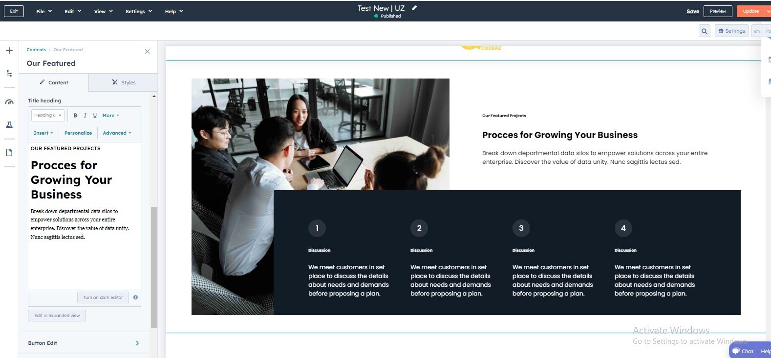
Our Featured
In your module click on Content Tab > left side > you can edit everything according to you
Add Image
Title Heading
- Button Edit
- Button Choice
- Button Size
- Button Text
- Button Link
-
Button Icon Enable/Disable
Icon Choice
- Svg Code
- Hubspot Icon
-
Custom Style
-
Button Custom Style
- Button BG Color
- Button BG Color | Hover
- Button Text Color
- Button Text Color | Hover
-
Content Repeater
- Add content
Also, you can edit custom colors in the style tab :
Main section (Background Type): background Gradient Or background image
Spacing: desktop, tablet, and mobile
Items | Style: Background Color (Gradient) | Number Background Color | Number Text Color | Border Color