.jpg?width=290&height=188&name=desktop-wallpaper-indian-vegetarian-food-platter-or-thali-by-stockfactory-on-envato-elements-vegan-food%20(1).jpg)
%20(1).jpg?width=290&height=188&name=dish%20(1)%20(1).jpg)
%20(1)%20(1).jpg?width=290&height=188&name=sushi-platter%20(1)%20(1)%20(1).jpg)
%20(1)%20(1)%20(1).jpg?width=290&height=188&name=Whisk_PI_190919_Pizzas_004_MARGHERITA%20(1)%20(1)%20(1)%20(1).jpg)
Up and Running Restaurant Theme

Copy to different account
Select your Theme Folder then click right click then show some option
Select option = Copy to different account

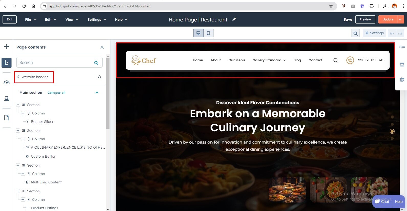
Global Header
To edit your header, you'll first need to create a page with a theme template. When a page is created then edit you page in the left side click Tab Contents. Then click Page header.
Global Footer
To edit your Footer, you'll first need to create a page with a theme template. When a page is created then edit you page in the left side click Tab Contents. Then click Page footer.

Pre-built Template

Internal Delivery
Manage customer blog template and settings
- In the customer HubSpot account, click the settings icon settings in the main navigation bar.
- In the left sidebar menu, navigate to Website > Blog.
- On the Templates tab, you can view or change the templates applied to your blog posts and blog listing page
- In the Blog post and Blog listing sections, click the Actions dropdown menu to manage your template
- Select Change template to choose a different template. On the template selection screen, select your new template, then click Done. In the bottom left of your template settings, click Save.

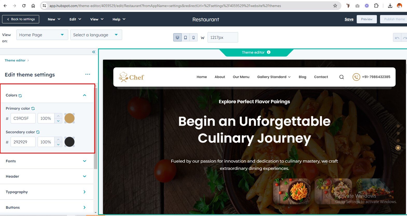
Global Color
- Primary Color
- Secondary Color
Global Fonts
- Primary Font
- Secondary Font

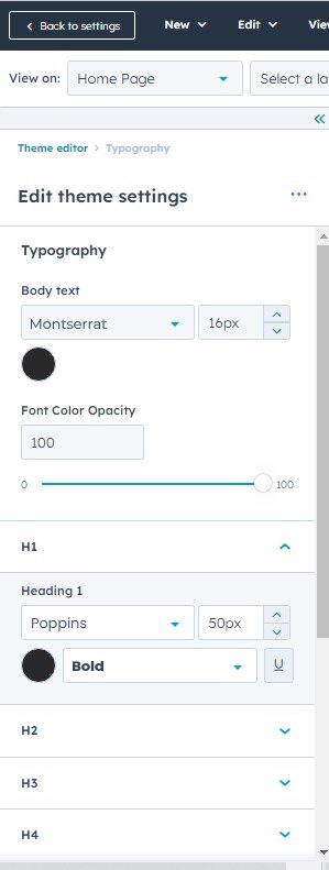
Typography
Body
- Body font style
- Body font color opacity
(H1 > H6)
- Font style
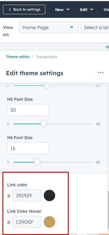
Typography On Mobile(Headings (H1 > H6)
- Font Size
Links
- Link color
- Link hover color

Buttons
Buttons Size
- Small
- Font size
- Vertical Spacing
- Horizontal Spacing
- Regular
- Font size
- Vertical Spacing
- Horizontal Spacing
- Large
- Font size
- Vertical Spacing
- Horizontal Spacing
Primary Button
- Google Font Style
- Text Transform
- Background Color
- Border
- Style
- Width
- Color
- Corner Radius
- Hover
- color
- Background Color
- Border
- Width
- Color
Secondary
- Google Font
- Text Transform
- Background Color
- Border
- Style
- Width
- Color
- Corner Radius
- Hover
- color
- Background Color
- Border
- Width
- Color
Simple
- Google Font
- Text Transform
- Underline
- Hover
- Font Color
- Underline

Header
Header Background
- Background Color
Menu
- Google Font
- Menu Transform
- Menu Link Color
- Menu Hover Link Color
- Child Menu Color
- Submenu background Color
- Submenu border Color
- Mobile header Background color
- Top and bottom padding
Footer
Menu
- Google Font
- Text transform
Hover
- Font Color
- Background Color
Active
- Font Color
- Background Color
Footer background color
- Background color
Footer Social Icon Color
- Background Color
- Icon color
- Background Hover Color
- Icon Hover color
copyright
- Background color
- Top Border color

Forms
Title
- Background Color
- Google Font
-
Padding
- Top/Bottom
- Left/Right
-
Border
- Border style
- Corner radius
Labels
- Google Font
- Background color
-
padding
- Top/Bottom
- Left/Right
Field
- Google Font
- Background color
- Placeholder color
-
padding
- Top/Bottom
- Left/Right
-
Border
- Border style
- Border Choice (both side, top border , bottom border)
- Border Width
- Border Color
- Corner radius
-
Error massage
- Font style
- Background color
-
Error massage border style
- Border Width
- border color
Help text
- Google Font
Background Color
- Form Background Color
Border Choice
- Duble
- Groove
- Ridge
- Inset
- Outset
- Corner Radius
Form Padding
- Top/Bottom
- Left/Right
Submit Button
- Button Style
- Button Size

Table
- Header Background Color
- Header Text Color
- Body Background Color
- Body Text Color
- Footer Background Color
- Footer Text Color
- Border Color

Spacing (Container Width)
- Vertical Spacing
- Maximum Content Width

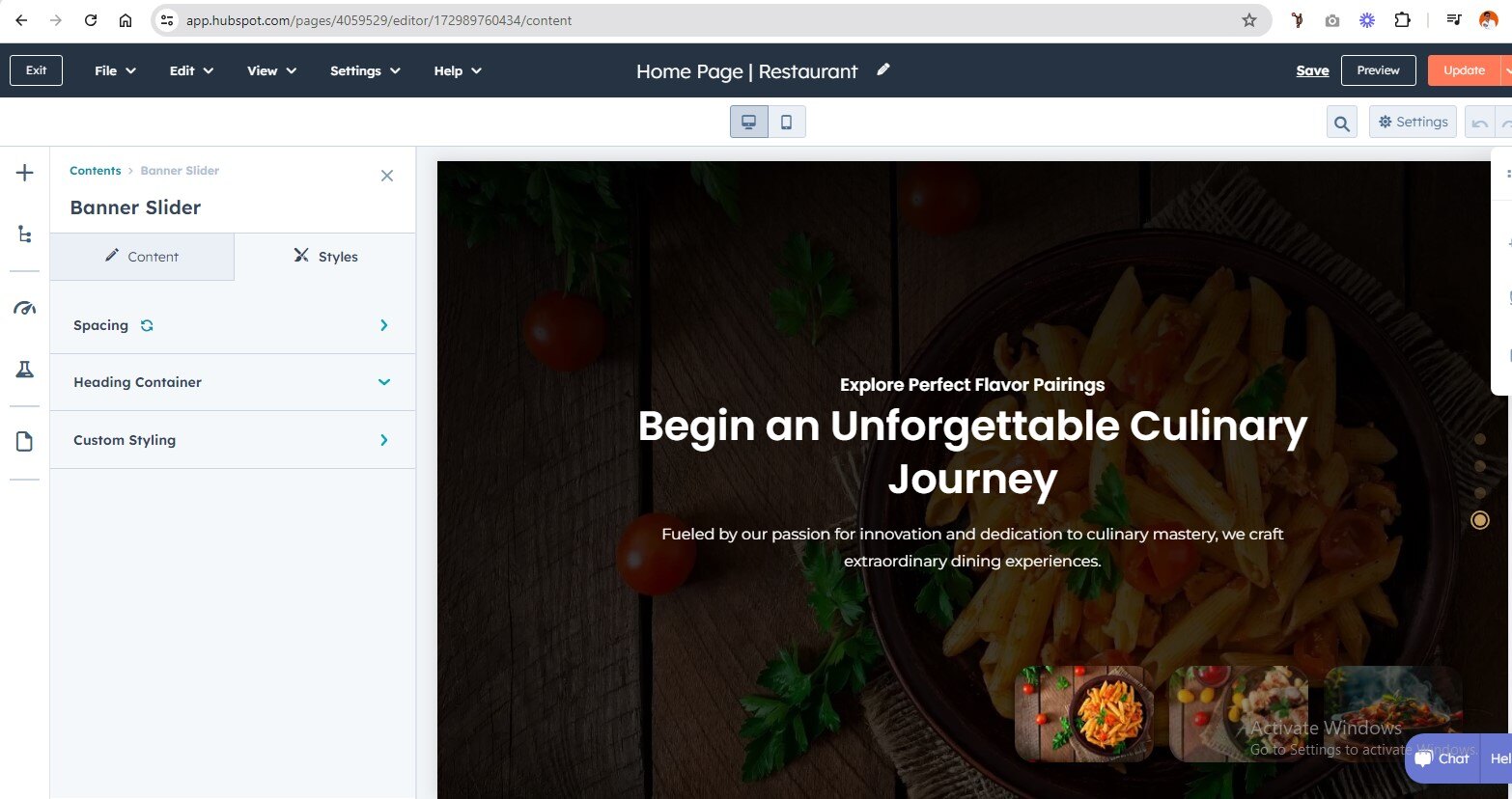
Banner Slider
In your module click on Content Tab > left side > you can edit everything according to you
Custom ID | ClassCard Repeater (Slider Slide Items)
- Image
- Title / Description
Also, you can edit custom colors in the style tab :
Spacing:
- Desktop, tablet, and mobile
Heading Container :
- max-width
Custom Style
- slider bg Image overlay color
- Autoplay speed
-
Dots style
- Dots Color

Multi Img Content
In your module click on Content Tab > left side > you can edit everything according to you
Custom ID | Class
Title heading
Schedule content
- Title
- Day and Time Repeater
Also, you can edit custom colors in the style tab :
Background:
- Background color
- background image
Spacing
- desktop, tablet, and mobile
Schedule | Style
- Schedule | Background Color
- Schedule Content | Border
- Schedule Content | Left Content Border
- Schedule Content | Right Content Border


Product Listings
In your module click on Content Tab > left side > you can edit everything according to you
Custom ID | Class
Title Heading
Product Items
- Filter Tag
- background Color
- Border Show/Hide
- Border Color
- Product Heading
- Price Sale
- Description
- Product Detail Link
Also, you can edit custom colors in the style tab :
Background:
- Background Color
- background Image
Spacing
- Desktop, Tablet, and Mobile
Left Content Style
- Label Color
- Label Hover Color
- Text Alignment
- Box Border Color
- Background Gradient
- Line Border Color

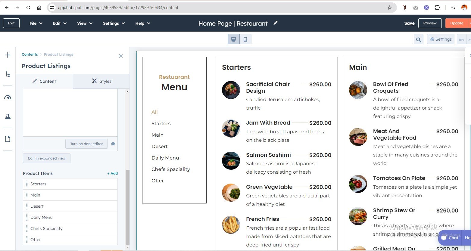

Image With Button
In your module click on Content Tab > left side > you can edit everything according to you
Custom ID | Class
Add Content
Card Repeater
-
Title Bg Image / Gradient Overlay
- Background Type : Background Image / Background Color
- Name & Description
- Client Detail Content
Also, you can edit custom colors in the style tab :
Background:
- Background Color
- background Image
Spacing
- Desktop, Tablet, and Mobile
Custom Style
- Card Border Radius
- Column Type
- Card Overlay


Content With Video Popup
In your module click on Content Tab > left side > you can edit everything according to you
Custom ID | Class
Heading Content
Video Popup (Show/Hide)
Video
- Video Choice : Embed Code / Video File
- Video File
Number And Sub Heading Rpeater
Also, you can edit custom colors in the style tab :
Background:
- Background Color
- background Image
Spacing
- Desktop, Tablet, and Mobile
Play Button Style
- Play Icon Color
- Background Color
Popup Overlay
- Background Overlay
Count | Style
- Counter | Number
- Counter | Text


Testimonial Slider
In your module click on Content Tab > left side > you can edit everything according to you
Custom ID | Class
Testimonial Repeater
- Heading
- Name
Also, you can edit custom colors in the style tab :
Background:
- Background Color
- background Image
Spacing
- Desktop, Tablet, and Mobile
Slider ON/OFF
Logo Slider Style
- Logo Slider Width (Choice) : Full Width / Container Width
- Slider Option For Desktop, Tablate, Mobile("We can handle all options of the slider. Do you want to show dots and arrows on desktop, tablet, and mobile, or not? All options are provided.")
- Dots Color
-
Arrow Style
- Background Color
- Icon Color
- slider Autoply Option Show/Hide
Symble Color


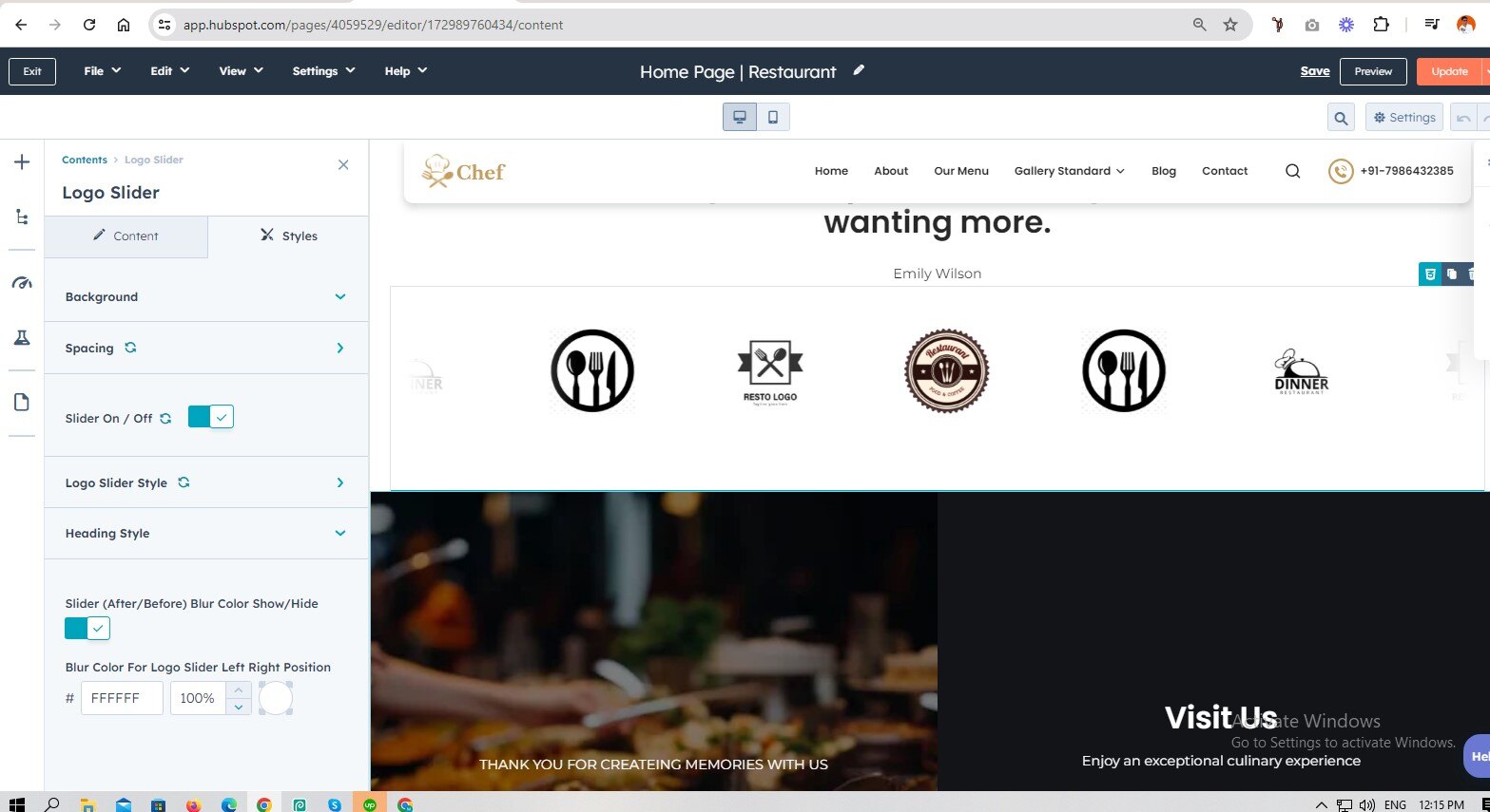
Logo Slider
In your module click on Content Tab > left side > you can edit everything according to you
Custom ID | Class
Heading content
Logo Slider (Repeater)
- Logo Image
- Logo Link
Also, you can edit custom colors in the style tab :
Background:
- Background Color
- background Image
Spacing
- Desktop, Tablet, and Mobile
Slider ON/OFF
Logo Slider Style
- Logo Slider Width (Choice) : Full Width / Container Width
- Slider Option For Desktop, Tablate, Mobile ("We can handle all options of the slider. Do you want to show dots and arrows on desktop, tablet, and mobile, or not? All options are provided.")
- Dots Color
-
Arrow Style
- Background Color
- Icon Color
- slider Autoply Option Show/Hide
Heading Style
- Content Max-Width
- Content Alignment Choice : Left, Center, Right
Slider (After/Before) Blur Color Show/Hide
Blur Color For Logo Slider Left Right Position


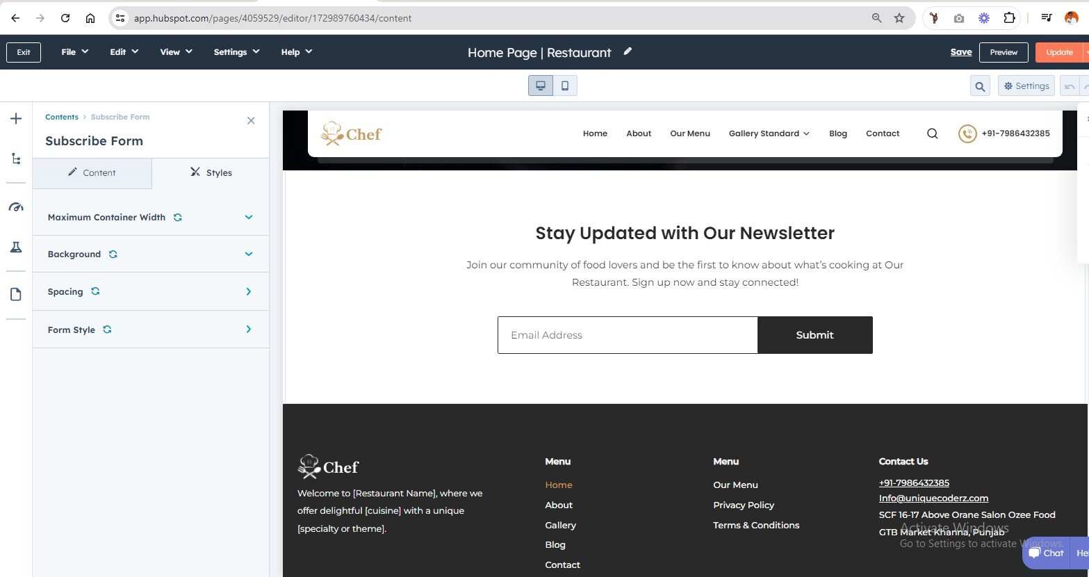
Subscribe Form
In your module click on Content Tab > left side > you can edit everything according to you
Custom ID | Class
Title / content
Subscriber Form Show/Hide
Form
- Choice Form
- Bottom Text
Also, you can edit custom colors in the style tab :
Background:
- Background Color
- background Image
Spacing
- Desktop, Tablet, and Mobile
Form Style
- Theme / Custom Style Choice
- Form Container Max-width

Custom Button
In your module click on Content Tab > left side > you can edit everything according to you
Custom ID | Class
Button Text
Button Option
- Use as link
- Add Icon
Style Option
Button Style
- Primary
- Secondary
- Simple
Button Size
- Regular
- Small
- Large
Desktop Position
- left, Center, Right
Mobile Position
- left, Center, Right
Also, you can edit custom colors in the style tab :
Background:
- Background Color
- background Image
Spacing
- Desktop, Tablet, and Mobile


Content Listing Image
In your module click on Content Tab > left side > you can edit everything according to you
Custom ID | Class
Title Heading
Order List
- Svg Icon / Image Choice
- Add Content
Button
- Button Type : Primary, Secondary, Simple
- Button Size : Large, Ragular, Small
- Link
Image1
Image2
Also, you can edit custom colors in the style tab :
Background:
- Background Color
- background Image
Spacing
- Desktop, Tablet, and Mobile
Section Layout Choice
- Image/Content
- Content/Image
Order List | Style
- Icon Color


Leadership Module
In your module click on Content Tab > left side > you can edit everything according to you
Custom ID | Class
Title / Description
Card Repeater
- Image (Team Members Profile Image)
- Title (Members Name / Profession)
- Social Icon (Hubspot Icon With Link)
-
Button
- Button Type : Primary, Secondary, Simple
- Button Size : Large, Ragular, Small
- Button Text
- Button Link
Also, you can edit custom colors in the style tab :
Background:
- Background Color
- background Image
Spacing
- Desktop, Tablet, and Mobile
Card Style
- Border Radius
- Background color
- Image Overlay
-
Social Icon
- Background Color
- Icon Color
-
Hover
- Background Color
- Icon Color
Slider ON/OFF
Slider Style
- slider Autoplay (Show/Hide)
- Infinite Option (Show/Hide)
- Speed
- Logo Slider Width (Choice) : Full Width / Container Width
- Slider Option For Desktop, Tablate, Mobile("We can handle all options of the slider. Do you want to show dots and arrows on desktop, tablet, and mobile, or not? All options are provided.")
-
Arrow Style
- Background Color
- Icon Color
-
Dots Style
- Background Color
- Icon Color


Icon Content Cards
In your module click on Content Tab > left side > you can edit everything according to you
Custom ID | Class
Heading / Description
Layout Choice
- Layout One
- Layout Two
Icon Content Cards (Repeater)
- Icon Image / Hubspot Icon
- Add Content
-
Button
- Button Type : Primary, Secondary, Simple
- Button Size : Large, Ragular, Small
- Button Text
- Button Link
Also, you can edit custom colors in the style tab :
Background:
- Background Color
- background Image
Spacing
- Desktop, Tablet, and Mobile
Block Alignment
- Large Screen Block Alignment Choice(Left, Center, Right)
- Medium Screen Block Alignment Choice(Left, Center, Right)
- Small Screen Block Alignment Choice(Left, Center, Right)
Card Style
- Hubspot Icon Color


Image Slider
In your module click on Content Tab > left side > you can edit everything according to you
Custom ID | Class
Heading content
Add Images (Repeater)
- Add Image
Also, you can edit custom colors in the style tab :
Background:
- Background Color
- background Image
Spacing
- Desktop, Tablet, and Mobile
Slider ON/OFF
Image Slider Style
- Image Slider Width (Choice) : Full Width / Container Width
- Slider Option For Desktop, Tablate, Mobile ("We can handle all options of the slider. Do you want to show dots and arrows on desktop, tablet, and mobile, or not? All options are provided.")
- Dots Color
- slider Autoply Option Show/Hide


Content Listing With Detail
In your module click on Content Tab > left side > you can edit everything according to you
Custom ID | Class
Title Heading
Items (Repeater)
- Title
- Price
- Description
Image1
Image2
Also, you can edit custom colors in the style tab :
Background:
- Background Color
- background Image
Spacing
- Desktop, Tablet, and Mobile
Section Layout Choice
- Image/Content
- Content/Image
Items | Style
- Icon Color


Image gallery
In your module click on Content Tab > left side > you can edit everything according to you
Custom ID | Class
Card Items (Repeater)
- Image
- Name (Food name)
- Text (Food Category Text)
Image1
Image2
Also, you can edit custom colors in the style tab :
Background:
- Background Color
- background Image
Spacing
- Desktop, Tablet, and Mobile
Csutom Styling
- Background Color
- Card Hover Overlay Color


Icon Content
In your module click on Content Tab > left side > you can edit everything according to you
Custom ID | Class
Heading / Description
Card Repeater
- Icon Image / Hubspot Icon
- Add Content
Also, you can edit custom colors in the style tab :
Background:
- Background Color
- Background Image
Spacing
- Desktop, Tablet, and Mobile
Card Style
- Hubspot Icon Color
- Card Content Alignment
- Column Border Color


Contact Us Form
In your module click on Content Tab > left side > you can edit everything according to you
Custom ID | Class
Form
- Heading
- Choose a Form
Also, you can edit custom colors in the style tab :
Background:
- Background Color
- Background Image
Spacing
- Desktop, Tablet, and Mobile


Blog Listing Banner
Also, you can edit custom colors in the style tab :
Listing Background:
- Background Color
- Background Image / Overlay color
Author Background:
- Background Color
- Background Image / Overlay color
Spacing
- Desktop, Tablet, and Mobile

Blog Listing Cards
In your module click on Content Tab > left side > you can edit everything according to you
Custom ID | Class
Tag Show/Hide
- Date
- Topics
- Author
- Post summary
Also, you can edit custom colors in the style tab :
Background:
- Background Color
- Background Image
Spacing
- Desktop, Tablet, and Mobile
Card Style
- Background Color
- Post Title Color
- Body Post Text Color
- DEscription Bottom Border Color
-
Date Style
- Background Color
- Text Color
-
Tag Style
- Background Color
- Text Color
-
Author Link Style
- Author Name Color
- Author Name Hover Color
Pagination Style
- Text Color
-
Active / Hover
- Background Color
- Text Color


Header Search Input
In your module click on Content Tab > left side > you can edit everything according to you
Label Text
Placeholder Text
Include Search Button Show/Hide
Result
- Use Custom Search Result Page
Search Result Include
- Website Pages
- Landing Pages
- Blog Post


Social Follow
In your module click on Content Tab > left side > you can edit everything according to you
Social Link (REpeater)
Show / Hide
- Show Social Media
- Hide Social Media

Related Blog Listing Card
In your module click on Content Tab > left side > you can edit everything according to you
Custom ID | Class
Heading / Content
Blog (Select Option)
Tag Show/Hide
- Date
- Topics
- Author
- Post summary
Also, you can edit custom colors in the style tab :
Background:
- Background Color
- Background Image
Spacing
- Desktop, Tablet, and Mobile
Card Style
- Background Color
- Post Title Color
- Body Post Text Color
- DEscription Bottom Border Color
-
Date Style
- Background Color
- Text Color
-
Tag Style
- Background Color
- Text Color
-
Author Link Style
- Author Name Color
- Author Name Hover Color
Pagination Style
- Text Color
-
Active / Hover
- Background Color
- Text Color


Header Mega Menu
In your module click on Content Tab > left side > you can edit everything according to you
Naviation Menu
-
Menu (Repeater)
- Menu Text
- Menu Link
-
Submenu Show/Hide
-
Submenu (Repeater)
- Sub Menu Tittle
- Menu Link
-
Submenu Show / Hide
-
Submenu
- Product Image Show / Hide
- Product Image
- Sub Menu Link
- Sub Menu Text
-
-


Link With Search Icon Menu
In your module click on Content Tab > left side > you can edit everything according to you
Search Icon Svg Code
Contact Number
- Conatct Icon
- Contact Text
- Add Link


Single Image
In your module click on Content Tab > left side > you can edit everything according to you
Image
ALSO, YOU CAN EDIT CUSTOM COLORS IN THE STYLE TAB :
Desktop Image Alignment (Choice)
- Left, Center, Right
Tablate Image Alignment (Choice)
- Left, Center, Right
Mobile Image Alignment (Choice)
- Left, Center, Right
Image Width Full Show / Hide

