

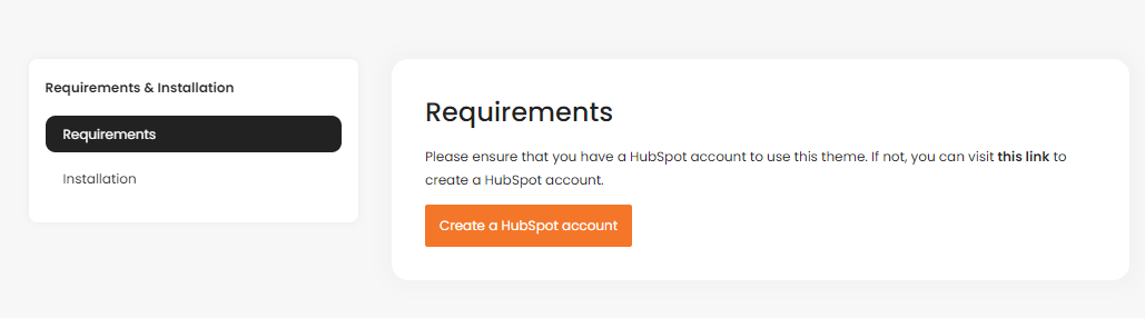
Up and Running Human Charity Theme
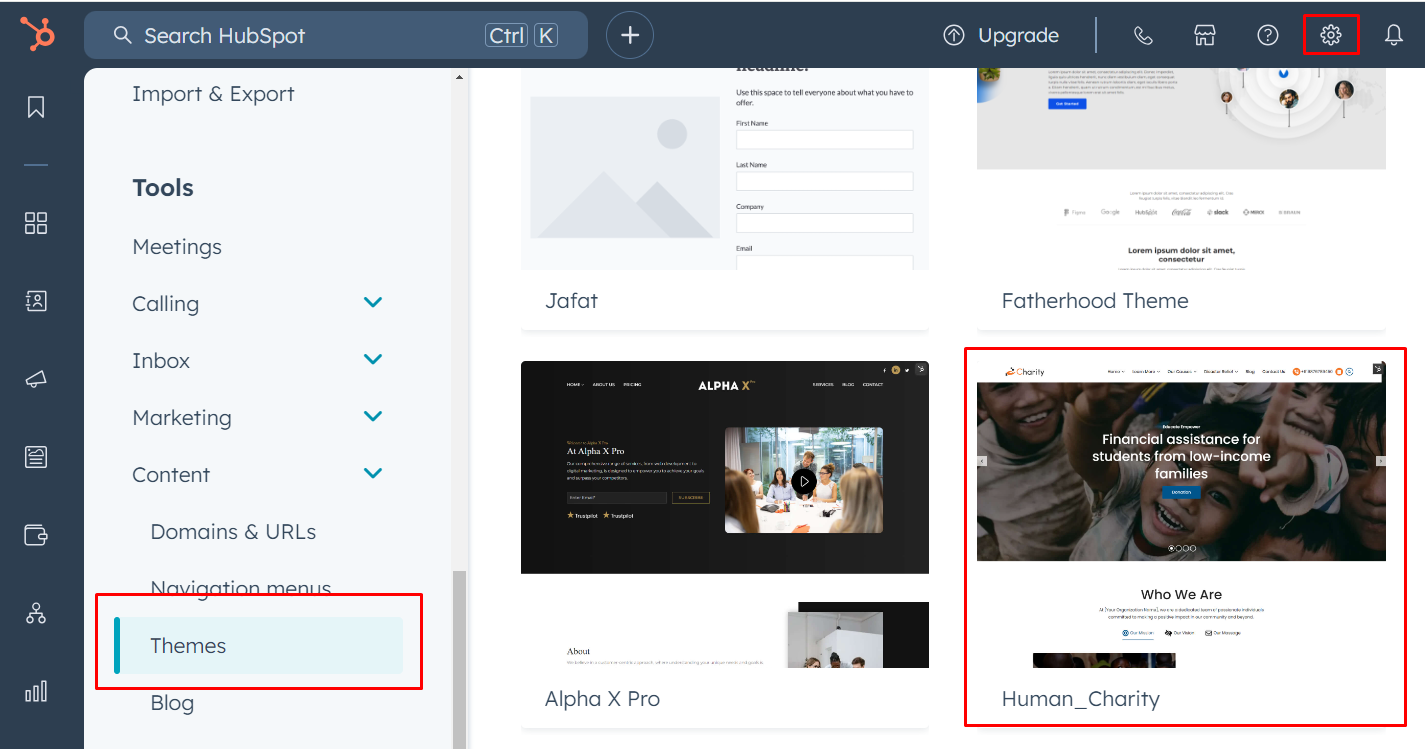
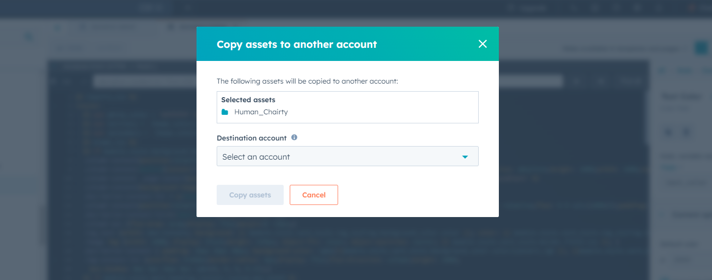
Copy to Different account
Select your Theme Folder then click right click then show some option
Select option = Copy to different account
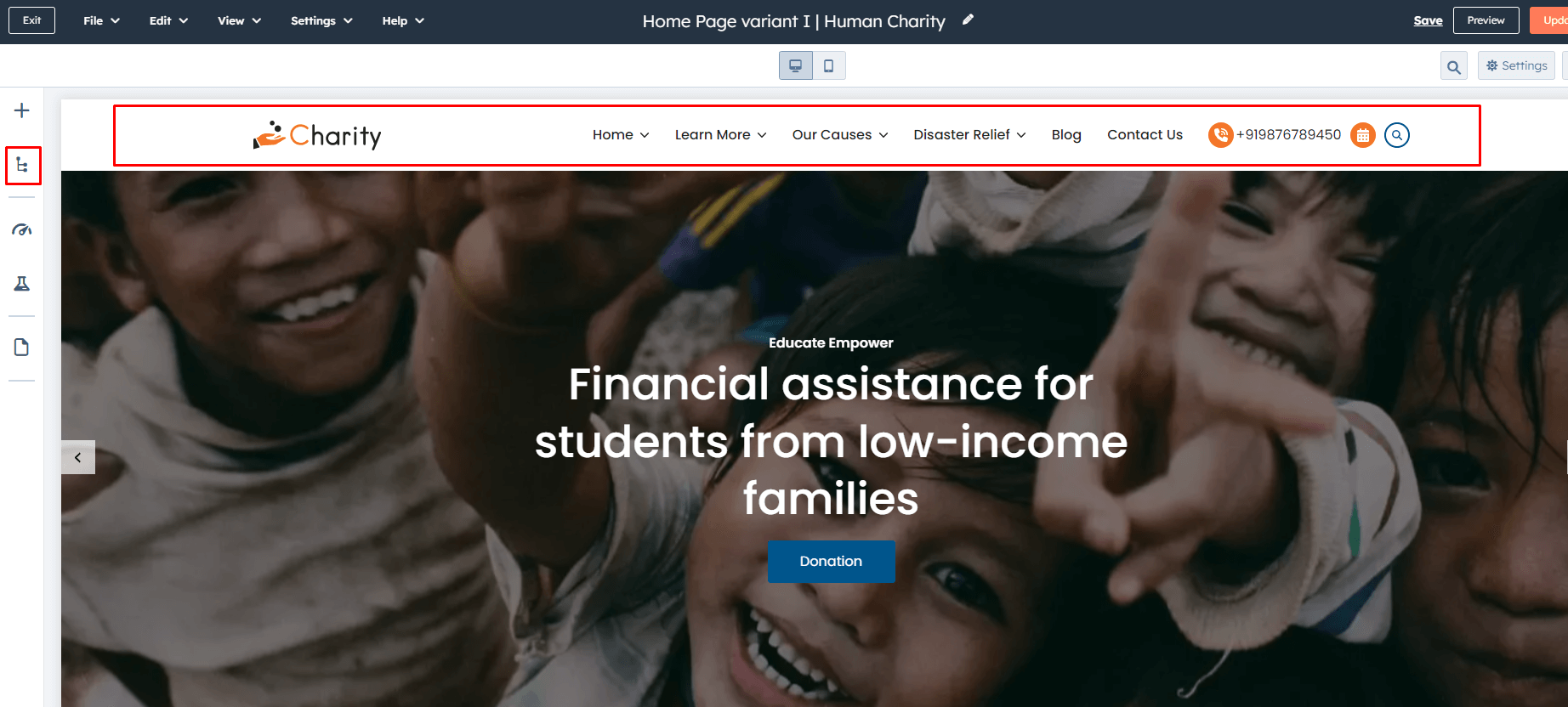
Global Header
To edit your header, you'll first need to create a page with a theme template. When a page is created then edit you page in the left side click Tab Contents. Then click Page header.
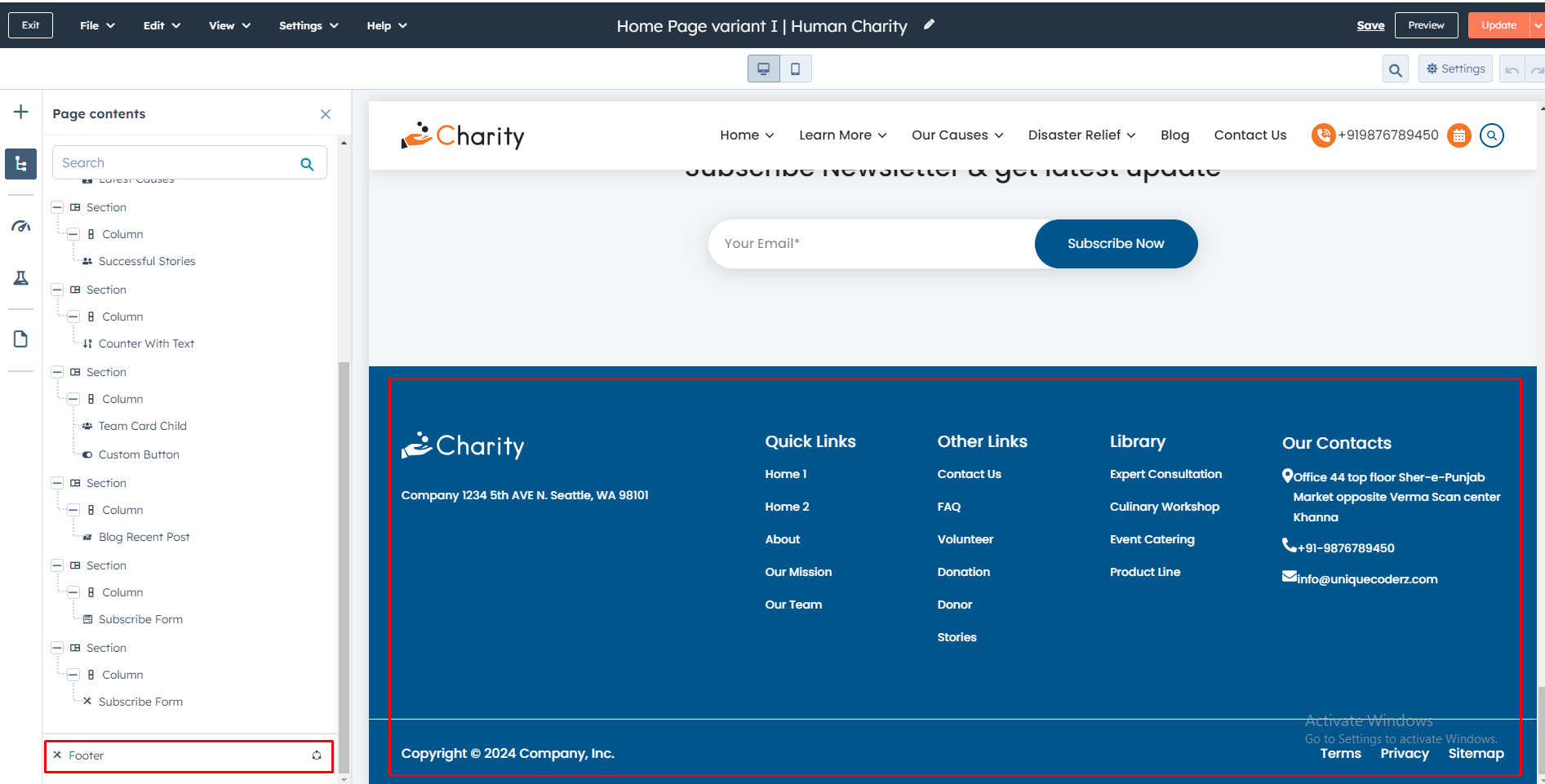
Global Footer
To edit your Footer, you'll first need to create a page with a theme template. When a page is created then edit you page in the left side click Tab Contents. Then click Page footer.
Pre-built Template
To edit your Footer, you'll first need to create a page with a theme template. When a page is created then edit you page in the left side click Tab Contents. Then click Page footer.
Internal Delivery
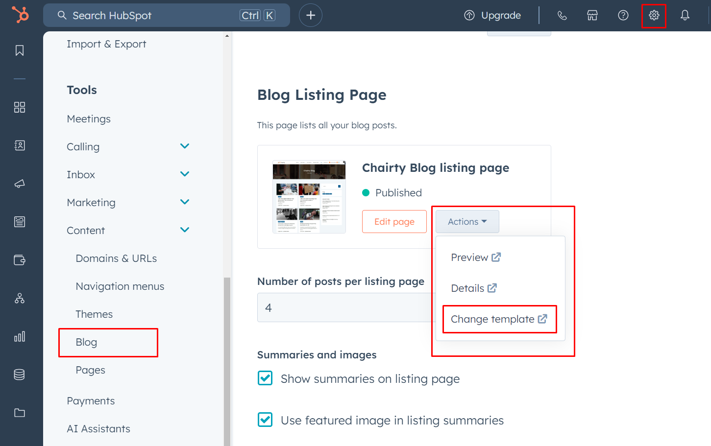
Manage customer blog template and settings
- In the customer HubSpot account, click the settings icon settings in the main navigation bar.
- In the left sidebar menu, navigate to Website > Blog.
- On the Templates tab, you can view or change the templates applied to your blog posts and blog listing page
- In the Blog post and Blog listing sections, click the Actions dropdown menu to manage your template
- Select Change template to choose a different template. On the template selection screen, select your new template, then click Done. In the bottom left of your template settings, click Save.
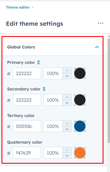
Global Colors
- Primary Color
- Secondary color
- Tertiary color
- Quaternary color
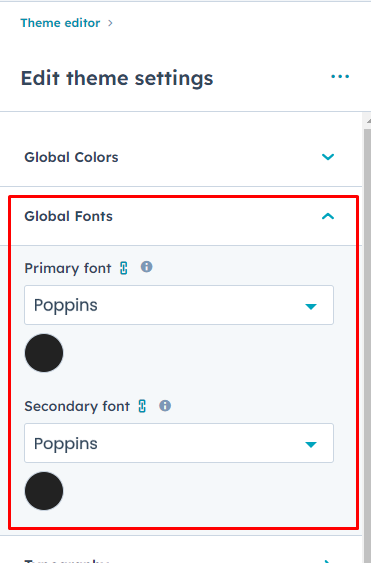
Global Fonts
- Primary font
- Secondary font
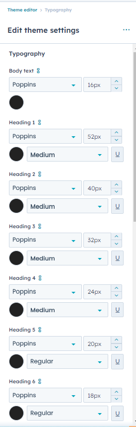
Typography
- Body text
(H1 > H6)
- Font style
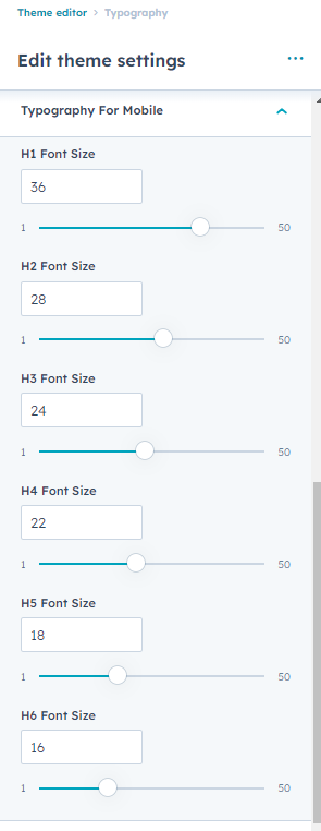
Typography For Mobile(Headings (H1 > H6)
- Font Size
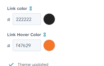
Links
- Link
- Link hover color
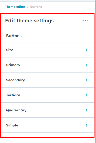
Buttons
Buttons Size
-
Small
- Font size
- Vertical Spacing
- Horizontal Spacing
-
Regular
- Font size
- Vertical Spacing
- Horizontal Spacing
-
Large
- Font size
- Vertical Spacing
- Horizontal Spacing
Primary Button
- Google Font Style
- Text Transform
- Background Color
-
Border
- Style
- Width
- Color
- Corner Radius
-
Hover
- color
- Background Color
-
Border
- Style
- Width
- Color
Secondary
- Google Font
- Text Transform
- Background Color
-
Border
- Style
- Width
- Color
- Corner Radius
-
Hover
- color
- Background Color
-
Border
- Style
- Width
- Color
Tertiary
- Google Font
- Text Transform
- Background Color
-
Border
- Style
- Width
- Color
- Corner Radius
-
Hover
- color
- Background Color
-
Border
- Style
- Width
- Color
Quaternary
- Google Font
- Text Transform
- Background Color
-
Border
- Style
- Width
- Color
- Corner Radius
-
Hover
- color
- Background Color
-
Border
- Style
- Width
- Color
Simple
- Google Font
- Text Transform
-
Underline
- Add underline
- Width
- Color
-
Hover
- Font Color
-
Underline
- Add underline
- Width
- Color
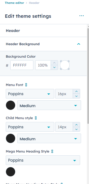
Header
Header Background
- Background Color
-
Menu Font Style
- Font
- Font Size
- Font Weight
-
Child Menu Style
- Font
- Font Size
- Font Weight
-
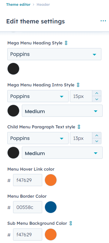
Mega Menu Heading Style
- Font
-
Mega Menu Heading Intro Style
- Font
- Font Size
- Font Wight
Child Menu Paragraph Text Style
- Font
- font size
- Font weight
Menu Hover Link Color
Menu Border Color
Sub Menu Background Color
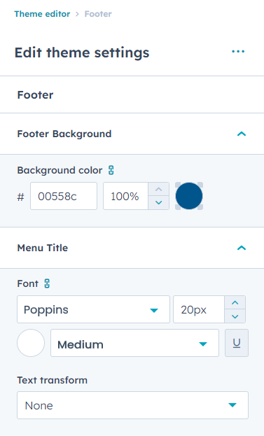
Footer
Footer Background
- Background Color
Menu Title
- Font Style
- Text Transform
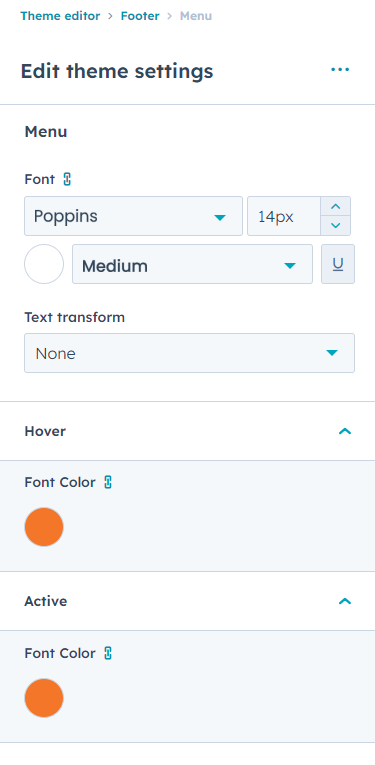
Menu
- Font Style
- Text Transform
Hover
- Font Color
Active
- Font Color
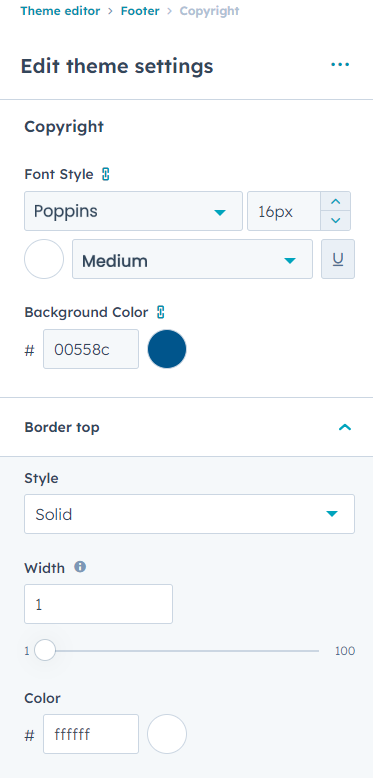
Copyright
- Font Style
- Background Color
-
Border
- Style
- Width
- Color
Form
-
Title
- Background Color
- Font Style
- Text Transform
-
Padding
- Top / Bottom
- Left / Right
-
Border
- Style
- Corner Radius
Labels
- Font Style
- Background Color
-
Padding
- Top/Bottom
- Left/Right
Fields
- Background Color
- Placeholder Color
- Font Style
- Box Shadow Color
-
Field Hover
- Placeholder color
- Box Shadow Color
-
Field Active
- Placeholder color
- Box Shadow Color
-
Field Focus
- Placeholder color
- Box Shadow Color
-
Padding
- Top/Bottom
- Left/Right
-
Border
- Style
- Width
- Color
- Corner Radius
-
Checkbox/radio
- Font Style
-
Error Message Style
- Font Style
- Background Color
-
Error Message Border Style
- Width
- Color
-
GDPR Text
- Font Style
-
Rich Text
- Font Style
Help Text
- Font Style
Form Background Color
- Color
Form Border
- Style
- Width
- Color
- Corner Radius
Form padding
- Top/Bottom
- Left/Right
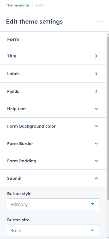
Submit
-
Button Style
- Primary
- Secondary
- Tertiary
- Quaternary
- Simple
-
Button Size
- Small
- Regular
- Large
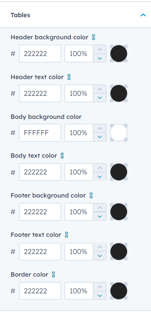
Table
- Header background color
- Header text color
- Body background color
- Body text color
- Footer background color
- Footer text color
- Border color
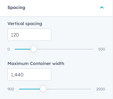
Spacing
- Vertical Spacing
- Maximum Container width
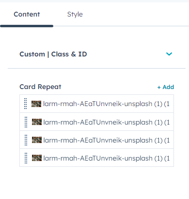
Banner Slider Zooming
In your module click on Content Tab > left side > you can edit everything according to you
Custom | Class & ID
Card Repeat(Repeater)
- Background Image
- Title / Description
-
Button Edit
- Button Edit
-
Button type(Choice)
- Primary
- Secondary
- Tertiary
- Quaternary
-
Button Size
- Small
- Regular
- Large
- Button Text
- Link
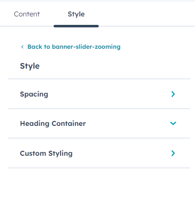
Also, you can edit in the style tab :
Spacing
- Desktop, Tablet, and Mobile
Heading Container
- Max-Width(Add custom max-width)
- Block Alignment(choice / Left, Right, Center)
- Text alignment(Left, center, right, Justify)
Custom Styling(Group)
- Slider Bg Image Overlay Color
-
Slider Style
- Slider Autoplay
- Autoplay Speed
-
Desktop
- Dot Show / Hide
- Arrow Show / Hide
-
Tablet
- Dot Show / Hide
- Arrow Show / Hide
-
Mobile
- Dot Show / Hide
- Arrow Show / Hide
-
Dots Styling
- Color
-
Arrow Styling
- Icon Color
- Background Color
- Icon Hover Color
- Background Hover Color
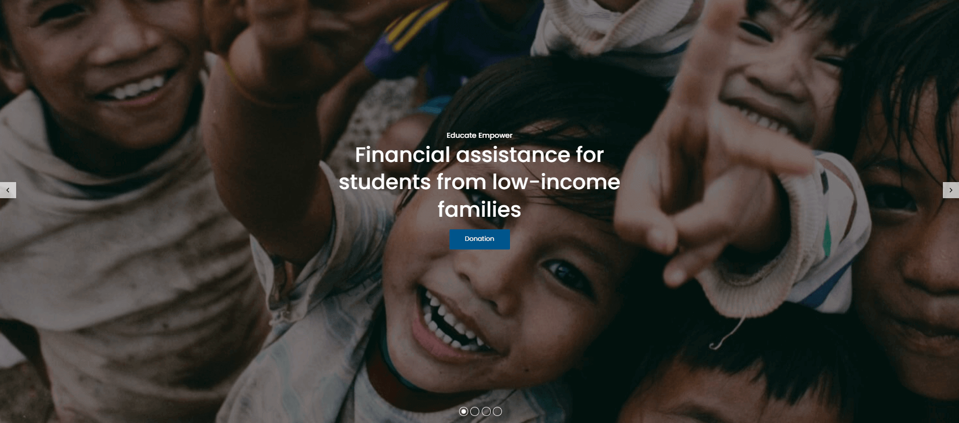
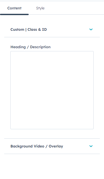
Banner With Background Video Option
In your module click on Content Tab > left side > you can edit everything according to you
Custom | Class & ID
Heading / Description
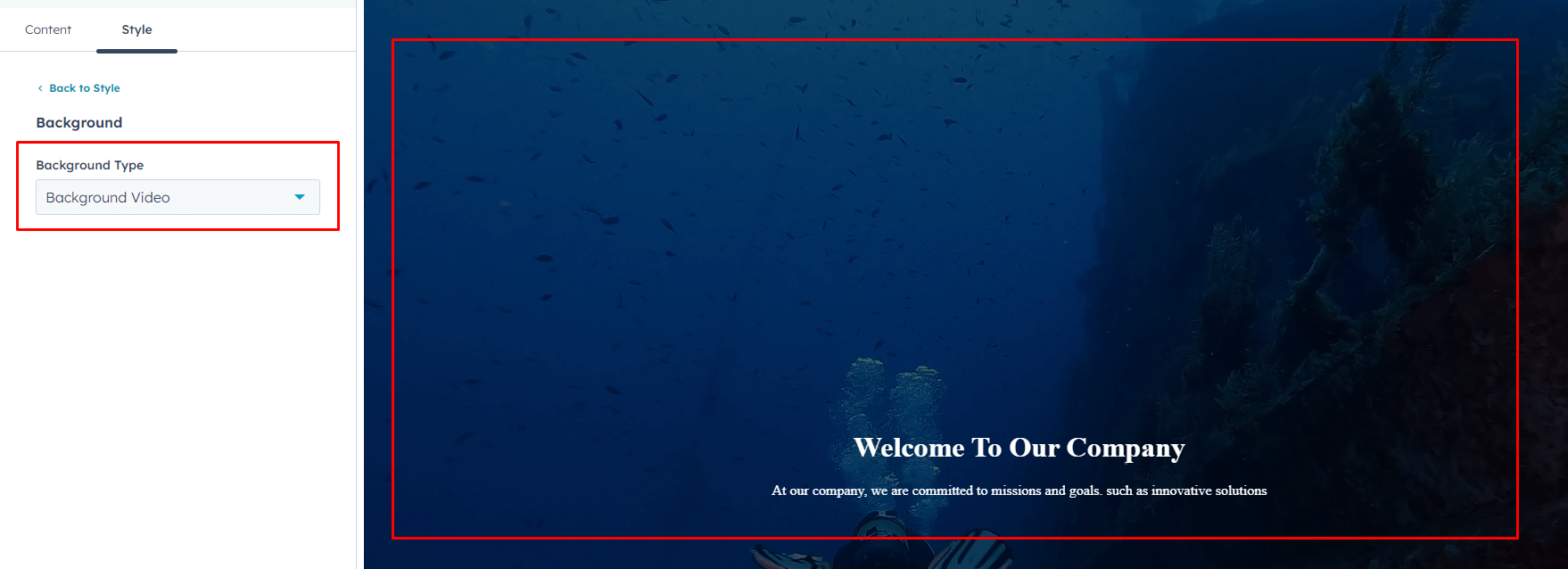
Background Video / Overlay( In the "Background Type" choice field, you can select an Background Video, and the Background Video / Overlay field will be displayed.)
- Background Video
- Overlay
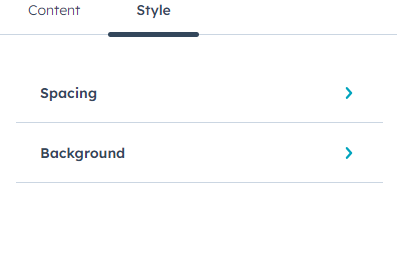
Also, you can edit in the style tab :
Spacing
- Desktop, Tablet, and Mobile
Background
- Background Type(Choice)
-
Background Image(In the "Background Type" choice field, you can select an Background Image, and the background image field will be displayed.)
- Background image
- Overlay
- Background Gradient(In the "Background Type" choice field, you can select an Background Gradient, and the Background Gradient field will be displayed.)
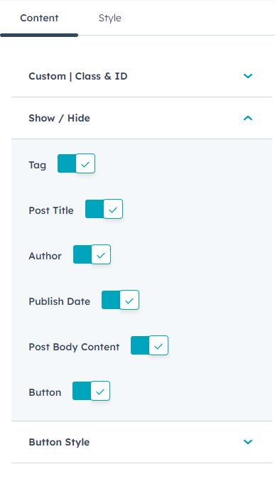
Blog Listing
In your module click on Content Tab > left side > you can edit everything according to you
Custom | Class & ID
Show / Hide
- Tag
- Post Title
- Author
- Publish Date
- Post Body Content
- Button
Button Style ( Above the show/hide option, When the button field is toggled on, the Button Style option will be displayed.)
-
Button Type(Choice)
- Primary
- Secondary
- Simple
- Tertiary
- Quaternary
-
Button Size(Choice)
- Small
- Regular
- Large
- Text
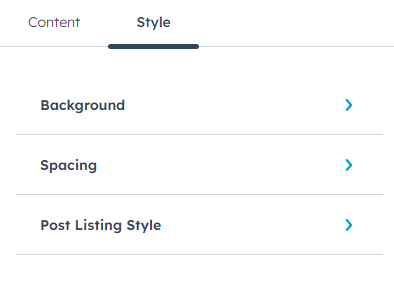
Also, you can edit in the style tab :
Spacing
- Desktop, Tablet, and Mobile
Background
- Background Type(Choice)
-
Background Image (In the "Background Type" choice field, you can select an Background Image, and the background image field will be displayed.)
- Background image
- Overlay
- Background Gradient (In the "Background Type" choice field, you can select an Background Gradient, and the Background Gradient field will be displayed.)
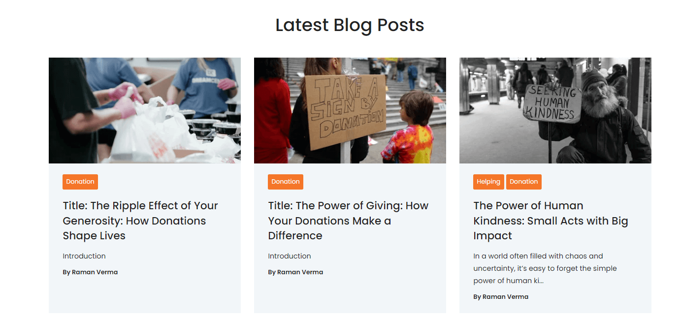
Post Listing Style
- Background Color
-
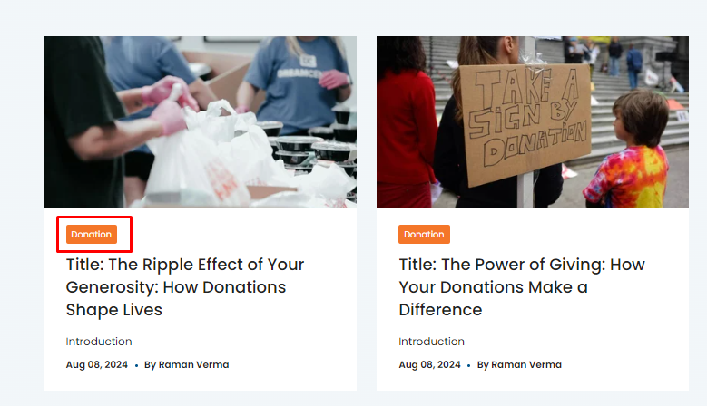
Tag Style
- Style Choice(Theme, Custom)
-
Tag Custom Style (If the "Style Choice" field is set to "Custom," the "Tag Custom Style" field will be displayed.)
- Background Color
- Text Color
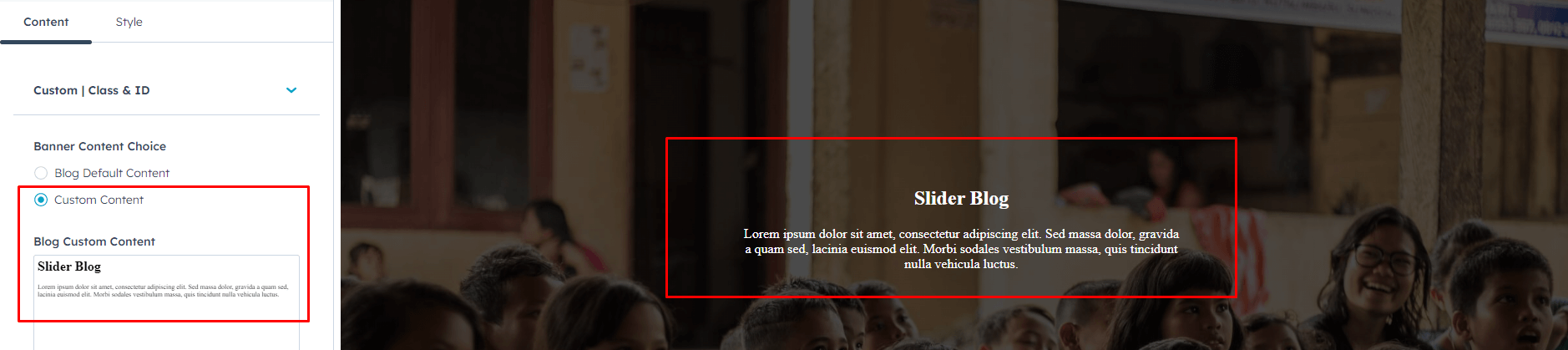
Blog Listing Banner
In your module click on Content Tab > left side > you can edit everything according to you
Custom | Class & ID
Banner Content Choice (Blog Default Content / Custom Content)
- Blog Custom Content(If the "Banner Content Choice" above is set to "Custom Content," the "Blog Custom Content" field will be displayed.)
Also, you can edit in the style tab :
Spacing
- Desktop, Tablet, and Mobile
Background
- Background Type(Choice)
-
Background Image (In the "Background Type" choice field, you can select an Background Image, and the background image field will be displayed.)
- Background image
- Overlay
- Background Gradient (In the "Background Type" choice field, you can select an Background Gradient, and the Background Gradient field will be displayed.)
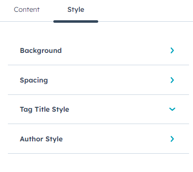
Tag Title Style(Tag Banner Content Style)
- Color
Author Style (Author Page Banner Style)
- Text Color
- Border Color
-
Social Icon style
- Background Color
- Icon Color
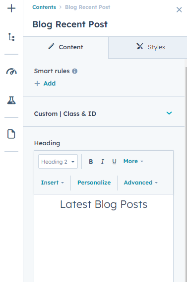
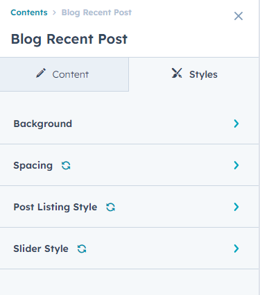
Blog Recent Post
In your module click on Content Tab > left side > you can edit everything according to you
Custom | Class & ID
Heading
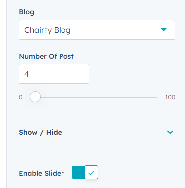
Blog(select blog)
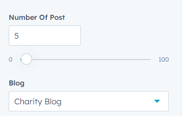
Number Of Post
-
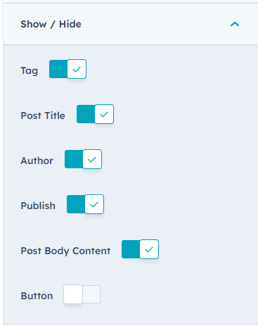
Show / Hide
- Tag
- Post Title
- Author
- Publish Date
- Post Body Content
- Button
Button Style ( Above the show/hide option, When the button field is toggled on, the Button Style option will be displayed.)
-
Button Type(Choice)
- Primary
- Secondary
- Simple
- Tertiary
- Quaternary
-
Button Size(Choice)
- Small
- Regular
- Large
- Text
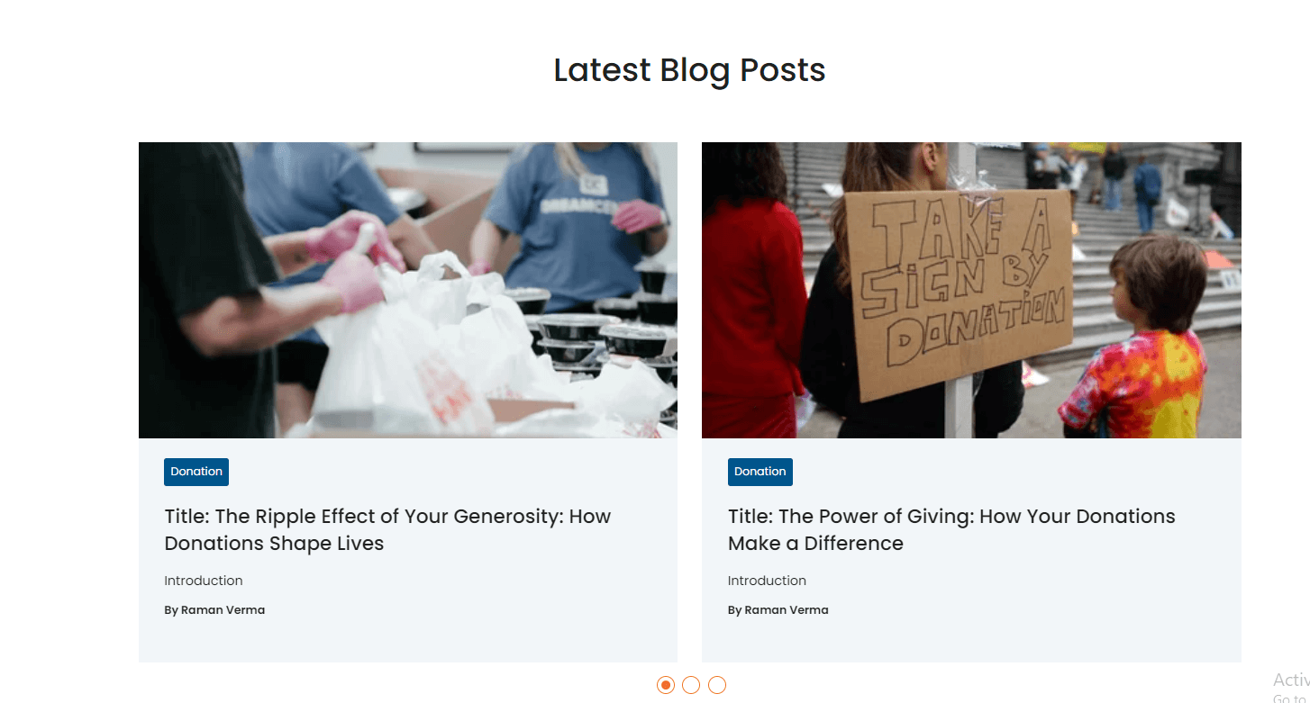
Enable Slider(Slider Enable / Disable option)
Also, you can edit in the style tab :
Spacing
- Desktop, Tablet, and Mobile
Background
- Background Type(Choice)
-
Background Image (In the "Background Type" choice field, you can select an Background Image, and the background image field will be displayed.)
- Background image
- Overlay
- Background Gradient (In the "Background Type" choice field, you can select an Background Gradient, and the Background Gradient field will be displayed.)
Post Listing Style
- Background Color
-
Tag Style
- Background Color
- Text Color
Slider Style(If the slider is enabled, the "Slider Style" field will be displayed in the Style tab.)
- Autoplay
- Speed
-
Desktop
- Dots
- Arrows
- Slides To Show
- Slides To Scroll
-
Tablet
- Dots
- Arrows
- Slides To Show
- Slides To Scroll
-
Mobile
- Dots
- Arrows
- Slides To Show
- Slides To Scroll
-
Dots Styling
- Color
-
Arrow Styling
- Icon Color
- Backgound Color
-
Hover
- Icon Color
- Backgound Color
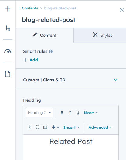
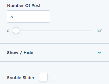
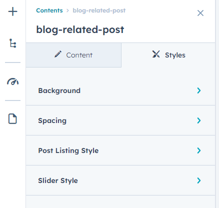
Blog Related Post
In your module click on Content Tab > left side > you can edit everything according to you
Custom | Class & ID
Heading
Number Of Post
-
Show / Hide
- Tag
- Post Title
- Author
- Publish Date
- Post Body Content
- Button
Button Style ( Above the show/hide option, When the button field is toggled on, the Button Style option will be displayed.)
-
Button Type(Choice)
- Primary
- Secondary
- Simple
- Tertiary
- Quaternary
-
Button Size(Choice)
- Small
- Regular
- Large
- Text
Enable Slider(Slider Enable / Disable option)
Also, you can edit in the style tab :
Spacing
- Desktop, Tablet, and Mobile
Background
- Background Type(Choice)
-
Background Image (In the "Background Type" choice field, you can select an Background Image, and the background image field will be displayed.)
- Background image
- Overlay
- Background Gradient (In the "Background Type" choice field, you can select an Background Gradient, and the Background Gradient field will be displayed.)
Post Listing Style
- Background Color
-
Tag Style
- Background Color
- Text Color
Slider Style(If the slider is enabled, the "Slider Style" field will be displayed in the Style tab.)
- Autoplay
- Speed
-
Desktop
- Dots
- Arrows
- Slides To Show
- Slides To Scroll
-
Tablet
- Dots
- Arrows
- Slides To Show
- Slides To Scroll
-
Mobile
- Dots
- Arrows
- Slides To Show
- Slides To Scroll
-
Dots Styling
- Color
-
Arrow Styling
- Icon Color
- Backgound Color
-
Hover
- Icon Color
- Backgound Color

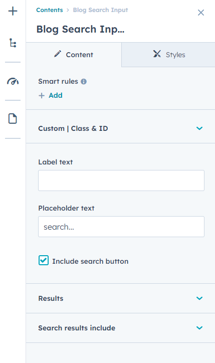
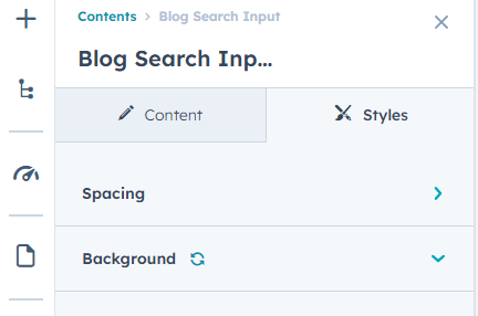
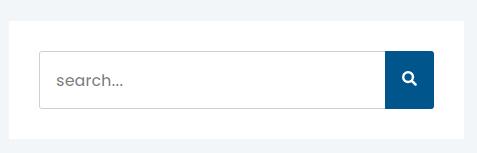
Blog Search Input
In your module click on Content Tab > left side > you can edit everything according to you
Custom | Class & ID
Label text
Placeholder text
Include search button
Results
- Use custom search results page
- Search results page
Search results include
- Website pages
- Landing pages
- Blog posts
- Knowledge articles
Also, you can edit in the style tab :
Spacing
- Desktop, Tablet, and Mobile
Background
- Background Color
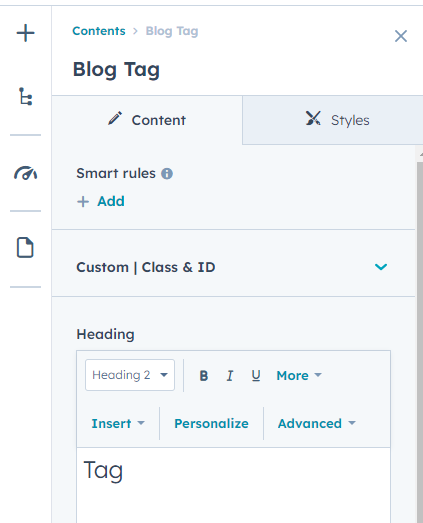
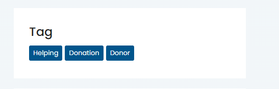
Blog Tag
In your module click on Content Tab > left side > you can edit everything according to you
Custom | Class & ID
Heading
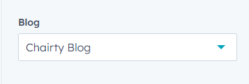
Blog(select blog)
Enable Slider(Slider Enable / Disable option)
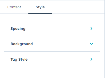
Also, you can edit in the style tab :
Spacing
- Desktop, Tablet, and Mobile
Background
- Background Color
Tag Style
- Style Choice(Theme / Custom)
-
Custom Style ( If the "Style Choice" field is set to "Custom," the "Tag Custom Style" field will be displayed )
- Background Color
- Text Color
-
Hover
- Background Color
- Text Color
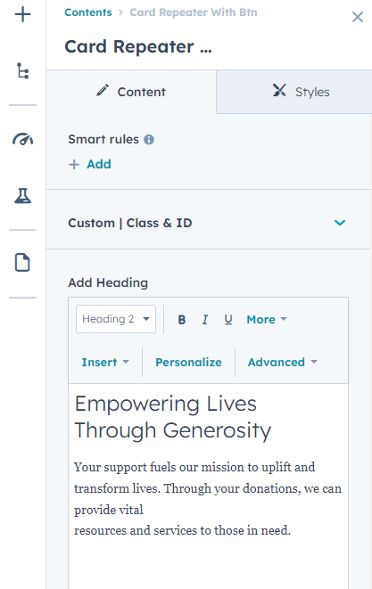
Card Repeater With Btn
In your module click on Content Tab > left side > you can edit everything according to you
Custom | Class & ID
Add Heading
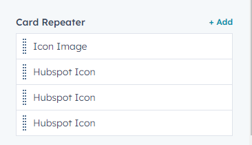
Card Repeater(Repater)
- Icon Image / Hubspot Icon(Choice)
- Hubspot Icon
- Icon Image
- Add Content
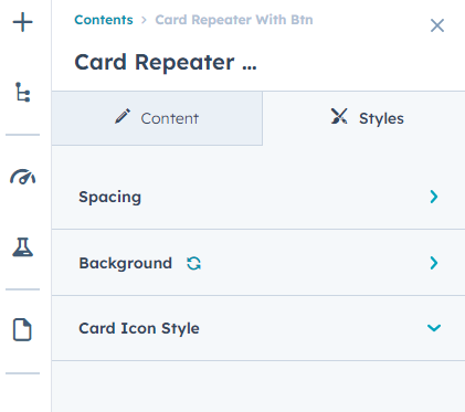
Also, you can edit in the style tab :
Spacing
- Desktop, Tablet, and Mobile
Background
- Background Type(Choice)
-
Background Image (In the "Background Type" choice field, you can select an Background Image, and the background image field will be displayed.)
- Background image
- Overlay
- Background Gradient (In the "Background Type" choice field, you can select an Background Gradient, and the Background Gradient field will be displayed.)
Card Icon Style
- Background Color
- Icon Color(If the "Card Repeater" has an "Icon Image / HubSpot Icon" choice, and the HubSpot Icon is selected, this field will be used.)
.png?width=1511&height=706&name=Screenshot_7%20(1).png)
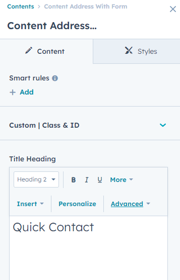
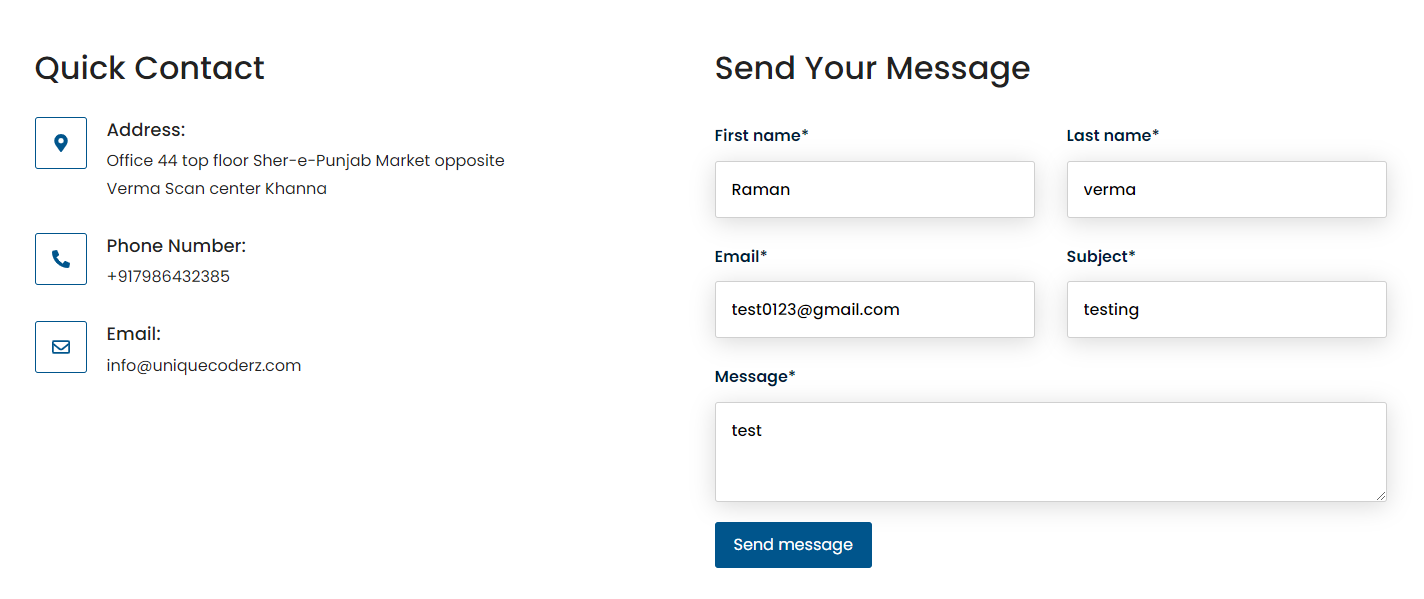
Content Address With Form
In your module click on Content Tab > left side > you can edit everything according to you
Custom | Class & ID
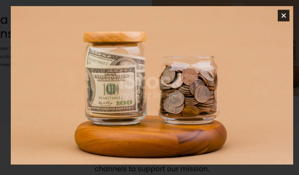
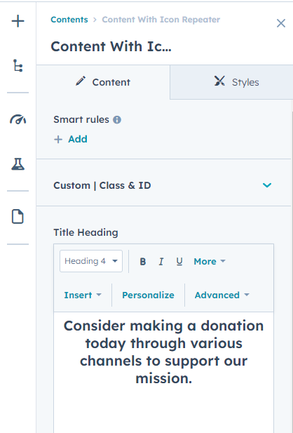
Title Heading
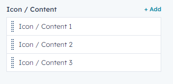
Icon / Content(Repeater)
- Add Icon
- Add Content
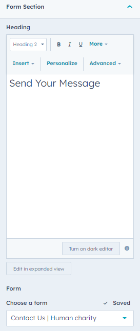
Form Section
- Heading
- Form
Also, you can edit in the style tab :
Spacing
- Desktop, Tablet, and Mobile
Background
- Background Type(Choice)
-
Background Image (In the "Background Type" choice field, you can select an Background Image, and the background image field will be displayed.)
- Background image
- Overlay
- Background Gradient (In the "Background Type" choice field, you can select an Background Gradient, and the Background Gradient field will be displayed.)
Icon Style
- Border Color
- Background Color
- Icon Color
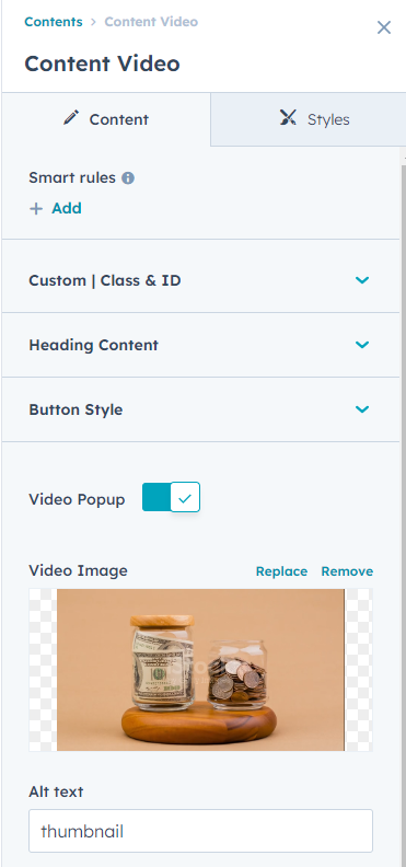
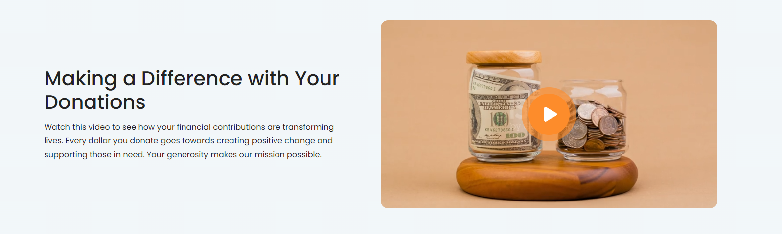
Content Video
In your module click on Content Tab > left side > you can edit everything according to you
Custom | Class & ID
Heading Content
- Content
Button Style
-
Button Type(Choice)
- Primary
- Secondary
- Simple
- Tertiary
- Quaternary
-
Button Size(Choice)
- Small
- Regular
- Large
- Text
- Link
Video Popup( If the Video Popup field is enabled, the "Popup Custom Style" option will be displayed in the Style tab. )
Video Image
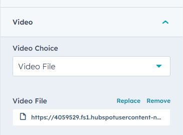
Video
- Video Choice(Embed Code, Video File)
- Video File
- Embed Code
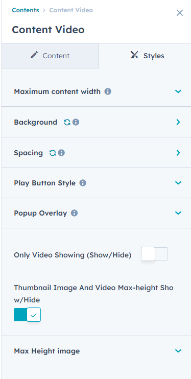
Also, you can edit in the style tab :
Spacing
- Desktop, Tablet, and Mobile
Background
- Background Type(Choice)
-
Background Image (In the "Background Type" choice field, you can select an Background Image, and the background image field will be displayed.)
- Background image
- Overlay
- Background Gradient (In the "Background Type" choice field, you can select an Background Gradient, and the Background Gradient field will be displayed.)
Maximum content width
- Show / Hide
- Max-Width
Play Button Style
- Play Icon Color
- Background Color
Popup Custom Style (If the Video Popup field is enabled, the "Popup Custom Style" option will be displayed.)
- Popup Background Overlay
-
Cross Icon
- Background Color
- Icon Color
Only Video Showing (Show/Hide)
Thumbnail Image And Video Max-height Show/Hide
Max Height image
- Thumbnail Image Max-Height
Content With Icon Repeater
In your module click on Content Tab > left side > you can edit everything according to you
Custom | Class & ID
Title Heading
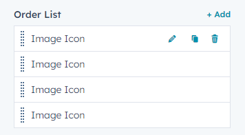
Order List(Repeater)
- Svg Icon / Img Choice (Hubspot Icon, Image Icon, Svg Code)
- Hubspot Icon
- Icon SVG Code
- Icon Image
- Add Content
Also, you can edit in the style tab :
Spacing
- Desktop, Tablet, and Mobile
Background
- Background Type(Choice)
-
Background Image (In the "Background Type" choice field, you can select an Background Image, and the background image field will be displayed.)
- Background image
- Overlay
- Background Gradient (In the "Background Type" choice field, you can select an Background Gradient, and the Background Gradient field will be displayed.)
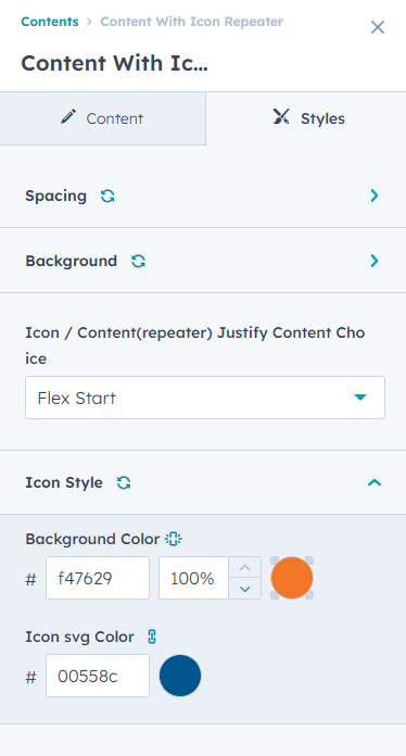
Icon / Content(repeater) Justify Content Choice
- Center
- Flex Start
- Flex End
- Space Between
- Space Around
- Space Evenly
Icon Style
- Background Color
- Icon svg Color
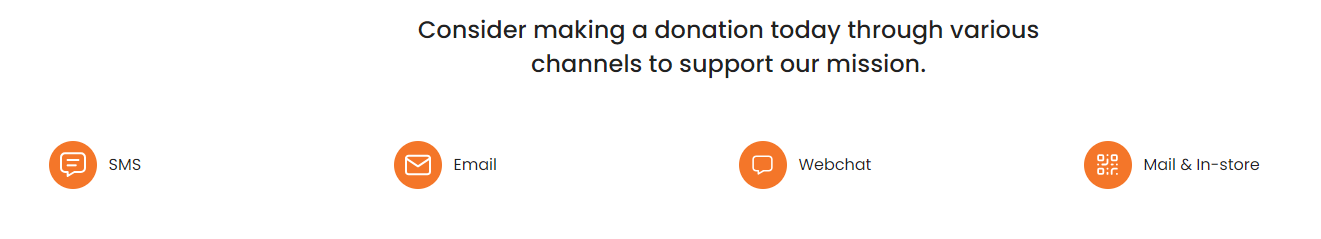
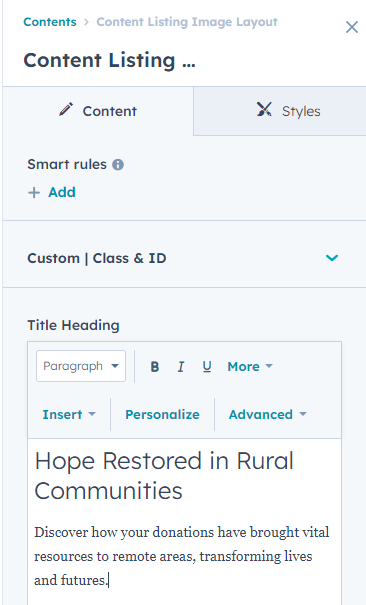
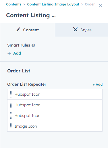
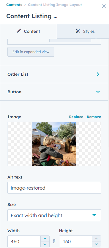
Content Listing Image Layout
In your module click on Content Tab > left side > you can edit everything according to you
Custom | Class & ID
Title Heading
Order List
-
Order List Repeater
- Svg Icon / Img Choice (Hubspot Icon,Image Icon)
- Hubspot Icon
- Icon SVG Code
- Icon Image
- Add Content
Button
-
Button Type(Choice)
- Primary
- Secondary
- Tertiary
- Quaternary
- Simple
-
Button Size(Choice)
- Small
- Regular
- Large
- Text
- Link
Also, you can edit in the style tab :
Spacing
- Desktop, Tablet, and Mobile
Background
- Background Type(Choice)
-
Background Image (In the "Background Type" choice field, you can select an Background Image, and the background image field will be displayed.)
- Background image
- Overlay
- Background Gradient (In the "Background Type" choice field, you can select an Background Gradient, and the Background Gradient field will be displayed.)
Img / Content Direction Choice(Img/Content, Content/ Img)
Hubspot Icon Color( In the "Order List Repeater" SVG Icon/Img selection field, you can choose a HubSpot icon, and the color specified in the HubSpot Icon Color field will be applied.)

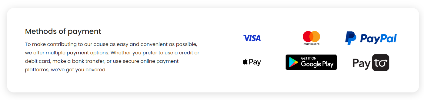
Content With Multi Logo
In your module click on Content Tab > left side > you can edit everything according to you
Custom | Class & ID
Heading / Content
- Add Content
Button
-
Button Type(Choice)
- Primary
- Secondary
- Tertiary
- Quaternary
- Simple
-
Button Size(Choice)
- Small
- Regular
- Large
- Text
- Link
Logo / Link (Repeater)
- Image
- Link
Also, you can edit in the style tab :
Spacing
- Desktop, Tablet, and Mobile
Background
- Background Type(Choice)
-
Background Image (In the "Background Type" choice field, you can select an Background Image, and the background image field will be displayed.)
- Background image
- Overlay
- Background Gradient (In the "Background Type" choice field, you can select an Background Gradient, and the Background Gradient field will be displayed.)
Section Inner Spacing
- Desktop, Tablet, and Mobile
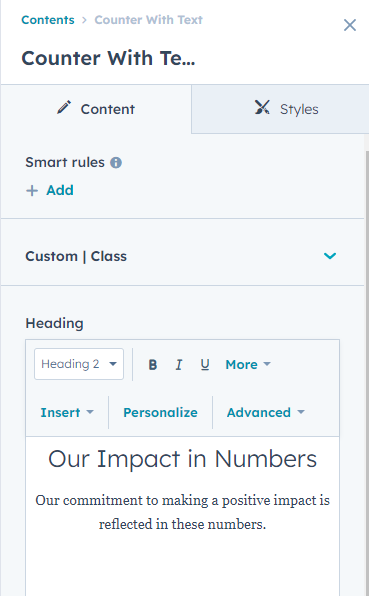
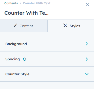
Counter With Text
In your module click on Content Tab > left side > you can edit everything according to you
Custom | Class
Heading
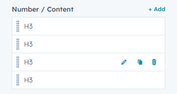
Number / Content(Repeater)
- Number Tag Choice
- Number
- Symbol
- Text
- Background Color
Also, you can edit in the style tab :
Spacing
- Desktop, Tablet, and Mobile
Background
- Background Type(Choice)
-
Background Image (In the "Background Type" choice field, you can select an Background Image, and the background image field will be displayed.)
- Background image
- Overlay
- Background Gradient (In the "Background Type" choice field, you can select an Background Gradient, and the Background Gradient field will be displayed.)
Counter Style
- Number Color
- Symbol Text Color
- Text Color
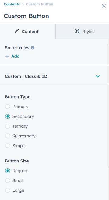
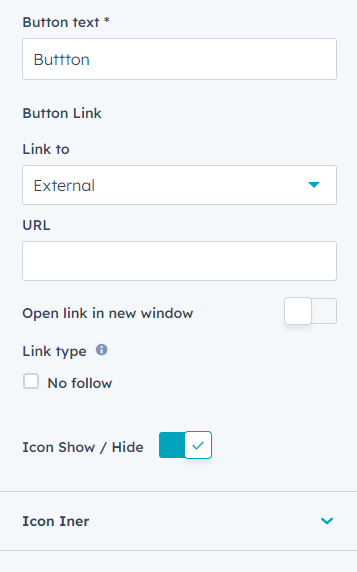
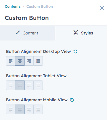
Custom Button
In your module click on Content Tab > left side > you can edit everything according to you
Custom | Class & ID
Heading
Button Type(Choice)
- Primary
- Secondary
- Tertiary
- Quaternary
- Simple
Button Size(Choice)
- Small
- Regular
- Large
- Button text
- Button Link
Icon Show / Hide(If the Icon Show/Hide option is enabled, the Icon inner fields will be displayed. )
Icon Iner
- Icon Type(Hubspot Icon, Svg Icon)
- Icon
- Svg Icon
Also, you can edit in the style tab :
Button Alignment Desktop View
- Left align, Center align, Right align, Justify
Button Alignment Tablet View
- Left align, Center align, Right align, Justify
Button Alignment Mobile View
- Left align, Center align, Right align, Justify

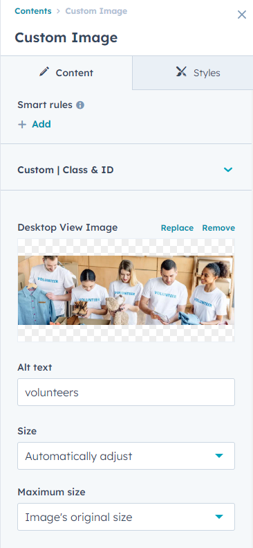
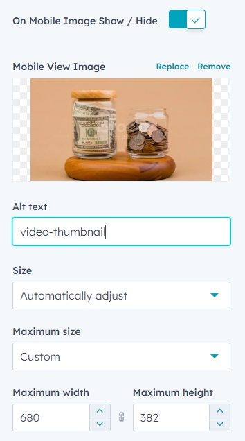
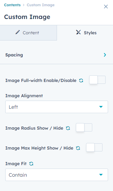
Custom Image
In your module click on Content Tab > left side > you can edit everything according to you
Custom | Class & ID
Desktop View Image
On Mobile Image Show / Hide(If the Mobile Image Show/Hide option is enabled , the Mobile View Image field will be displayed.)
Mobile View Image
Also, you can edit in the style tab :
Spacing
- Desktop, Tablet, and Mobile
Image Full-width Enable/Disable (If the Image Full-width option is enabled, the image will be set to 100% width.)
Image alignment (If the Image Full-width option is disabled, the Image Alignment field will be displayed.)
- Right, Center, Left
Image Radius Show / Hide(If the Image Radius Show/Hide option is enabled , the Add Border Radius field will be displayed.)
- Add Border Radius
Image Max Height Show / Hide(If the Image Max Height Show/Hide option is enabled , the Max Height field will be displayed.)
- Max Height
Image Fit(choice)
- Cover, Contain

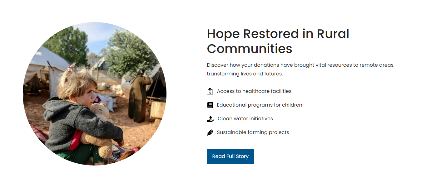
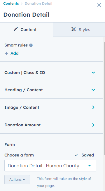
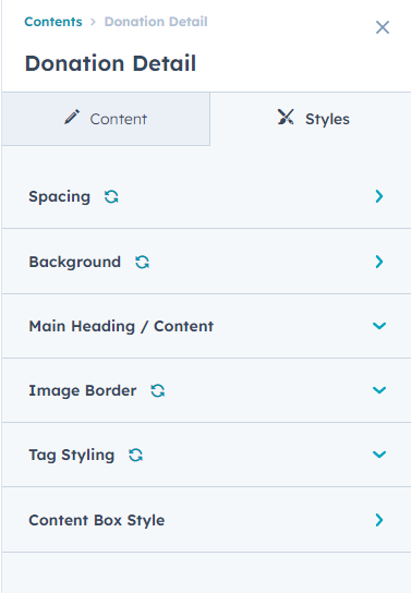
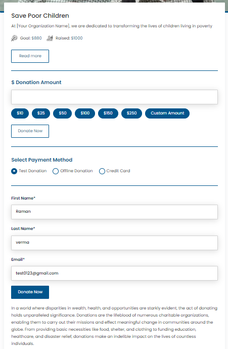
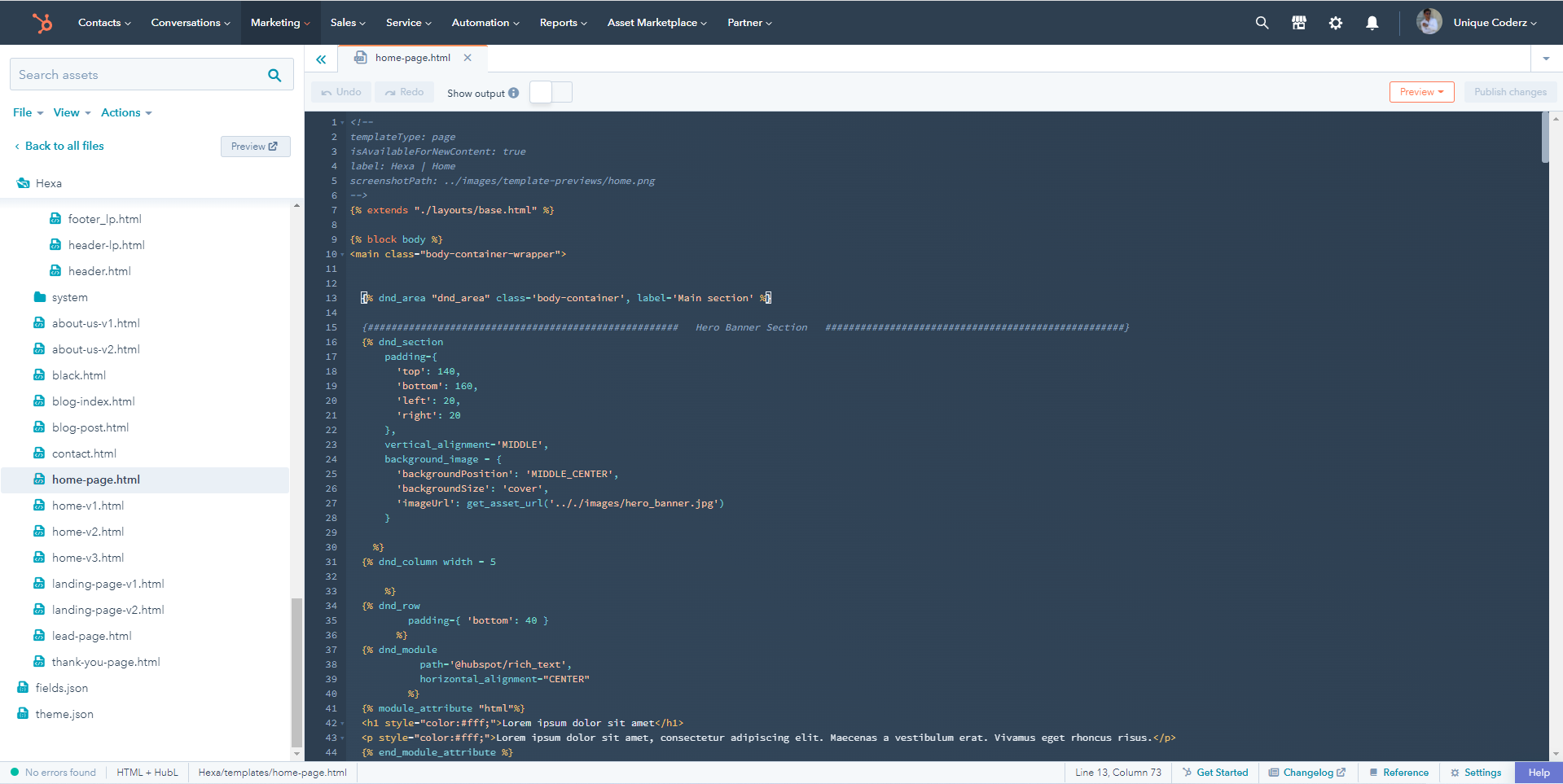
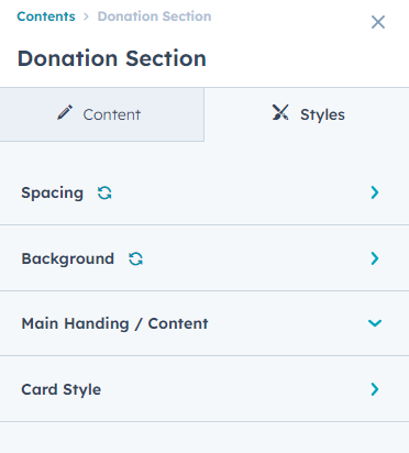
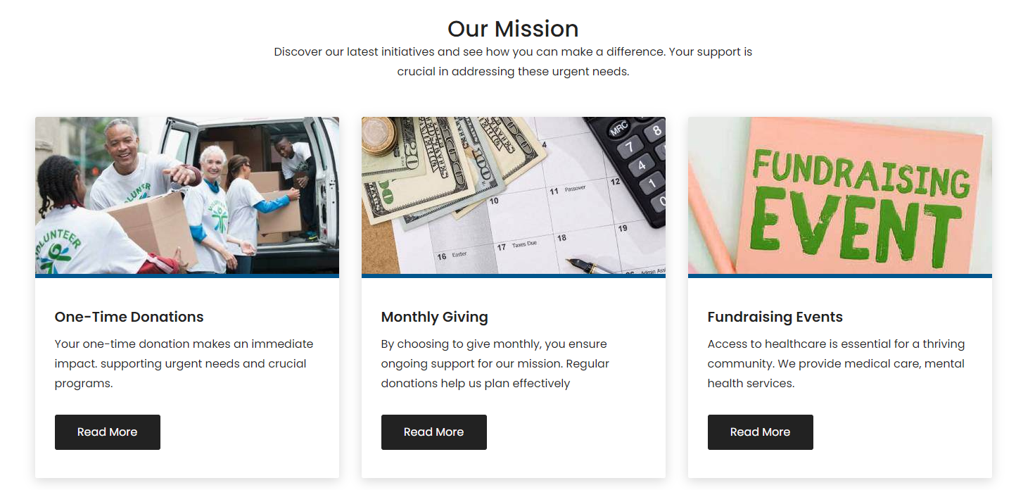
Donation Detail
In your module click on Content Tab > left side > you can edit everything according to you
Custom | Class & ID
Heading / Content
- Add Content
Image / Content
-
Content Column(Repeater)
- Tag Text
- Feature Image
- Description
-
Campaign Information(Repeater)
- Icon Choice(SVG, Image)
- Icon Image
- Svg Icon Code
- Add Label
- Add Value
-
Button Edit
-
Button Type(Choice)
- Primary
- Secondary
- Tertiary
- Quaternary
- Simple
-
Button Size(Choice)
- Small
- Regular
- Large
- Button Link
- Button Text
-
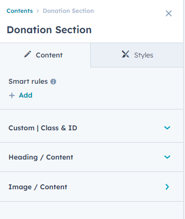
Also, you can edit in the style tab :
Spacing
- Desktop, Tablet, and Mobile
Background
- Background Type(Choice)
-
Background Image (In the "Background Type" choice field, you can select an Background Image, and the background image field will be displayed.)
- Background image
- Overlay
- Background Gradient (In the "Background Type" choice field, you can select an Background Gradient, and the Background Gradient field will be displayed.)
Main Heading / Content
- Custom Max-Width( if the custom max-width option is enabled, the Main Heading Max-width field will be displayed.)
- Main Heading Max-width
Tag Styling
- Background Color
- Text Color
Content Box Style
- Add Inner Border Color
- Background Color
Donation Listing
In your module click on Content Tab > left side > you can edit everything according to you
Custom | Class & ID
Heading / Content
- Add Content
Image / Content
-
Content Column(Repeater)
- Tag Text
- Feature Image
- Description
-
Campaign Information(Repeater)
- Icon Choice(SVG, Image)
- Icon Image
- Svg Icon Code
- Add Label
- Add Value
-
Button Edit
-
Button Type(Choice)
- Primary
- Secondary
- Tertiary
- Quaternary
- Simple
-
Button Size(Choice)
- Small
- Regular
- Large
- Button Link
- Button Text
-
Also, you can edit in the style tab :
Spacing
- Desktop, Tablet, and Mobile
Background
- Background Type(Choice)
-
Background Image (In the "Background Type" choice field, you can select an Background Image, and the background image field will be displayed.)
- Background image
- Overlay
- Background Gradient (In the "Background Type" choice field, you can select an Background Gradient, and the Background Gradient field will be displayed.)
Main Heading / Content
- Custom Max-Width( if the custom max-width option is enabled, the Main Heading Max-width field will be displayed.)
- Main Heading Max-width
Card Style
- Background Color
- Image Border
-
Tag Styling
- Background Color
- Text Color
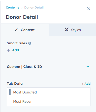
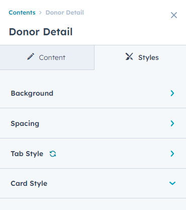
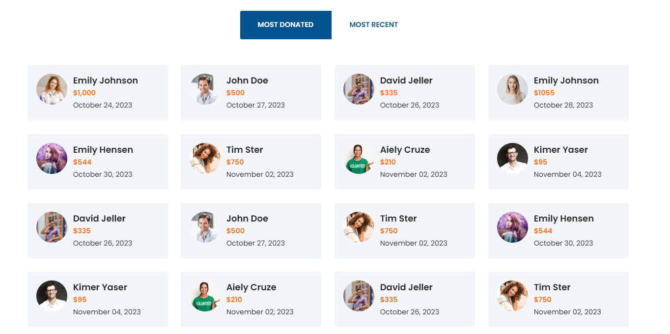
Donor Detail
In your module click on Content Tab > left side > you can edit everything according to you
Custom | Class & ID
Tab Data(Repeater)
-
Tab Name
- Text
-
Tab Content(Repeater)
- Image
- Donor Name
- Amount
- Date
Also, you can edit in the style tab :
Spacing
- Desktop, Tablet, and Mobile
Background
- Background Type(Choice)
-
Background Image (In the "Background Type" choice field, you can select an Background Image, and the background image field will be displayed.)
- Background image
- Overlay
- Background Gradient (In the "Background Type" choice field, you can select an Background Gradient, and the Background Gradient field will be displayed.)
Tab Style
-
Tab
- Background Color
- Text Color
- Right Border Color
-
Active / Hover
- Background Color
- Text Color
Card Style
- Background Color
- Amount Text Color
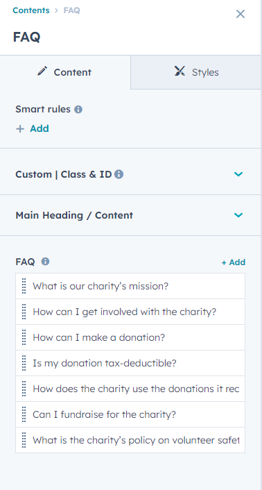
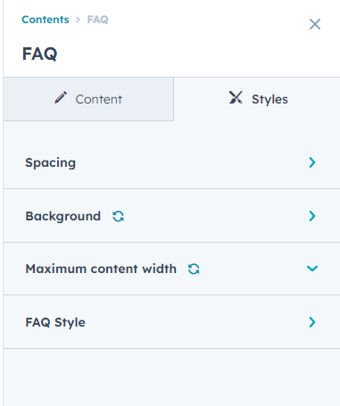
FAQ
In your module click on Content Tab > left side > you can edit everything according to you
Custom | Class & ID
Main Heading / Content
- Add Content
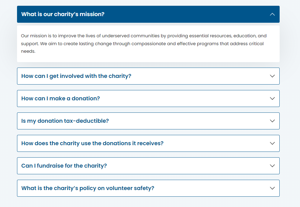
FAQ(Repeater)
- Question
- Answer
Also, you can edit in the style tab :
Spacing
- Desktop, Tablet, and Mobile
Background
- Background Type(Choice)
-
Background Image (In the "Background Type" choice field, you can select an Background Image, and the background image field will be displayed.)
- Background image
- Overlay
- Background Gradient (In the "Background Type" choice field, you can select an Background Gradient, and the Background Gradient field will be displayed.)
Maximum content width
- Show / Hide (If the Show/Hide option is enabled, the Max-Width and Padding Left Right fields will be displayed.)
- Max-Width
- Padding Left Right
FAQ Style
-
Question Style
- Background Color
-
Answer Style
- Background Color
-
Border
- Border Width
- Border Color
- Question Border Radius
- Answer Box Border Radius
-
Arrow Icon Color
- Icon Color
-
Hover / Active
- Background Color
- Question Text Color
- Arrow Icon Color
- Border Color
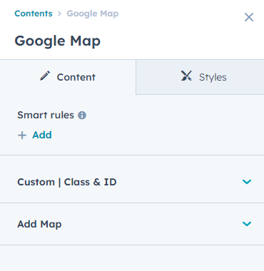
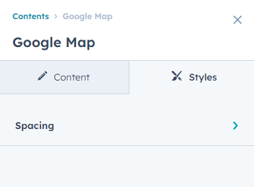
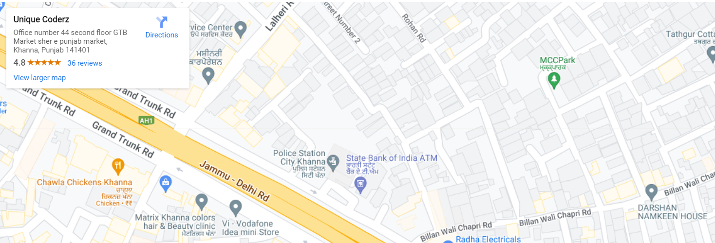
Google Map
In your module click on Content Tab > left side > you can edit everything according to you
Custom | Class & ID
Add Map
- Google Map Iframe
Also, you can edit in the style tab :
Spacing
- Desktop, Tablet, and Mobile
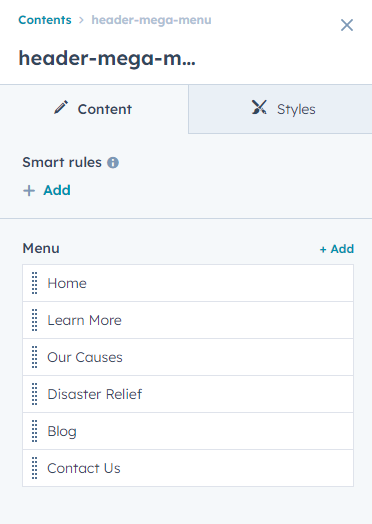
Header Mega Menu
In your module click on Content Tab > left side > you can edit everything according to you
Menu(Repeater)
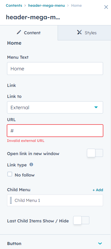
- Menu Text
- Link
-
Child Menu(Repeater)
- Top Heading
- Heading
-
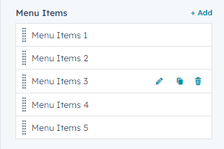
Menu Items (Repeater)
- Icon Choice
- Icon Image
- Svg Code
- Menu Content
- Link Show/Hide
- Add Link
- Last Child Items Show / Hide
-
Last Child Items
- Layout Choice(Featured Content 1,Featured Content 2,Featured Content 3)
-
Feature Content 1
- Add Image
-
Icon & Text (Repeater)
- Icon Choice(Svg Code, Image)
- Icon Image
- Add Content
-
Button Edit
-
Button Type(Choice)
- Primary
- Secondary
- Tertiary
- Quaternary
- Simple
-
Button Size(Choice)
- Small
- Regular
- Large
- Button Text
- Link
-
-
Feature Content 2
- Add Content
-
Feature Content 3
- Link Text
- Add Link
-
Button
-
Button Type(Choice)
- Primary
- Secondary
- Tertiary
- Quaternary
- Simple
-
Button Size(Choice)
- Small
- Regular
- Large
- Button Text
- Button Link
-
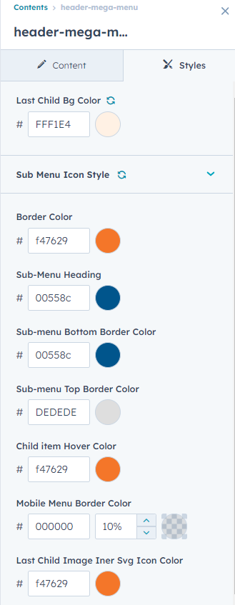
Also, you can edit in the style tab :
Last Child Bg Color
Sub Menu Icon Style
- SVG Icon Color
- SVG Background Color
Border Color
Sub-Menu Heading
Sub-menu Bottom Border Color
Sub-menu Top Border Color
Child item Hover Color
Mobile Menu Border Color
Last Child Image Iner Svg Icon Color
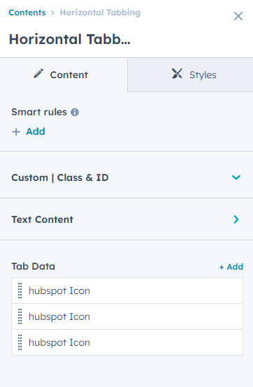
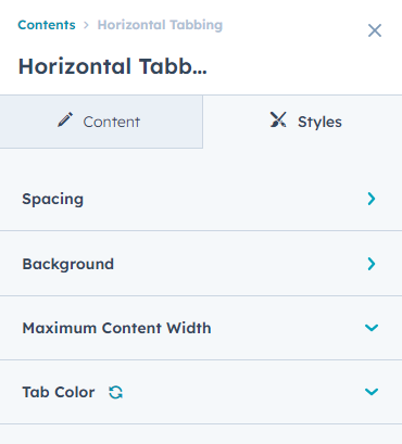
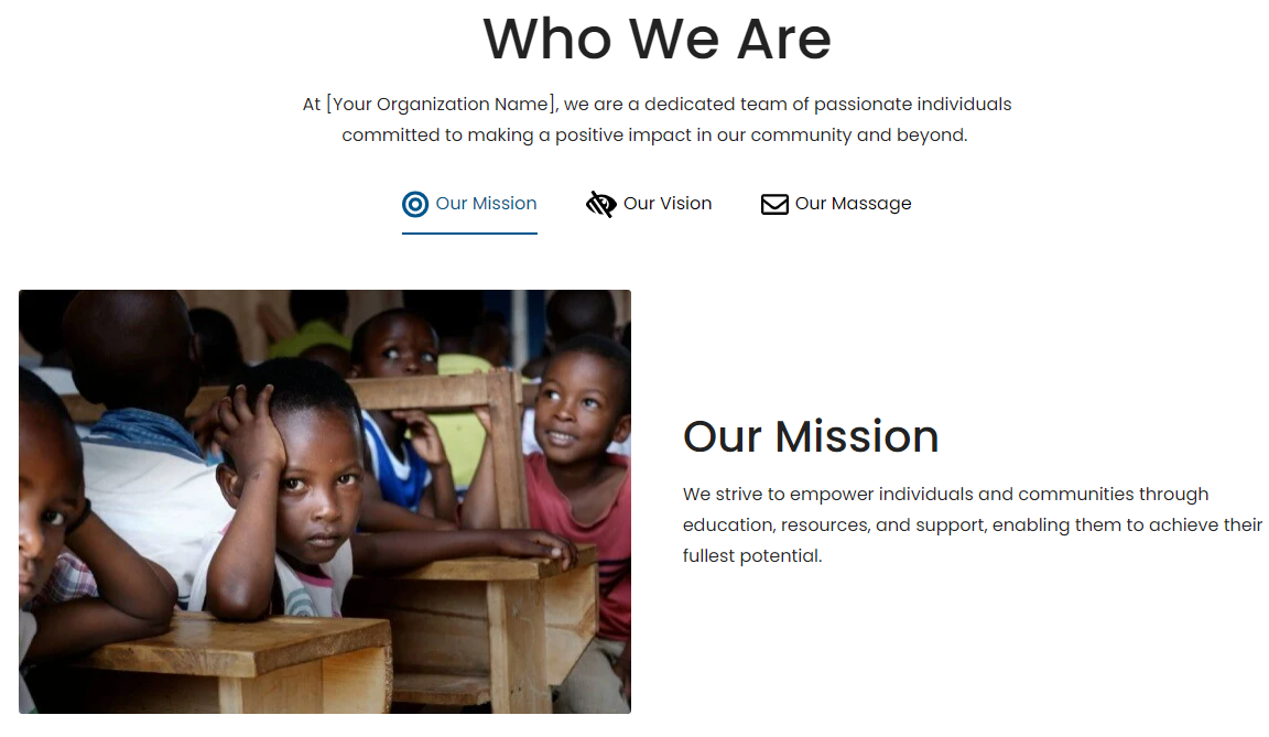
Horizontal Tabbing
In your module click on Content Tab > left side > you can edit everything according to you
Custom | Class & ID
Text Content
-
Tag
- Text
- Color
- Backround Color
- Heading
Tab Data
-
Tab Name(Repeater)
-
Tab Name
-
Icon / Image(Image,Hubspot Icon,Svg Code choice)
- Image
- Icon
- Svg Code
- Tab Name
-
-
Tab Content
- Description
- Image
-
- Image / Content Direction Choice(Image / Content , Content / Image)
Also, you can edit in the style tab :
Spacing
- Desktop, Tablet, and Mobile
Background
- Background Type(Choice)
-
Background Image (In the "Background Type" choice field, you can select an Background Image, and the background image field will be displayed.)
- Background image
- Overlay
- Background Gradient (In the "Background Type" choice field, you can select an Background Gradient, and the Background Gradient field will be displayed.)
Maximum content width
- Show / Hide (If the Show/Hide option is enabled, the Max-Width and Padding Left Right fields will be displayed.)
- Max-Width
- Padding Left Right
Tab Color
- Tab Text & Icon
- Tab Text & Icon | Active - Hover
- Tab Underline Color
- Tab Underline Color | Active - Hover
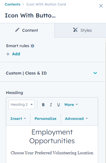
Icon With Button Card
In your module click on Content Tab > left side > you can edit everything according to you
Custom | Class & ID
Heading
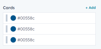
Cards(Repeater)
- Background Color
- Image
- Content
-
Button Edit
-
Button Type(choice)
- Primary
- Secondary
- Tertiary
- Quaternary
- Simple
-
Button Size(Choice)
- Small
- Regular
- Large
- Button Link
- Button Text
-
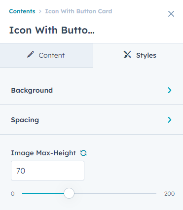
Also, you can edit in the style tab :
Spacing
- Desktop, Tablet, and Mobile
Background
- Background Type(Choice)
-
Background Image (In the "Background Type" choice field, you can select an Background Image, and the background image field will be displayed.)
- Background image
- Overlay
- Background Gradient (In the "Background Type" choice field, you can select an Background Gradient, and the Background Gradient field will be displayed.)
Image Max-Height (add image custom max height )
Icon With Text
In your module click on Content Tab > left side > you can edit everything according to you
Custom | Class & ID
Heading
Icon / Content(Repeater)
- Icon
- Content
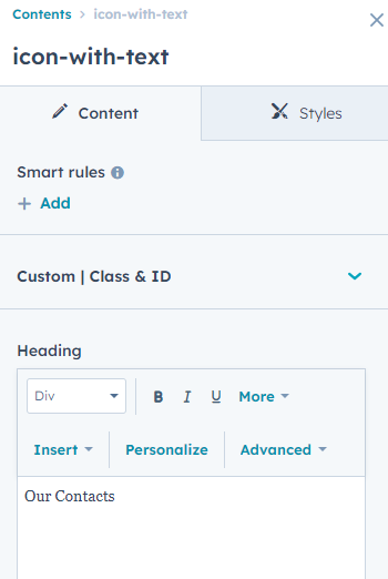
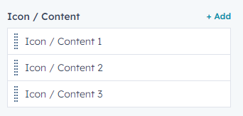
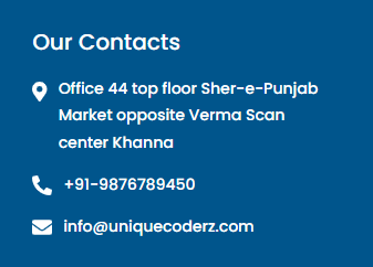
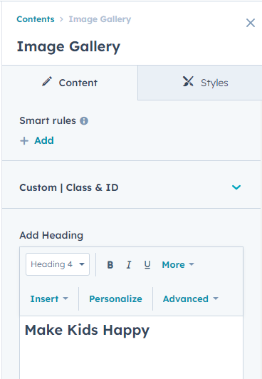
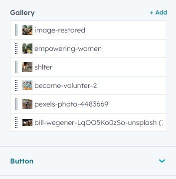
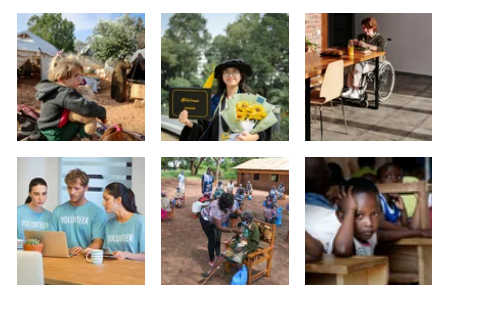
Image Gallery
In your module click on Content Tab > left side > you can edit everything according to you
Custom | Class & ID
Add Heading
Gallery(Repeater)
- Images
- Text
-
Button
-
Button Type(choice)
- Primary
- Secondary
- Tertiary
- Quaternary
- Simple
-
Button Size(Choice)
- Small
- Regular
- Large
- Button Link
- Button Text
-
Also, you can edit in the style tab :
Spacing
- Desktop, Tablet, and Mobile
Background
- Background Type(Choice)
-
Background Image (In the "Background Type" choice field, you can select an Background Image, and the background image field will be displayed.)
- Background image
- Overlay
- Background Gradient (In the "Background Type" choice field, you can select an Background Gradient, and the Background Gradient field will be displayed.)
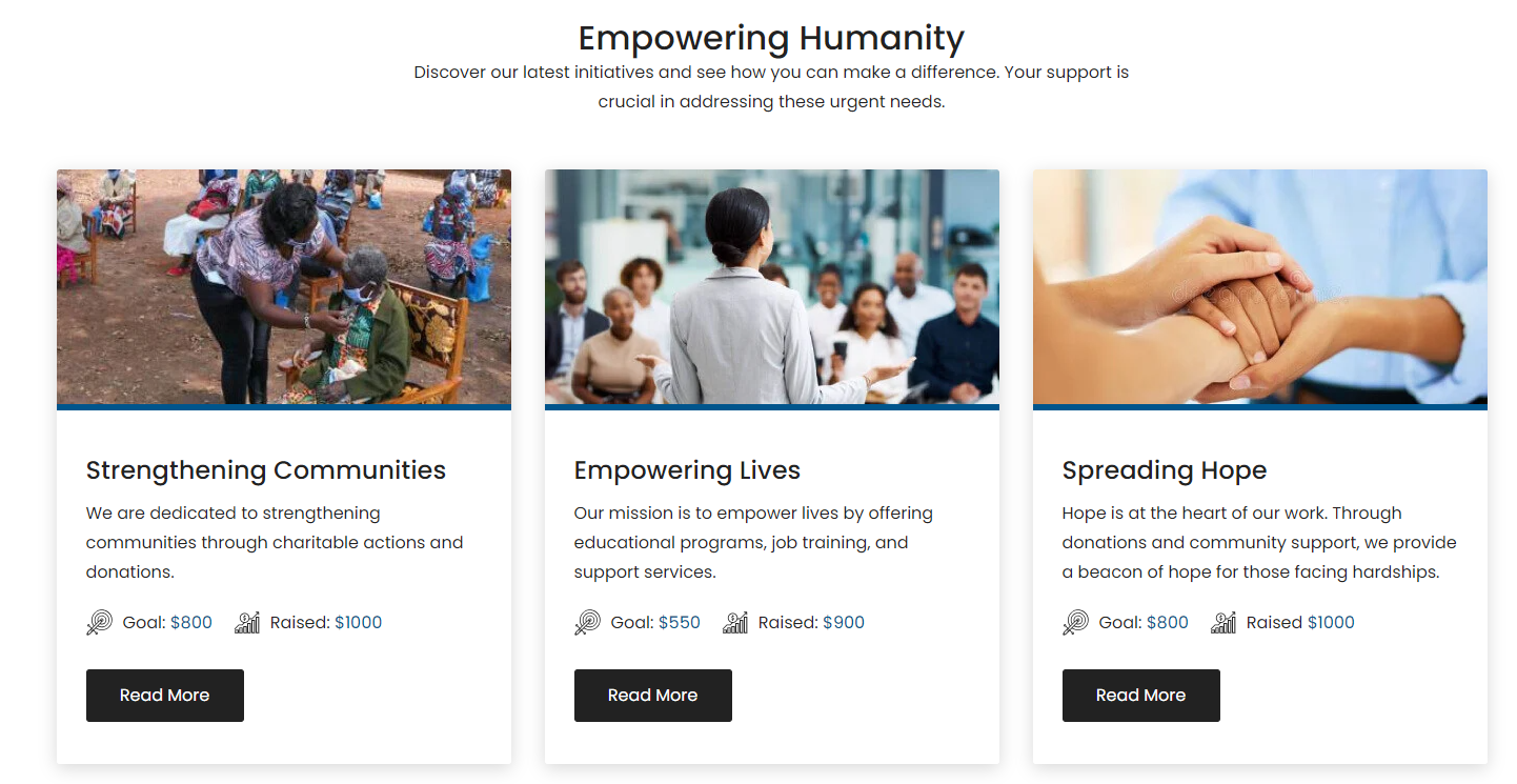
Latest Causes
In your module click on Content Tab > left side > you can edit everything according to you
Custom | Class & ID
Heading / Content
- Add Heading
Image / Content
-
Content Column(Repeater)
- Feature Image
- Description
-
Campaign Information(Repeater)
- Icon Choice(SVG, Image)
- Icon Image
- Svg Icon Code
- Add Label
- Add Value
-
Button Edit
-
Button Type(Choice)
- Primary
- Secondary
- Tertiary
- Quaternary
- Simple
-
Button Size(Choice)
- Small
- Regular
- Large
- Button Link
- Button Text
-
Also, you can edit in the style tab :
Spacing
- Desktop, Tablet, and Mobile
Background
- Background Type(Choice)
-
Background Image (In the "Background Type" choice field, you can select an Background Image, and the background image field will be displayed.)
- Background image
- Overlay
- Background Gradient (In the "Background Type" choice field, you can select an Background Gradient, and the Background Gradient field will be displayed.)
Main Heading / Content
- Custom Max-Width( if the custom max-width option is enabled, the Main Heading Max-width field will be displayed.)
- Main Heading Max-width
Card Style
- Image Border(Style, Color, Width)
- Background Color
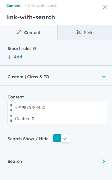
Link With Search
In your module click on Content Tab > left side > you can edit everything according to you
Custom | Class & ID
Content(Repeater)
- Add Text
- Add Link
-
Icon Type(Svg Code, Image choice)
- SVG Icon
- Icon Image
-
Icon Styling (In the "Icon Type" choice field, you can select an "SVG Icon", and the Icon Styling field will be displayed.)
- Icon Color
- Icon Size
- Background Color
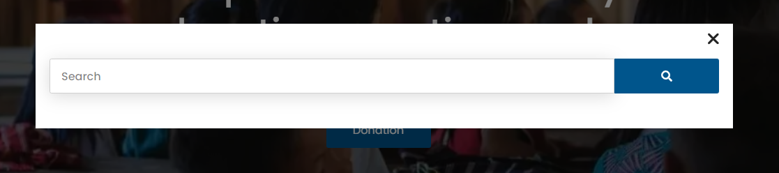
Search Show / Hide(if the Search Show/Hide option is enabled, the Search field will be displayed.)
Search
-
Icon Type(Svg Code, Image)
- SVG Icon
- Icon Image
-
Icon Styling (In the "Icon Type" choice field, you can select an "SVG Icon", and the Icon Styling field will be displayed.)
- Icon Color
- Icon Size
- Background Color
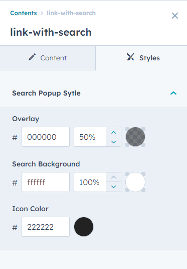
Also, you can edit in the style tab :
Search Popup Sytle (if the Search Show/Hide option is enabled, the Search Popup Sytle field will be displayed.)
- Overlay
- Search Background
- Icon Color

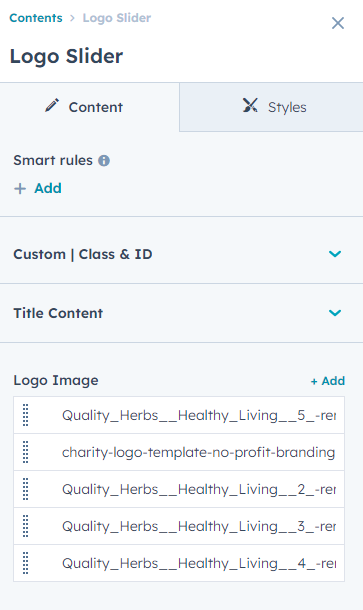
Logo Slider
In your module click on Content Tab > left side > you can edit everything according to you
Custom | Class & ID
Title Content
- Title
Logo Image(Repeater)
- Image
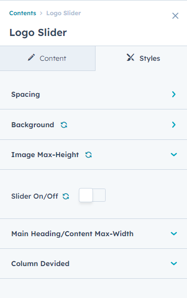
Also, you can edit in the style tab :
Spacing
- Desktop, Tablet, and Mobile
Background
- Background Type(Choice)
-
Background Image (In the "Background Type" choice field, you can select an Background Image, and the background image field will be displayed.)
- Background image
- Overlay
- Background Gradient (In the "Background Type" choice field, you can select an Background Gradient, and the Background Gradient field will be displayed.)
Image Max-Height
- Add Max-height
Slider On/Off( If the Slider On/Off option is enabled, the logo image will display as a slider.)
Slider Styling (If the Slider On/Off option is enabled, the Slider Styling fields will be displayed.)
- Autoplay
- Speed
-
Desktop
- Dots
- Arrows
- Slides To Show
- Slides To Scroll
-
Tablet
- Dots
- Arrows
- Slides To Show
- Slides To Scroll
-
Mobile
- Dots
- Arrows
- Slides To Show
- Slides To Scroll
-
Dots Styling
- Color
-
Arrow Styling
- Icon Color
- Backgound Color
-
Hover
- Icon Color
- Backgound Color
Main Heading/Content Max-Width
- Max-width
- Max-Width Alignment Choice(Left, Center, Right)
Slider Top / Bottom Spacing
- Slider Spacing
Column Devided
- Large screens
- Medium screens
- Small screens

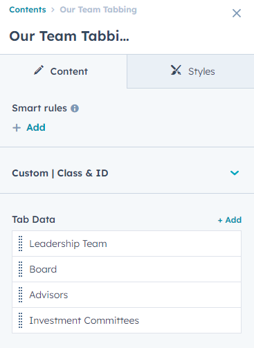
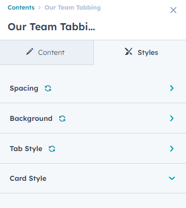
Our Team Tabbing
In your module click on Content Tab > left side > you can edit everything according to you
Custom | Class & ID
Tab Data(Repeater)
-
Tab Name
- Text
-
Tab Content
- Image
- Description
-
Social Follow(Repeater)
- Icon
- Link
- Backgorund Color
- Icon Color
Also, you can edit in the style tab :
Spacing
- Desktop, Tablet, and Mobile
Background
- Background Type(Choice)
-
Background Image (In the "Background Type" choice field, you can select an Background Image, and the background image field will be displayed.)
- Background image
- Overlay
- Background Gradient (In the "Background Type" choice field, you can select an Background Gradient, and the Background Gradient field will be displayed.)
Tab Style
-
Tab
- Background Color
- Text Color
- Right Border Color
-
Active / Hover
- Background Color
- Text Color
.png?width=1308&height=849&name=Screenshot_10%20(1).png)
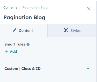
Pagination Blog
In your module click on Content Tab > left side > you can edit everything according to you
Custom | Class & ID
Tab Data(Repeater)
-
Tab Name
- Text
-
Tab Content
- Image
- Description
-
Social Follow(Repeater)
- Icon
- Link
- Backgorund Color
- Icon Color
Also, you can edit in the style tab :
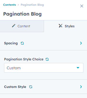
Spacing
- Desktop, Tablet, and Mobile
Pagination Style Choice(Theme, Custom)
-
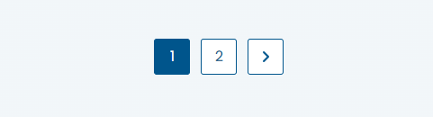
Custom Style ( In the "Pagination Style Choice" field, you can select an Custom,the Custom Style fields will be displayed. )
- Background Color
- Border Color
- Text Color
-
Active / Hover
- Background Color
- Border Color
- Text Color
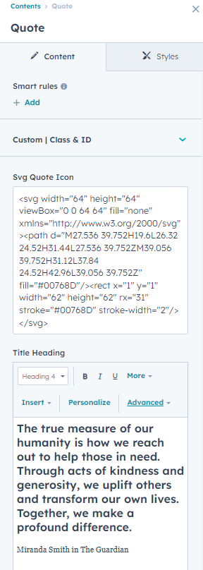
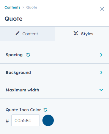
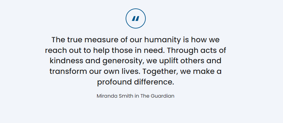
Quote
In your module click on Content Tab > left side > you can edit everything according to you
Custom | Class & ID
Svg Quote Icon
Title Heading
Also, you can edit in the style tab :
Spacing
- Desktop, Tablet, and Mobile
Background
- Background Type(Choice)
-
Background Image (In the "Background Type" choice field, you can select an Background Image, and the background image field will be displayed.)
- Background image
- Overlay
- Background Gradient (In the "Background Type" choice field, you can select an Background Gradient, and the Background Gradient field will be displayed.)
Maximum width
- Large screens
- Medium screens
- Small screens
Quote Iocn Color
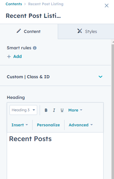
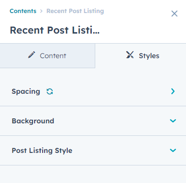
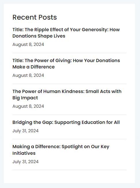
Recent Post Listing
In your module click on Content Tab > left side > you can edit everything according to you
Custom | Class & ID
Heading
Number Of Post(Number Post Show)
Blog(Select Blog)
Also, you can edit in the style tab :
Spacing
- Desktop, Tablet, and Mobile
Background
- Background Color
Post Listing Style
- Border Color
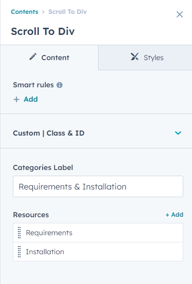
Scroll To Div
In your module click on Content Tab > left side > you can edit everything according to you
Custom | Class & ID
Categories Label
Resources
- Nav
- Categories
- Description
-
Image / Video Choice
- Image
- Video
- Embed Video
- Image Width Full Show / Hide
- Embed Video
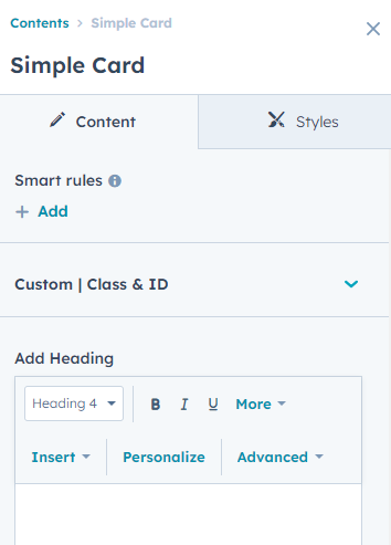
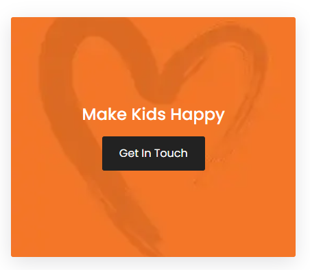
Simple Card
In your module click on Content Tab > left side > you can edit everything according to you
Custom | Class & ID
Add Heading
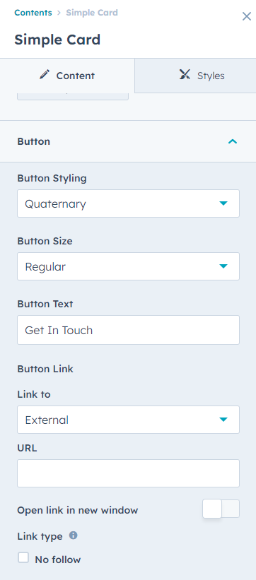
Button Edit
-
Button Type(Choice)
- Primary
- Secondary
- Tertiary
- Quaternary
- Simple
-
Button Size(Choice)
- Small
- Regular
- Large
- Button Link
- Button Text
Also, you can edit in the style tab :
Spacing
- Desktop, Tablet, and Mobile
Background
- Background Type(Choice)
-
Background Image (In the "Background Type" choice field, you can select an Background Image, and the background image field will be displayed.)
- Background image
- Overlay
- Background Gradient (In the "Background Type" choice field, you can select an Background Gradient, and the Background Gradient field will be displayed.)
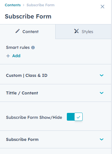
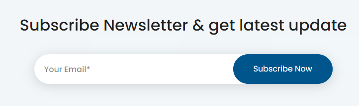
Subscribe Form
In your module click on Content Tab > left side > you can edit everything according to you
Custom | Class & ID
Tittle / Content
- Add Content
Subscribe Form Show/Hide(if the Subscribe Form Show/Hide option is enabled, the Subscribe Form fields will be displayed.)
Subscribe Form
- Form
- Bottom Text
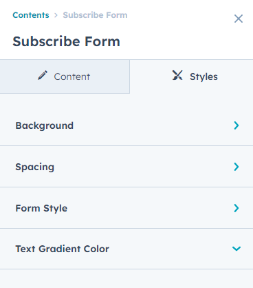
Also, you can edit in the style tab :
Spacing
- Desktop, Tablet, and Mobile
Background
- Background Type(Choice)
-
Background Image (In the "Background Type" choice field, you can select an Background Image, and the background image field will be displayed.)
- Background image
- Overlay
- Background Gradient (In the "Background Type" choice field, you can select an Background Gradient, and the Background Gradient field will be displayed.)
Form Style (if the Subscribe Form Show/Hide option is enabled, the Form Style fields will be displayed.)
- Theme / Custom Style Choice(Theme, Custom)
-
Input Field Style(if the Theme / Custom Style choice field, you can select an Custom option, and the Input Field Style fields will be displayed. )
- Placeholder Font Style
- Border Radius Input/Button
- Input Border Style
-
Button Style
- Button Text Color
- Button Border
- Button Background Color
-
Button Hover Style
- Button Text Color
- Button Border
- Button Background Color
- Form Container Max-Width(add custom max width)
-
Submitted Message Style (if the Theme/Custom Style choice field, you can select an Custom option, and the Submitted Message Style field will be displayed. )
- Background Color
Text Gradient Color
- Gradient Color(Add a span tag within the section heading text and apply a gradient color class "text-gradient" to it so that the gradient color works." )
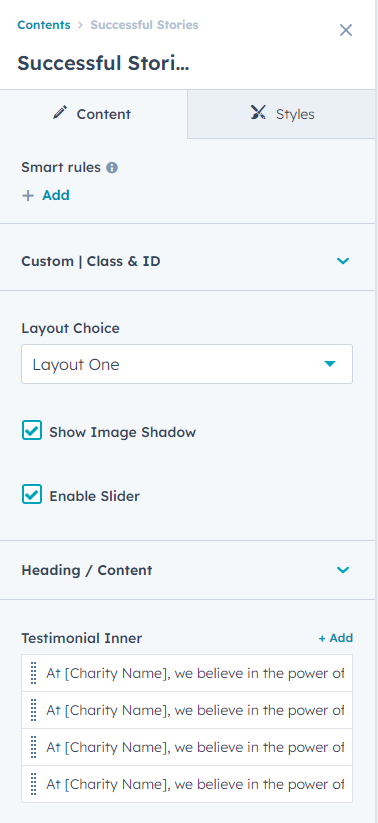
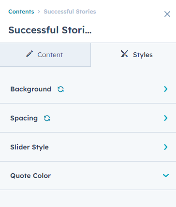
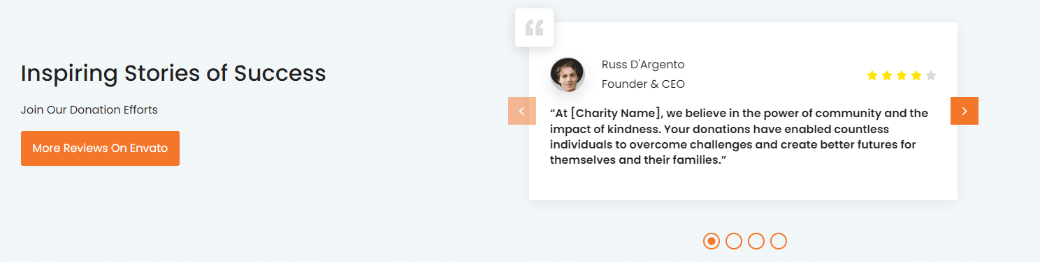
Successful Stories
In your module click on Content Tab > left side > you can edit everything according to you
Custom | Class & ID
Layout Choice(Layout One, Layout Two)
Show Image Shadow (If the Show Image Shadow option is turned on, the image box-shadow will be displayed.)
Enable Slider( If the Enable Slider option is turned on, the section will display as a slider.)
Heading / Content
- Add Content
Button
-
Button Type(Choice)
- Primary
- Secondary
- Tertiary
- Quaternary
- Simple
-
Button Size(Choice)
- Small
- Regular
- Large
- Button Link
- Button Text
Testimonial Inner(Repeater)
-
Testimonial Content
- Testimonial Desc
-
Client Section
- Client Name
- Client Role
- Client Image
- Star Reviews ✨
Also, you can edit in the style tab :
Spacing
- Desktop, Tablet, and Mobile
Background
- Background Type(Choice)
-
Background Image (In the "Background Type" choice field, you can select an Background Image, and the background image field will be displayed.)
- Background image
- Overlay
- Background Gradient (In the "Background Type" choice field, you can select an Background Gradient, and the Background Gradient field will be displayed.)
Star Icon Style
- Star Icon Color (Active)
Slider Style (If the Enable Slider option is enabled, the Slider Style fields will be displayed.)
- Autoplay
- Speed
-
Desktop
- Dots
- Arrows
- Slides To Show
- Slides To Scroll
-
Tablet
- Dots
- Arrows
- Slides To Show
- Slides To Scroll
-
Mobile
- Dots
- Arrows
- Slides To Show
- Slides To Scroll
-
Dots Styling
- Color
-
Arrow Styling
- Icon Color
- Backgound Color
-
Hover
- Icon Color
- Backgound Color
Quote Color
- Color
.png?width=1152&height=487&name=Screenshot_3%20(2).png)
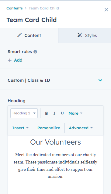
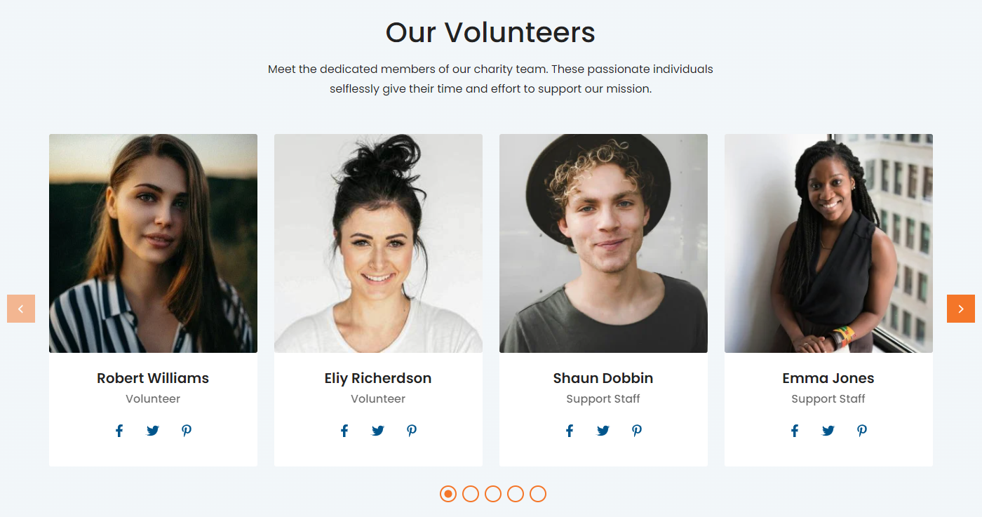
Team Card Child
In your module click on Content Tab > left side > you can edit everything according to you
Custom | Class & ID
Heading / Content
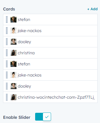
Cards(Repeater)
- Image
- Content
-
Icon
- Icon Type(Icon, Image, Svg)
- Icon
- Image
- Svg Code
- Icon Link
Enable Slider( If the Enable Slider option is turned on, the section will display as a slider.)
Also, you can edit in the style tab :
Spacing
- Desktop, Tablet, and Mobile
Background
- Background Type(Choice)
-
Background Image (In the "Background Type" choice field, you can select an Background Image, and the background image field will be displayed.)
- Background image
- Overlay
- Background Gradient (In the "Background Type" choice field, you can select an Background Gradient, and the Background Gradient field will be displayed.)
Icon Style
- Custom Icon Color
- Custom Background Color
-
Hover
- Custom Icon Color
- Custom Background Color
Card Bg Style
- Background Color
Slider Style (If the Enable Slider option is enabled, the Slider Style fields will be displayed.)
- Autoplay
- Speed
-
Desktop
- Dots
- Arrows
- Slides To Show
- Slides To Scroll
-
Tablet
- Dots
- Arrows
- Slides To Show
- Slides To Scroll
-
Mobile
- Dots
- Arrows
- Slides To Show
- Slides To Scroll
-
Dots Styling
- Color
-
Arrow Styling
- Icon Color
- Backgound Color
-
Hover
- Icon Color
- Backgound Color
Quote Color
- Color
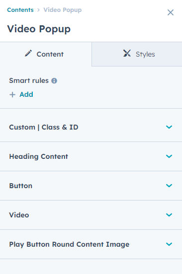
Video Popup
In your module click on Content Tab > left side > you can edit everything according to you
Custom | Class & ID
Heading Content
- Content
Button
-
Button Type(Choice)
- Primary
- Secondary
- Tertiary
- Quaternary
- Simple
-
Button Size(Choice)
- Small
- Regular
- Large
- Button Text
- Button Link
Video
- Video Choice(Embed Code, Video File )
- Video File
- Embed Code
Play Button Round Content Image
- Image
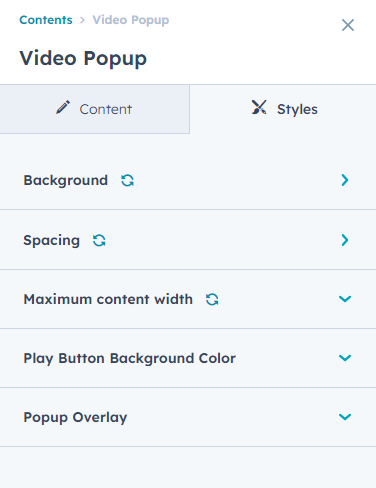
Also, you can edit in the style tab :
Spacing
- Desktop, Tablet, and Mobile
Background
- Background Type(Choice)
-
Background Image (In the "Background Type" choice field, you can select an Background Image, and the background image field will be displayed.)
- Background image
- Overlay
- Background Gradient (In the "Background Type" choice field, you can select an Background Gradient, and the Background Gradient field will be displayed.)
Maximum content width
- Show / Hide (If the Show/Hide option is enabled, the Max-Width and Padding Left Right fields will be displayed.)
- Max-Width
- Padding Left Right
Play Button Background Color
- Background Color
- Icon Color
Popup Overlay
- Background Overlay