.png?width=200&height=48&name=furniture-logo-Photoroom%20(1).png "furniture-logo")

.png?width=142&height=190&name=Group-64-Copy-89%20(1).png)

.png?width=220&height=325&name=Group-64-Copy-48%20(1).png)
Up and Running E- Commerce Theme

Copy to Different account
Select your Theme Folder then click right click then show some option
Select option = Copy to different account

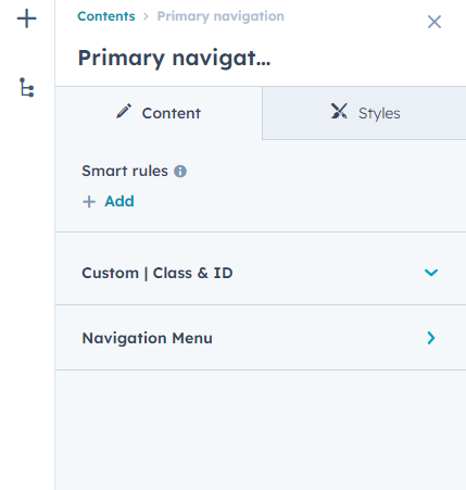
Global Header
To edit your header, you'll first need to create a page with a theme template. When a page is created then edit you page in the left side click Tab Contents. Then click Page header.
Global Footer
To edit your Footer, you'll first need to create a page with a theme template. When a page is created then edit you page in the left side click Tab Contents. Then click Page footer.

Pre-built Template

Internal Delivery
Manage customer blog template and settings
- In the customer HubSpot account, click the settings icon settings in the main navigation bar.
- In the left sidebar menu, navigate to Website > Blog.
- On the Templates tab, you can view or change the templates applied to your blog posts and blog listing page
- In the Blog post and Blog listing sections, click the Actions dropdown menu to manage your template
- Select Change template to choose a different template. On the template selection screen, select your new template, then click Done. In the bottom left of your template settings, click Save.

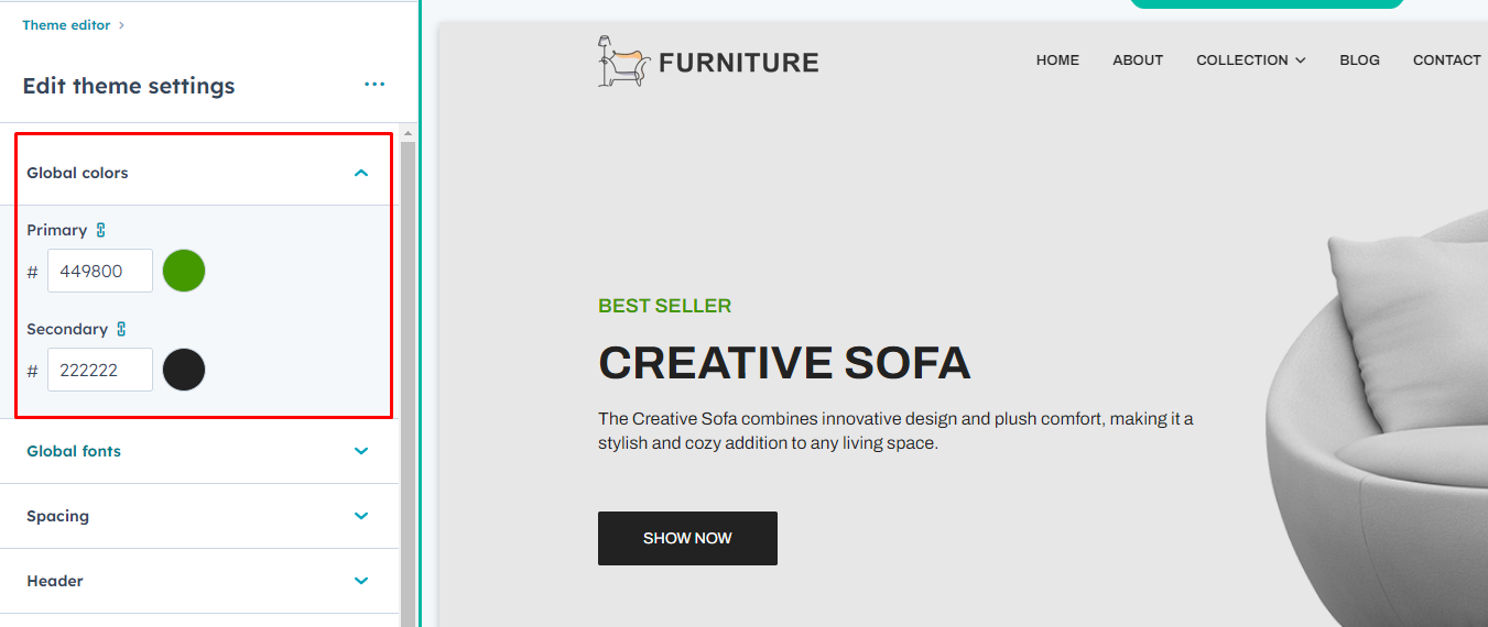
Global Color
- Primary Color
- Secondary Color
Global Fonts
- Primary Font
- Secondary Font

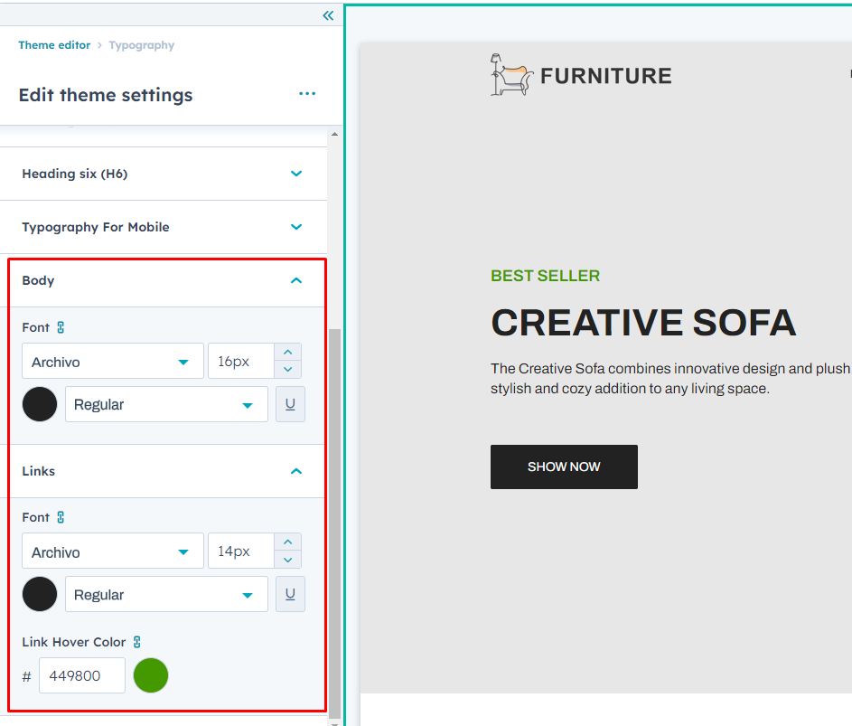
Typography
(H1 > H6)
- Font style
- Text Transform
Typography On Mobile(Headings (H1 > H6)
- Font Size
Body
- Body font style
Links
- Font Style
- Link hover color


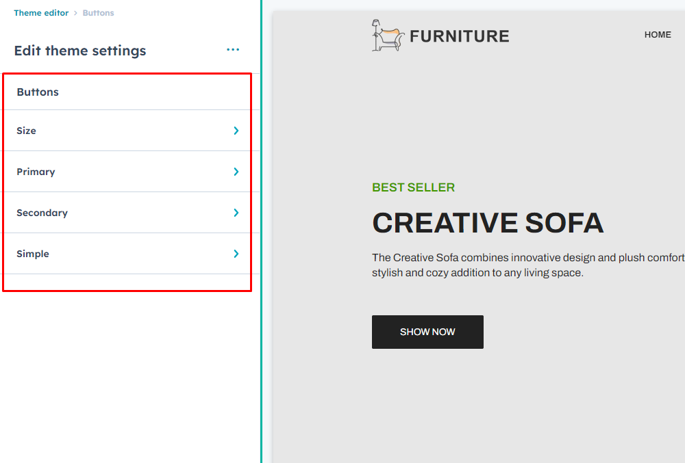
Buttons
Buttons Size
-
Small
- Font size
- Vertical Spacing
- Horizontal Spacing
-
Regular
- Font size
- Vertical Spacing
- Horizontal Spacing
-
Large
- Font size
- Vertical Spacing
- Horizontal Spacing
Primary Button
- Google Font Style
- Text Transform
- Background Color
-
Border
- Style
- Width
- Color
- Corner Radius
-
Hover
- color
- Background Color
-
Border
- Style
- Width
- Color
Secondary
- Google Font
- Text Transform
- Background Color
-
Border
- Style
- Width
- Color
- Corner Radius
-
Hover
- color
- Background Color
-
Border
- Style
- Width
- Color
Simple
- Google Font
- Text Transform
-
Underline
- Add underline
- Width
- Color
-
Hover
- Font Color
-
Underline
- Add underline
- Width
- Color
Header
- Background Color
- Menu Font
- Menu Text Transform
- Submenu Heading Font
- Menu Link Color
- Menu Hover Link color
- Child Menu Color
- Submenu Background Color
- Header Scroll Background Color
- Mobile Header Background Color
- Top and Bottom Padding


Footer
Menu
- Heading Font
- Menu Font
- Text transform
Hover
- Font Color
- Background Color
Active
- Font Color
- Background Color
Footer Background color
- Background color
Copyright
- Text Color
- Background color

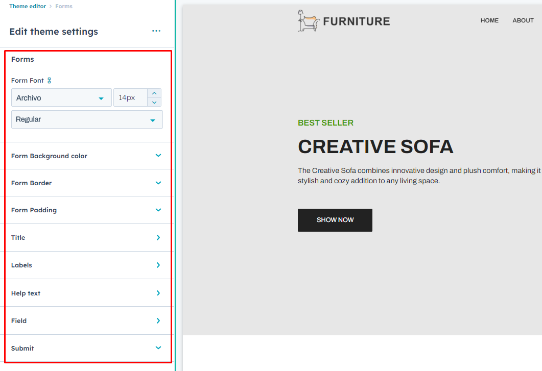
Form
- Form Font
- Form Background Color
- Border Color
- Padding
Title
-
Text Color
- color
Labels
-
Text Color
- color
Help text
-
Text Color
- color
Field
-
Text Color
- color
-
Background color
- color
-
Border
- Border Style
- Color
- Width
-
Corner Radius
- Radius
-
Padding
- Top/Bottom
- Left/Right
-
Placeholder
- color
Submit Button
- Button Style
- Button Size
Table
Header
- Text Color
- Background Color
Table Body
- Text Color
- Background Color
Table Footer
- Text Color
- Background Color
Cells
-
Spacing
- Padding
-
Border
- Border Style
- Color
- Width

Spacing (Container Width)
- Vertical Spacing
- Maximum Content Width

Banner Slider
In your module click on Content Tab > left side > you can edit everything according to you
Custom | Class & ID
Banner Items (repeater):
- Background Color
- Add Content
-
Button Edit
-
Button Type
- Primary
- Secondary
- Simple
-
Button Size
- Small
- Regular
- large
- Button Text
- Button Link
- Right Image
-
Also, you can edit in the style tab :
Module Visibility :
- Show / Hide
Spacing
- Desktop, Tablet, and Mobile
Slider Style
- Slider Autoplay On / Off
- Autoplay Speed
- Slider Speed
- Slider Option For Desktop, Tablet, Mobile ("We can handle all options of the slider. Do you want to show dots and arrows on desktop, tablet, and mobile, or not? All options are provided.")
- Slider Dots Style: Color and Active Color Options
-
Arrows Style
- Backgroud Color
- Icon Color
-
Hover
- Backgroud Color
- Icon Color
Custom Container Width Show / Hide
- Max Width


Blog Listing
In your module click on Content Tab > left side > you can edit everything according to you
Custom | Class & ID
Show / Hide
- Tag
- Post Title
- Author
- Publish Date
- Post Body Content
- Button
Button Style
- Button Type
- Button Size
- Text
Also, you can edit in the style tab :
Module Visibility :
- Show / Hide
Background
- Background Choice
- Background Image
- Background Overlay
- Background Gradient
Spacing
- Desktop, Tablet, and Mobile
Post Listing Style
- Background Color
-
Tag Style
- Background Color
- Text Color


Blog pagination
In your module click on Content Tab > left side > you can edit everything according to you
Custom | Class & ID
Also, you can edit in the style tab :
Module Visibility :
- Show / Hide
Spacing
- Desktop, Tablet, and Mobile
Pagination Style Choice
- Theme
- Custom
Custom Style
- Background Color
- Text Color
- Border Color
-
Active / Hover
- Background Color
- Text Color
- Border Color


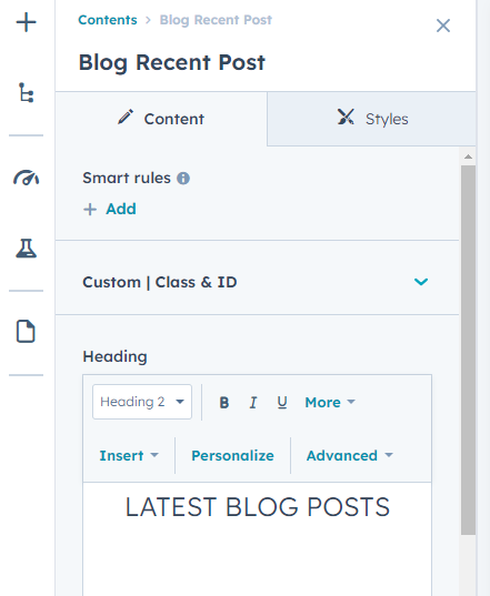
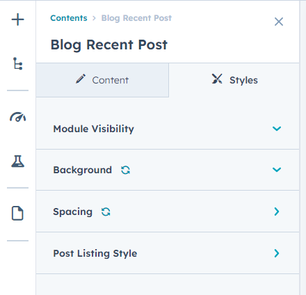
Blog Recent Post
In your module click on Content Tab > left side > you can edit everything according to you
Custom | Class & ID
Heading
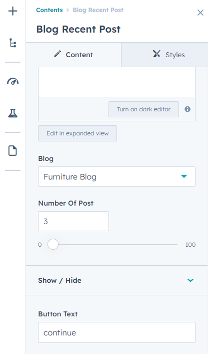
Blog
Number Of Post
Show / Hide
- Tag
- Post Title
- Author
- Publish
- Post Body Content
- Button
Button Style
- Button Type
- Button Size
- Text
Also, you can edit in the style tab :
Module Visibility :
- Show / Hide
Background
- Background Choice
- Background Image
- Background Overlay
- Background Gradient
Spacing
- Desktop, Tablet, and Mobile
Post Listing Style
- Background Color
-
Tag Style
- Background Color
- Text Color
Blog Related Post
In your module click on Content Tab > left side > you can edit everything according to you
Custom | Class & ID
Heading
Show / Hide
- Post Title
- Author
- Tag
- Publish
- Post Body
- Button
Button Style
- Button Type
- Button Size
- Text
Also, you can edit in the style tab :
Module Visibility :
- Show / Hide
Background
- Background Choice
- Background Image
- Background Overlay
- Background Gradient
Spacing
- Desktop, Tablet, and Mobile
Post Listing Style
- Background Color
-
Tag Style
- Background Color
- Text Color


Blog Tag
In your module click on Content Tab > left side > you can edit everything according to you
Custom | Class & ID
Heading
Also, you can edit in the style tab :
Module Visibility :
- Show / Hide
Spacing
- Desktop, Tablet, and Mobile


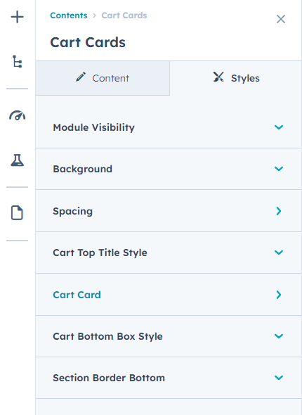
Cart Cards
In your module click on Content Tab > left side > you can edit everything according to you
Custom | Class & ID
Title
Table Heading
- Text(Repeater)
Card Total Content
- Content
-
Button
- Link
- Text
-
Button Type
- Primary
- Secondary
- Simple
-
Button Size
- Small
- Regular
- large
Also, you can edit in the style tab :
Module Visibility :
- Show / Hide
Background
- Background Choice
- Background Image
- Background Overlay
- Background Gradient
Spacing
- Desktop, Tablet, and Mobile
Cart Top Title Style
- Backgrund Color
- Border Color
- Text Color
Cart Card
-
Cart Value Style
- Border Color
- Background Color
- Text Color
- Price Text
Cart Bottom Box Style
- Border Color
- Background Color
- Text Color
- Payment Color
Section Border Bottom
- Color


Content Address With Form
In your module click on Content Tab > left side > you can edit everything according to you
Custom | Class & ID
Title Heading
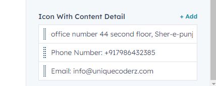
Icon / Content (Repeater)
- Add Icon
- Add Content
Add Description Content
Form Section
- Heading
- Form
Also, you can edit in the style tab :
Module Visibility :
- Show / Hide
Background
- Background Choice
- Background Image
- Background Overlay
- Background Gradient
Spacing
- Desktop, Tablet, and Mobile
Icon Style
- Border Color
- Background Color
- Icon Color


Custom Button
In your module click on Content Tab > left side > you can edit everything according to you
Custom | Class & ID
Button link
Button text
Button Choice
- Primary
- Secondary
- Simple
- Custom
Button Size
- Small
- Regular
- Large
Also, you can edit in the style tab :
Module Visibility :
- Show / Hide
Alignment
-
Desktop Alignment
- Center
- Left
- Right
-
Tablet Alignment
- Center
- Left
- Right
-
Mobile Alignment
- Center
- Left
- Right
Custom Button Style
- Text Color
- Border Color
- Background Color
-
Hover
- Text Color
- Border Color
- Background Color


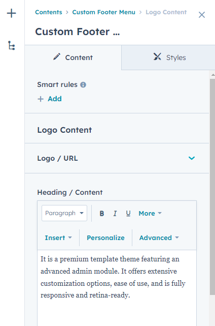
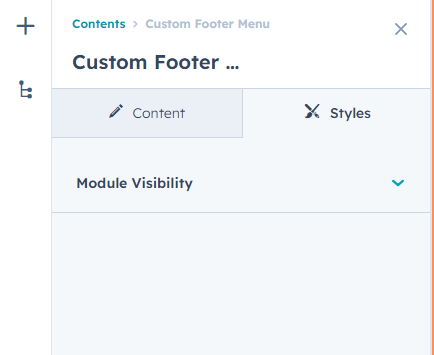
Custom Footer Menu
In your module click on Content Tab > left side > you can edit everything according to you
Custom | Class & ID
Logo Content
-
Logo / URL
- Logo Image
- URL
- Heading / Content
-
Icon With Content Detail(Repeater)
- Details Text
- Svg Icon Code
- Link
Footer Menu
- Menu
Also, you can edit in the style tab :
Module Visibility :
- Show / Hide

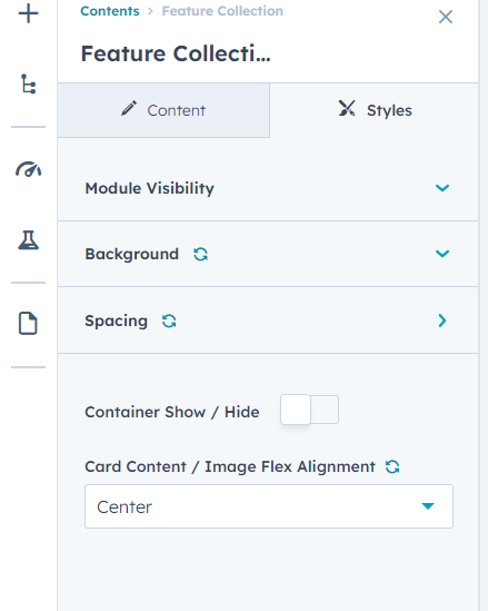
Feature Collection
In your module click on Content Tab > left side > you can edit everything according to you
Custom | Class & ID
Banner Items(Repeater)
- Add Content
-
Button Edit
-
Button Type
- Primary
- Secondary
- Simple
-
Button Size
- Small
- Regular
- Large
- Button Text
- Button Link
-
Also, you can edit in the style tab :
Module Visibility :
- Show / Hide
Background
- Background Choice
- Background Image
- Background Overlay
- Background Gradient
Spacing
- Desktop, Tablet, and Mobile
Container Show / Hide
Card Content / Image Flex Alignment
- Top
- Center
- End

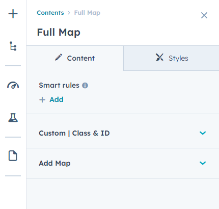
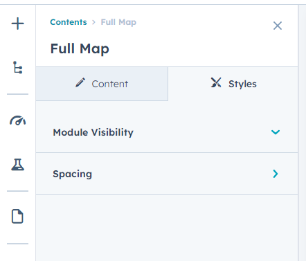
Full Map
In your module click on Content Tab > left side > you can edit everything according to you
Custom | Class & ID
Add Map
- Google Map Iframe
Also, you can edit in the style tab :
Module Visibility :
- Show / Hide
Spacing
- Desktop, Tablet, and Mobile
Header Mega menu
In your module click on Content Tab > left side > you can edit everything according to you
Custom | Class & ID
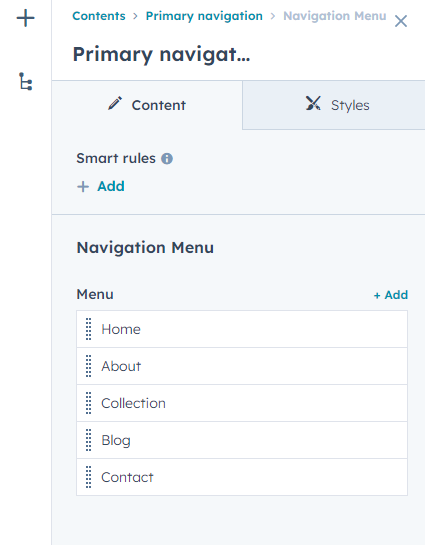
Navigation Menu
-
Menu(Repeater)
- Menu Text
- Menu Link
- Submenu Show / Hide
-
Submenu
- Sub Menu Tittle
- Sub Menu Tittle Show / Hide
-
Submenu Items(Repeater)
- Product Image Show / Hide
- Product Image
- Sub Menu Link
- Sub Menu Text
Also, you can edit in the style tab :
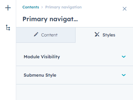
Module Visibility :
- Show / Hide
Submenu Style
- Image Background Color

Icon With Content
In your module click on Content Tab > left side > you can edit everything according to you
Custom | Class & ID
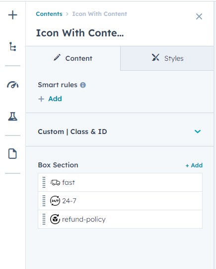
Box Section
- Add Image
- Add Description
Also, you can edit in the style tab :
Module Visibility :
- Show / Hide
Background
- Background Choice
- Background Image
- Background Overlay
- Background Gradient
Spacing
- Desktop, Tablet, and Mobile

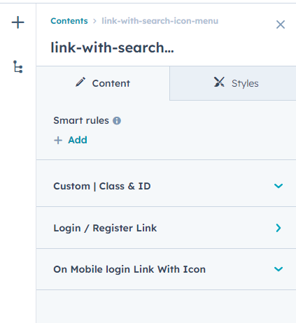
Link With Search Icon Menu
In your module click on Content Tab > left side > you can edit everything according to you
Custom | Class & ID
Login / Register Link
-
Link Items
- Add Links
- Link Text
- Search Icon Svg code
-
Add To Cart Icon/Link
- Cart Icon Svg Code
- Add Link
On Mobile login Link With Icon
- Icon Svg Code
- Login Link
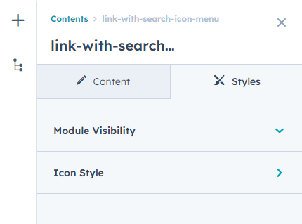
Also, you can edit in the style tab :
Module Visibility :
- Show / Hide
Icon Style
- Background Color
-
Cart Number Style
- Background Color
- Text Color
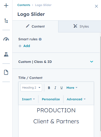
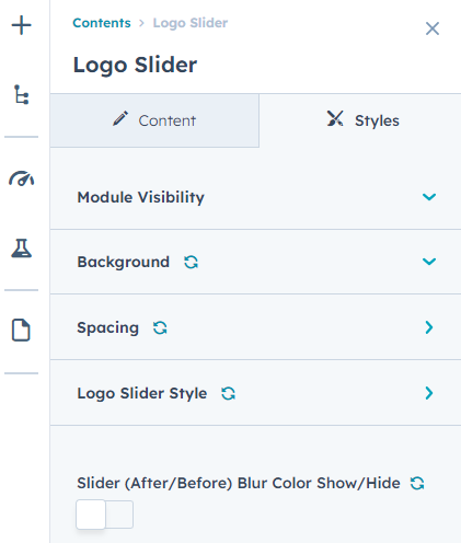
Logo Slider
In your module click on Content Tab > left side > you can edit everything according to you
Custom | Class & ID
Title / Content
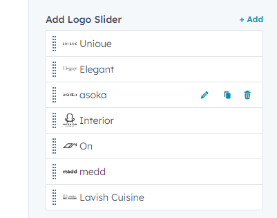
Add Logo Slider(Repeater)
- Logo
- Logo Link
Also, you can edit in the style tab :
Module Visibility :
- Show / Hide
Background
- Background Choice
- Background Image
- Background Overlay
- Background Gradient
Spacing
- Desktop, Tablet, and Mobile
Logo Slider Style
- Slider Auto Play
- Slider Speed
- Slider Option For Desktop, Tablet, Mobile (""We can accommodate all slider configurations. Would you like to display dots, specify the number of slides to show and scroll, and include arrows on desktop, tablet, and mobile views? All options are available.")
-
Dots Style
- Dots Color
- Dots Active
-
Arrows Style
- Background Color
- Icon Color
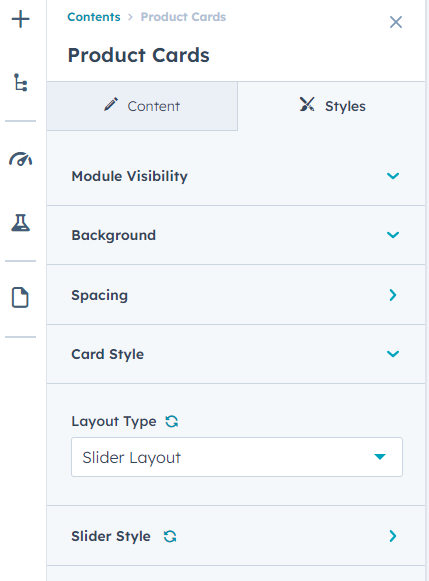
Product Cards
In your module click on Content Tab > left side > you can edit everything according to you
Custom | Class & ID
Heading
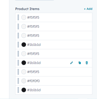
Product Items(Repeater)
- Background Color
- Product Detail Link
- Product Font Image
- Product Back Hover Image
- Sale Tag
-
Tag Color
- Background Color
- Text Color
-
Button Edit
-
Button Type
- Primary
- Secondary
- Simple
-
Button Size
- Small
- Regular
- large
- Button Text
- Button Link
-
- Product Content
- Price Sale
- Price Compare
- Start Rating
- Add Image
- Add Description
Also, you can edit in the style tab :
Module Visibility :
- Show / Hide
Background
- Background Choice
- Background Image
- Background Overlay
- Background Gradient
Spacing
- Desktop, Tablet, and Mobile
Card Style
- Price Color
- Start Color
Layout Type
- Slider Layout(With Slider)
- Flex Lauout(without Slider)
Slider Style
- Slider Auto Play
- Autoplay Speed
- Slider Speed
- Slider Option For Desktop, Tablet, Mobile (""We can accommodate all slider configurations. Would you like to display dots, specify the number of slides to show and scroll, and include arrows on desktop, tablet, and mobile views? All options are available.")
-
Dots Style
- Background Color
- Border Color
-
Active
- Background Color
- Border Color
-
Arrows Style
- Background Color
- Icon Color
-
Hover
- Background Color
- Icon Color


Product Detail
In your module click on Content Tab > left side > you can edit everything according to you
Custom | Class & ID
Heading
Product Image Edit
-
Product Image(Repeater)
- Image
Product Content
- Product Heading
- Customer Review Option Show / Hide
- Start Icon Choice
- Custom Review Text
Amount Text
Product Details Content
Card CTA
- Text
-
Button Choice
- Primary
- Secondary
- Simple
-
Button Size
- Simple
- Regular
- Large
Product Details List
-
Prouduct List
- Left Tittle
- Right Details
- Text With Link Show / Hide
-
Link / Collection Text
- Collection Text
- Link
Social Links
- Share Text
-
Social Links
- Social Links
- Icon
Also, you can edit in the style tab :
Module Visibility :
- Show / Hide
Background
- Background Choice
- Background Image
- Background Overlay
- Background Gradient
Spacing
- Desktop, Tablet, and Mobile
Arrows Style
- Background Color
- Icon Color
-
Hover
- Background Color
- Icon Color
Left Content Style
-
Star Style
- Color
- Active
- Review Text Color
- Price Color
- Border Color
-
Input Number Style
- Background Color
- Border Color
- Text Color
-
Product Listing
- Text Color
- Link Hover
-
Soical Style
- Text / Icon Color
- Hover


Recent Post Listing
In your module click on Content Tab > left side > you can edit everything according to you
Custom | Class & ID
Heading
Number Of Post
Also, you can edit in the style tab :
Module Visibility :
- Show / Hide
Spacing
- Desktop, Tablet, and Mobile
Post Listing Style
- Border Color


Scroll To Div
In your module click on Content Tab > left side > you can edit everything according to you
Custom | Class & ID
Categories Label
Resources
- Nav
- Categories
- Description
-
Image / Video Choice
- Image
- Video
- Embed Video
- Image Width Full Show / Hide
- Embed Video
Also, you can edit in the style tab :
Module Visibility :
- Show / Hide


Search Input
In your module click on Content Tab > left side > you can edit everything according to you
Custom | Class & ID
Label text
Placeholder text
Search results include
- Website pages
- Landing pages
- Blog posts
- Knowledge articles
Also, you can edit in the style tab :
Module Visibility :
- Show / Hide
Search Input Style
- Background Color
- Border Color
- Text Color
- Icon Color


Single Image
In your module click on Content Tab > left side > you can edit everything according to you
Custom | Class & ID
Image
Also, you can edit in the style tab :
Module Visibility :
- Show / Hide
Desktop Image Alignment
- Left
- Center
- Right
Tablet Image Alignment
- Left
- Center
- Right
Mobile Image Alignment
- Left
- Center
- Right
Image Full Width Show / Hide
Image Border Radius Show / Hide
- Border Radius(If the image border radius is enabled, this field will be displayed.)


Social Follow Footer
In your module click on Content Tab > left side > you can edit everything according to you
Custom | Class & ID
Social links
-
Social account
- YouTube
- Website
- Custom Icon
- Custom icon
- Social link
-
Accessibility options
- Title
Also, you can edit in the style tab :
Module Visibility :
- Show / Hide
Social Icon Style
- Background Color
- Icon Color


Subscribe
In your module click on Content Tab > left side > you can edit everything according to you
Custom | Class & ID
Tittle / Content
- Add Content
Subscribe Form
- Form
Also, you can edit in the style tab :
Module Visibility :
- Show / Hide
Background
- Background Choice
- Background Image
- Background Overlay
- Background Gradient
Spacing
- Desktop, Tablet, and Mobile
Form Style
- Border Color
- Text Color
- Submit Message Border Color


Team
In your module click on Content Tab > left side > you can edit everything according to you
Custom | Class & ID
Title Heading
Team Card(Repeater)
- Image
- Proflile Name
-
Social Icon
- URL
- Icon
- Description
Also, you can edit in the style tab :
Module Visibility :
- Show / Hide
Background
- Background Choice
- Background Image
- Background Overlay
- Background Gradient
Spacing
- Desktop, Tablet, and Mobile
Social Icon Style
- Background Color
- Icon Color
- Border Color
-
Hover
- Background Color
- Icon Color
- Border Color


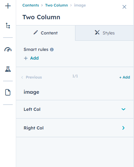
Two Column
In your module click on Content Tab > left side > you can edit everything according to you
Custom | Class & ID
Tittle / Content
- Add Content
Column Direction(Choice)
- Image / Content
- Content / Image
Image / Content(Repeater)
-
Left Col
- Add Image
-
Right Col
- Add Content
- Add Prices Content
-
Button
-
Button Choice
- Primary
- Secondary
- Simple
-
Button Size
- Small
- Regular
- Large
- Button Text
- Button Link
-
Also, you can edit in the style tab :
Module Visibility :
- Show / Hide
Background
- Background Choice
- Background Image
- Background Overlay
- Background Gradient
Spacing
- Desktop, Tablet, and Mobile
Card Content Style
- Background Color
-
Content Alignment Choice
- Center
- Left
- Right
Main Heading Custom Max width
- Max Width(If the Main Heading Custom Max Width is enabled, this field will be displayed.