Up and Running One Page Theme

Copy to different account
Select your Theme Folder then click right click then show some option
Select option = Copy to different account

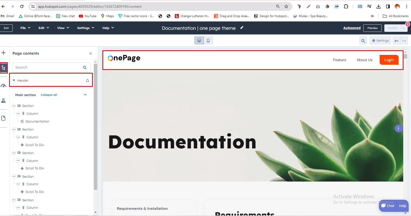
Global Header
To edit your header, you'll first need to create a page with a theme template. When a page is created then edit you page in the left side click Tab Contents. Then click Page header.
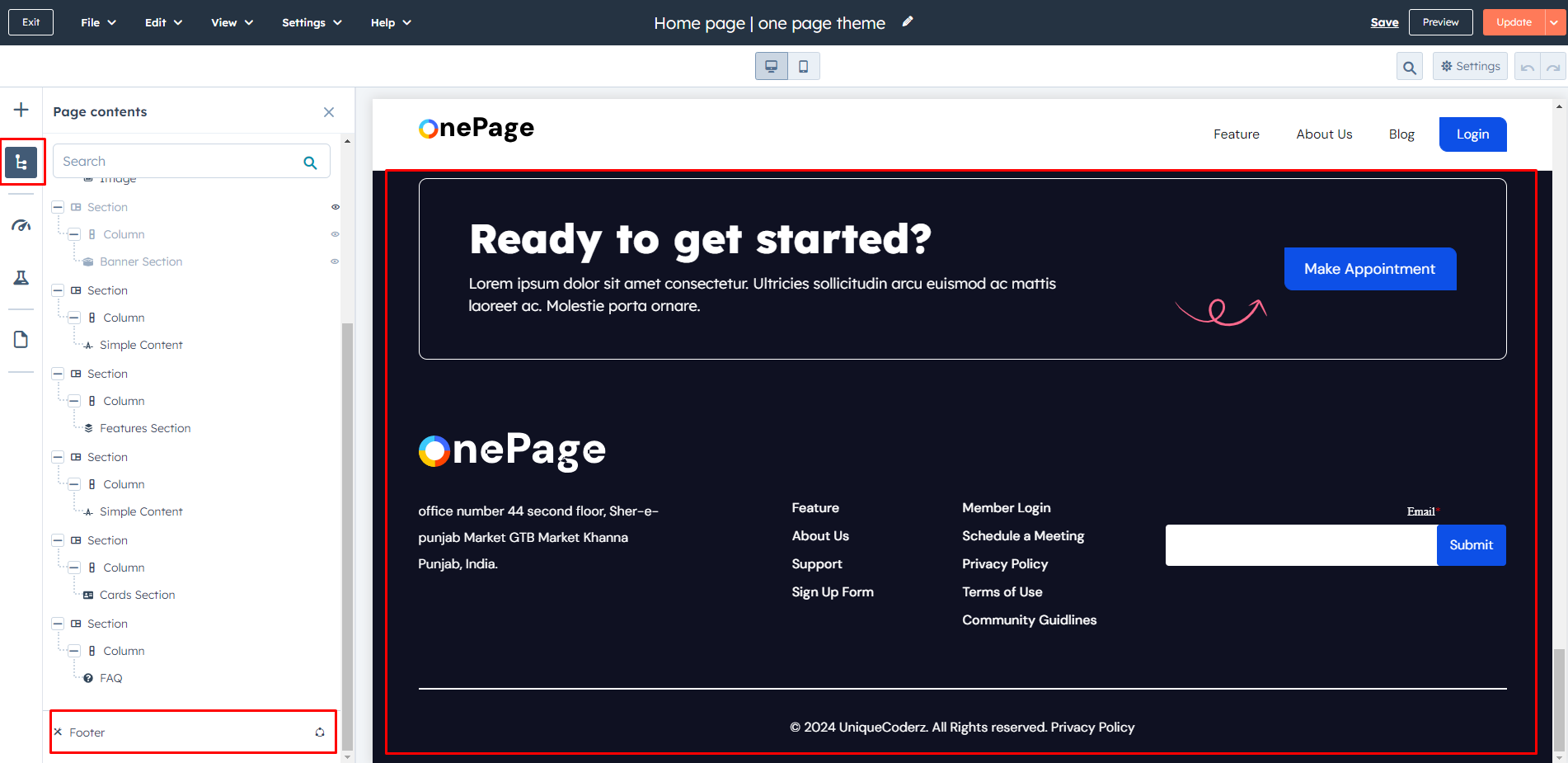
Global Footer
To edit your Footer, you'll first need to create a page with a theme template. When a page is created then edit you page in the left side click Tab Contents. Then click Page footer.
Pre-built Template

Internal Delivery
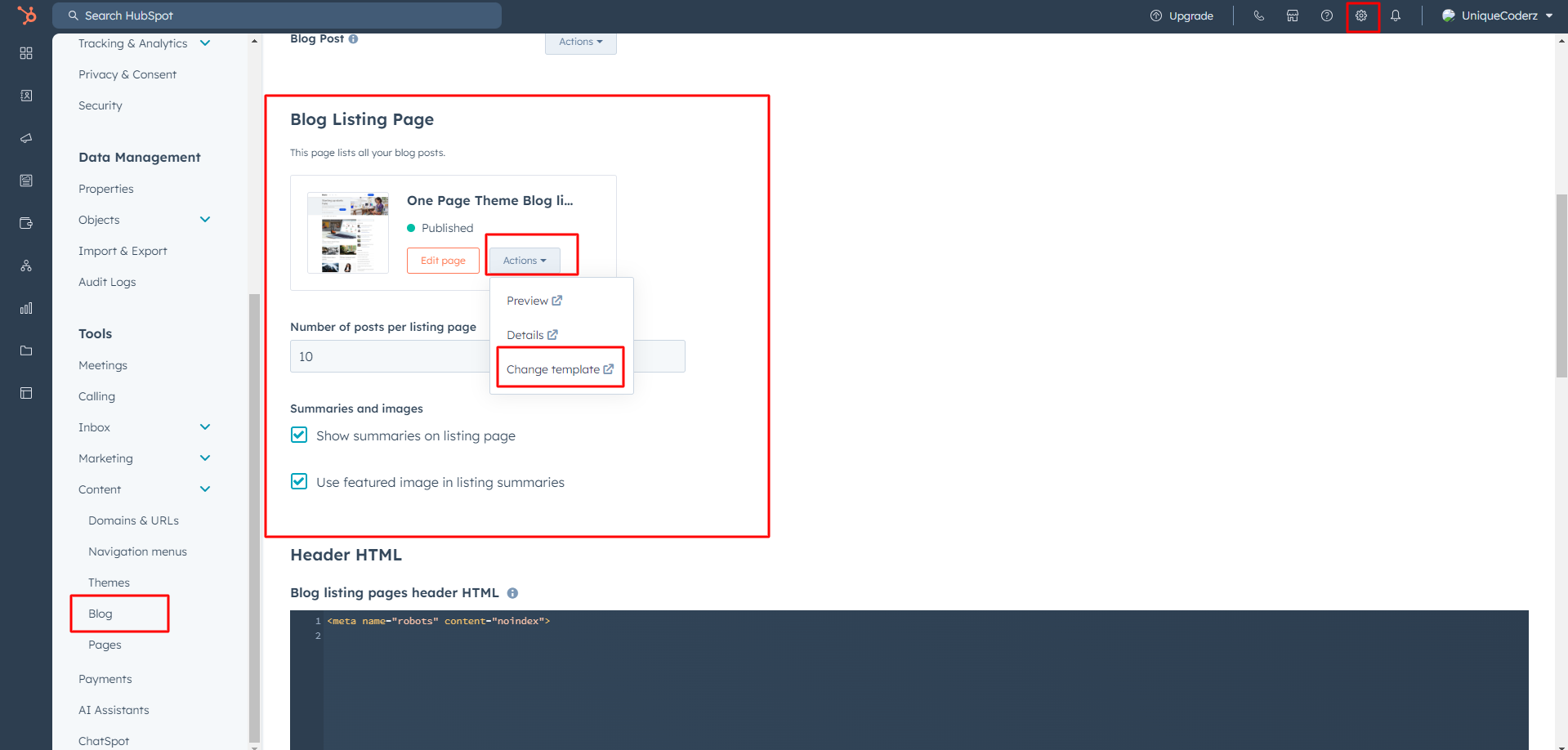
Manage customer blog template and settings
- In the customer HubSpot account, click the settings icon settings in the main navigation bar.
- In the left sidebar menu, navigate to Website > Blog.
- On the Templates tab, you can view or change the templates applied to your blog posts and blog listing page
- In the Blog post and Blog listing sections, click the Actions dropdown menu to manage your template
- Select Change template to choose a different template. On the template selection screen, select your new template, then click Done. In the bottom left of your template settings, click Save.
Create Header Menu
Access the HubSpot settings, then navigate to Content and select Navigation. From there, you can create a new menu.

Add Menu Links
To create a header menu link in which the page URL includes the ID #dummy at the end, and to ensure that clicking the menu item matches this ID to scroll to the corresponding section on the page:
- Edit the URL of the menu item to include the page URL with #dummy appended (e.g., https://www.example.com/page#dummy).
- Save your changes in HubSpot after adding the menu item
Following these steps will make your header menu link navigate to the specified page URL with the #dummy ID appended and smoothly scroll to the corresponding section when clicked."

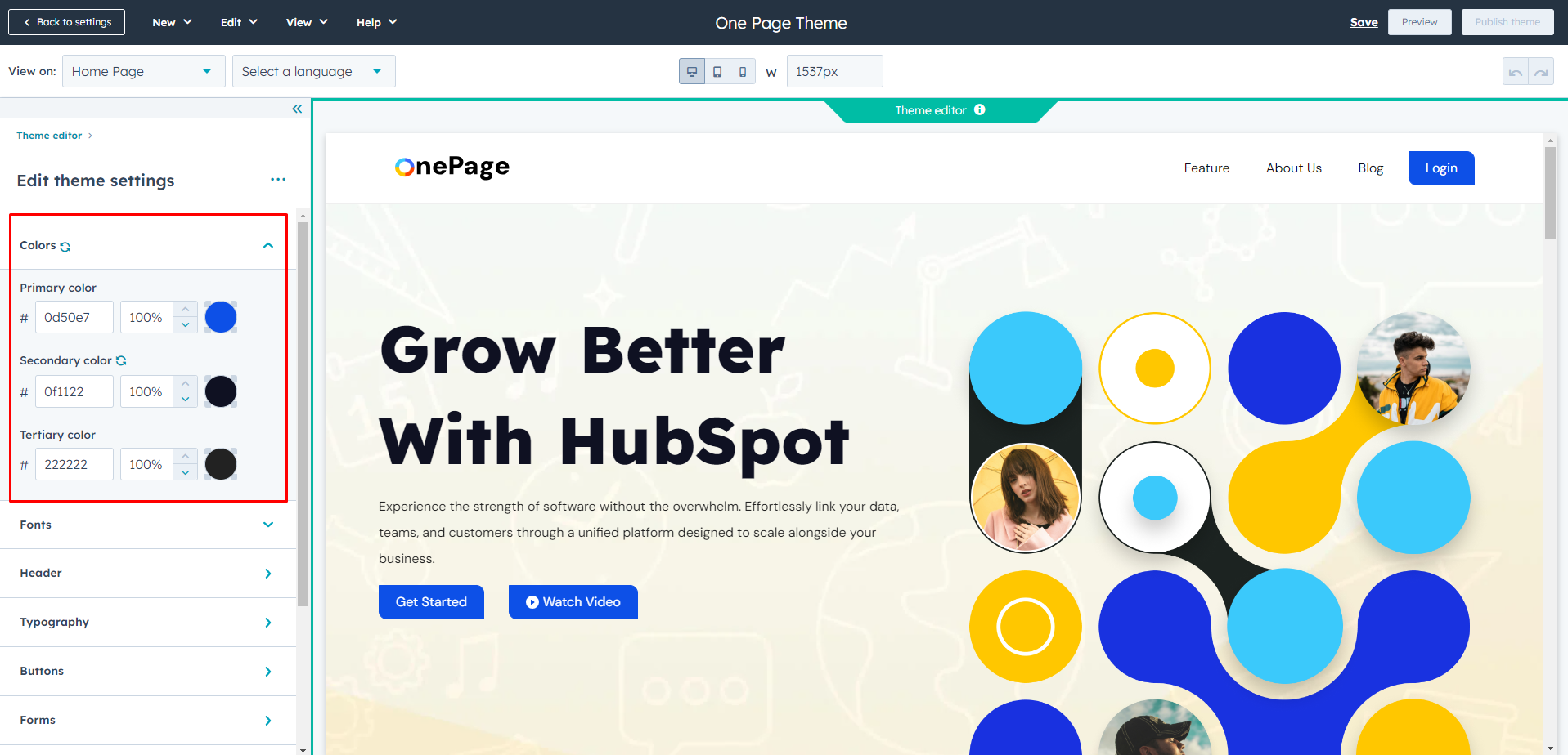
Global Color
- Primary Color
- Secondary Color
- Tertiary Color
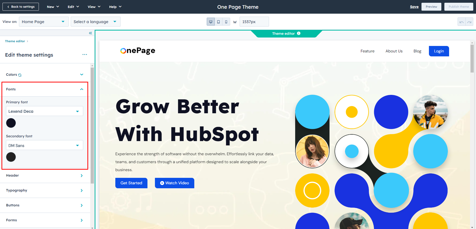
Global Fonts
- Primary Font
- Secondary Font
Header
Background Color
Bottom Border Width
Bottom Border Color
Fonts Style
Menu Link Color
Menu Link Hover Color
Child Menu Color
Child Menu Border Color
Reveal Header On Scroll up
Header Style
- Normal
- Fixed
- Transpaerent
Menu Visibility
- Show
- Hide
Mobile_header
- Submenu Background Color
- Submenu Icon Color
- Submenu Text Color


Typography
Body
- Font Style
Headings (H1 > H6)
- Font style
Typography On Mobile(Headings (H1 > H6)
- Font Size
Links
- Link color
- Link hover color


Buttons
Buttons Size
- Small
- Font size
- Vertical Spacing
- Horizontal Spacing
- Regular
- Font size
- Vertical Spacing
- Horizontal Spacing
- Large
- Font size
- Vertical Spacing
- Horizontal Spacing
Primary Button
- Font Style
- Text Transform
- Background Color
- Border
- Style
- Width
- Color
- Corner Radius
- Hover
- color
- Background Color
- Border
- Width
- Color
Secondary
- Font Style
- Text Transform
- Background Color
- Border
- Style
- Width
- Color
- Corner Radius
- Hover
- color
- Background Color
- Border
- Width
- Color
Simple
- Font Style
- Text Transform
- Underline
- Hover
- Font Color
- Underline

Form
Title
- Background Color
- Font Style
- Text Transfrom
padding
- Top/Bottom
- Left/Right
Border
- Border style
- Corner radius
Labels
- Font Style
- Background color
-
padding
- Top/Bottom
- Left/Right
Field
- Background color
- Font Style
- Placeholder color
- Box Shadow color
-
Fields hover
- Placeholder Color
- Box Shadow Color
-
Active hover
- Placeholder Color
- Box Shadow Color
-
Fields Focus
- Placeholder Color
- Box Shadow Color
-
padding
- Top/Bottom
- Left/Right
-
Border
- Border style
- Border Choice (both side, top border , bottom border)
- Border Width
- Border Color
- Corner radius
-
Error massage
- Font style
- Background color
-
Error massage border style
- Border Width
- border color
-
GDPR text
- Font style(Fonts,color,Size)
-
Rich text
- Font style(Fonts,color)
Checkbox / Radio
- Font style
-
Border
- Border style
- Border Choice (both side, top border , bottom border)
- Border Width
- Border Color
- Corner radius
-
Border Hover
- Color
Error Message Style
- Font Style
- Background Color
-
Error Message border Style
- Width
- Color
Help text
- Font Style(fonts , color , size)
Form Background Color
Border
Border Choice
- Duble
- Groove
- Ridge
- Inset
- Outset
- Corner Radius
Form Padding
- Top/Bottom
- Left/Right
Submit Button
- Button Style
- Button Size

Table
- Header Background Color
- Header Text Color
- Body Background Color
- Body Text Color
- Footer Background Color
- Footer Text Color
- Border Color

Spacing (Container Width)
- Vertical Spacing
- Maximum Content Width

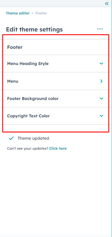
Footer
Menu Heading Style
- Font Style
Menu
- Font Style
- Text transform
-
Hover
- color
-
Active
- Color
Footer background Color
- Left Box Color
Copyright Text Color
- Font style