
.webp?width=320&height=226&name=pexels-jopwell-2422294%20(1).webp)
.webp?width=352&height=352&name=image%203%20(2).webp)
.jpg?width=100&height=100&name=image%201%20(2).jpg)
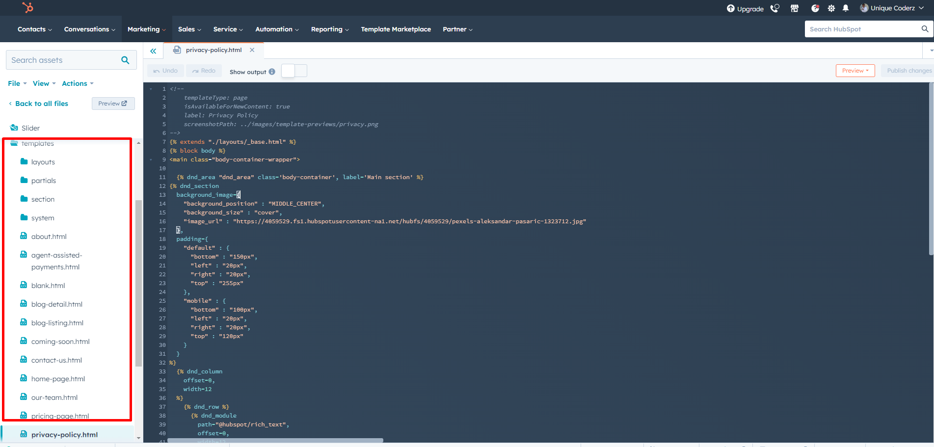
Up and Running Slider Theme

Copy to different account
Select your Theme Folder then click right click then show some option
Select option = Copy to different account

Global Header
To edit your header, you'll first need to create a page with a theme template. When a page is created then edit you page in the left side click Tab Contents. Then click Page header.

Global Footer
To edit your Footer, you'll first need to create a page with a theme template. When a page is created then edit you page in the left side click Tab Contents. Then click Page footer.

Pre-built Template
Internal Delivery
Manage customer blog template and settings
- In the customer HubSpot account, click the settings icon settings in the main navigation bar.
- In the left sidebar menu, navigate to Website > Blog.
- On the Templates tab, you can view or change the templates applied to your blog posts and blog listing page
- In the Blog post and Blog listing sections, click the Actions dropdown menu to manage your template
- Select Change template to choose a different template. On the template selection screen, select your new template, then click Done. In the bottom left of your template settings, click Save.

Global Color
- Primary Color
- Secondary Color
- Tertiary Color
- Quaternary Color

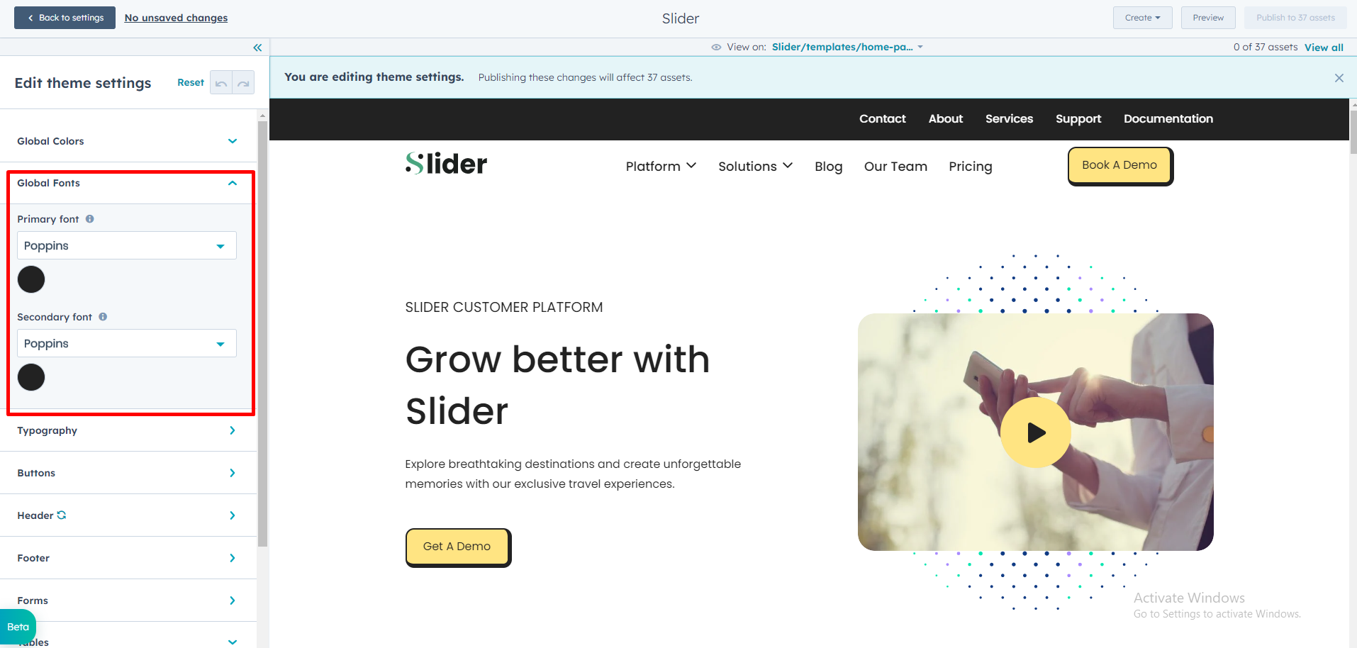
Global Fonts
- Primary Font
- Secondary Font
Typography
Body
- Font Style
Headings (H1 > H6)
- Font style
Typography On Mobile(Headings (H1 > H6)
- Font Size
Links
- Link color
- Link hover color


Buttons
Buttons Size
- Small
- Font size
- Vertical Spacing
- Horizontal Spacing
- Regular
- Font size
- Vertical Spacing
- Horizontal Spacing
- Large
- Font size
- Vertical Spacing
- Horizontal Spacing
Primary Button
- Font Style
- Text Transform
- Background Color
- Border
- Style
- Width
- Color
- Corner Radius
- Hover
- color
- Background Color
- Border
- Width
- Color
Secondary
- Font Style
- Text Transform
- Background Color
- Border
- Style
- Width
- Color
- Corner Radius
- Hover
- color
- Background Color
- Border
- Width
- Color
Tertiary
- Font Style
- Text Transform
- Background Color
- Border
- Style
- Width
- Color
- Corner Radius
- Hover
- color
- Background Color
- Border
- Width
- Color
Quaternary
- Font Style
- Text Transform
- Background Color
- Border
- Style
- Width
- Color
- Corner Radius
- Hover
- color
- Background Color
- Border
- Width
- Color
Simple
- Font Style
- Text Transform
- Underline
- Hover
- Font Color
- Underline

Header
Header Background
- Background Color
TopBar Menu
- Background Color
- Font Style
- Menu link Color Hover
Menu
- Font Style
- Child Menu Style
- Child Menu paragraph Text Style
- Mega Menu Into Color
- Menu Hover Link Color
- Menu Border Color
- Sub Menu Background Color

Footer
Menu Title
- Font Style
- Text transform
Menu
- Font Style
- Text transform
Hover
- Font Color
- Background Color
Active
- Font Color
- Background Color

Form
Title
- Background Color
- Font Style
- Text Transfrom
-
padding
- Top/Bottom
- Left/Right
-
Border
- Border style
- Corner radius
Labels
- Font Style
- Background color
-
padding
- Top/Bottom
- Left/Right
Field
- Background color
- Font Style
- Placeholder color
- Box Shadow color
-
Fields hover
- Placeholder Color
- Box Shadow Color
-
Active hover
- Placeholder Color
- Box Shadow Color
-
Fields Focus
- Placeholder Color
- Box Shadow Color
-
padding
- Top/Bottom
- Left/Right
-
Border
- Border style
- Border Choice (both side, top border , bottom border)
- Border Width
- Border Color
- Corner radius
-
Error massage
- Font style
- Background color
-
Error massage border style
- Border Width
- border color
-
GDPR text
- Font style(Fonts,color,Size)
-
Rich text
- Font style(Fonts,color)
Checkbox / Radio
- Font style
-
Border
- Border style
- Border Choice (both side, top border , bottom border)
- Border Width
- Border Color
- Corner radius
-
Border Hover
- Color
Error Message Style
- Font Style
- Background Color
-
Error Message border Style
- Width
- Color
Help text
- Font Style(fonts , color , size)
Form Background Color
Border
-
Border Choice
- Duble
- Groove
- Ridge
- Inset
- Outset
- Corner Radius
Form Padding
- Top/Bottom
- Left/Right
Submit Button
- Button Style
- Button Size

Table
- Header Background Color
- Header Text Color
- Body Background Color
- Body Text Color
- Footer Background Color
- Footer Text Color
- Border Color

Spacing (Container Width)
- Vertical Spacing
- Maximum Content Width
